Build a Statcast Exit-Velocity Leaderboard from Scratch
What you'll build
A sortable leaderboard ranking hitters by average and max exit velocity.
A leaderboard is the most honest chart in sports: it just asks who is best at this one thing? The "one thing" here is exit velocity - how hard hitters strike the ball - measured over a week of real Statcast data. Build it and you'll have practiced the three pandas moves that power almost every leaderboard you'll ever make: groupby, agg, and a join to turn cryptic player IDs into actual names.
This builds directly on your first pybaseball pull. If you ran that one, the data we need is already cached, so this will be fast.
-
Pull a week of batted balls
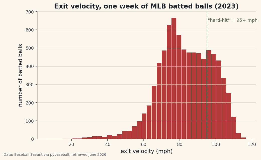
We turn on caching first so we never re-download the same days, then grab a week of the 2023 season. Every row is one pitch; we only care about pitches that were put in play, which is why we drop the rows with no exit velocity.
python import pybaseball as pyb pyb.cache.enable() data = pyb.statcast("2023-06-01", "2023-06-07") batted = data.dropna(subset=["launch_speed"]).copy()The column
launch_speedis exit velocity in miles per hour.battednow holds only the swings that produced a measurable hit. -
Group by hitter and aggregate
This is the heart of every leaderboard.
groupby("batter")splits the data into one bucket per hitter;aggthen computes several numbers for each bucket at once. We count the batted balls, take the average exit velocity, and grab each hitter's hardest-hit ball.python board = (batted.groupby("batter") .agg(bbe=("launch_speed", "size"), avg_ev=("launch_speed", "mean"), max_ev=("launch_speed", "max")))The tuple syntax -
("launch_speed", "mean")- reads as "make a column fromlaunch_speedusingmean." It's the cleanest way to build several summary columns in one pass. -
Require a real sample size
Without a minimum, a hitter with one lucky 115 mph rocket would top the board. We require at least a dozen batted balls, then sort and keep the top 15.
python MIN_BBE = 12 board = (board.query("bbe >= @MIN_BBE") .sort_values("avg_ev", ascending=False) .head(15) .round(1))The
@MIN_BBEinsidequerylets you reference a Python variable from the query string - handy when you want to tweak the threshold in one place. -
Turn player IDs into names
Statcast identifies hitters by an MLBAM ID number, not a name. pybaseball ships a reverse lookup that translates a list of IDs in one call; we then merge the names back onto the leaderboard.
python names = pyb.playerid_reverse_lookup(board.index.tolist(), key_type="mlbam") names["player"] = names["name_first"].str.title() + " " + names["name_last"].str.title() board = board.merge(names.set_index("key_mlbam")["player"], left_index=True, right_index=True)The first call builds a lookup table the first time you run it, so it can take a few seconds; after that it's cached.
-
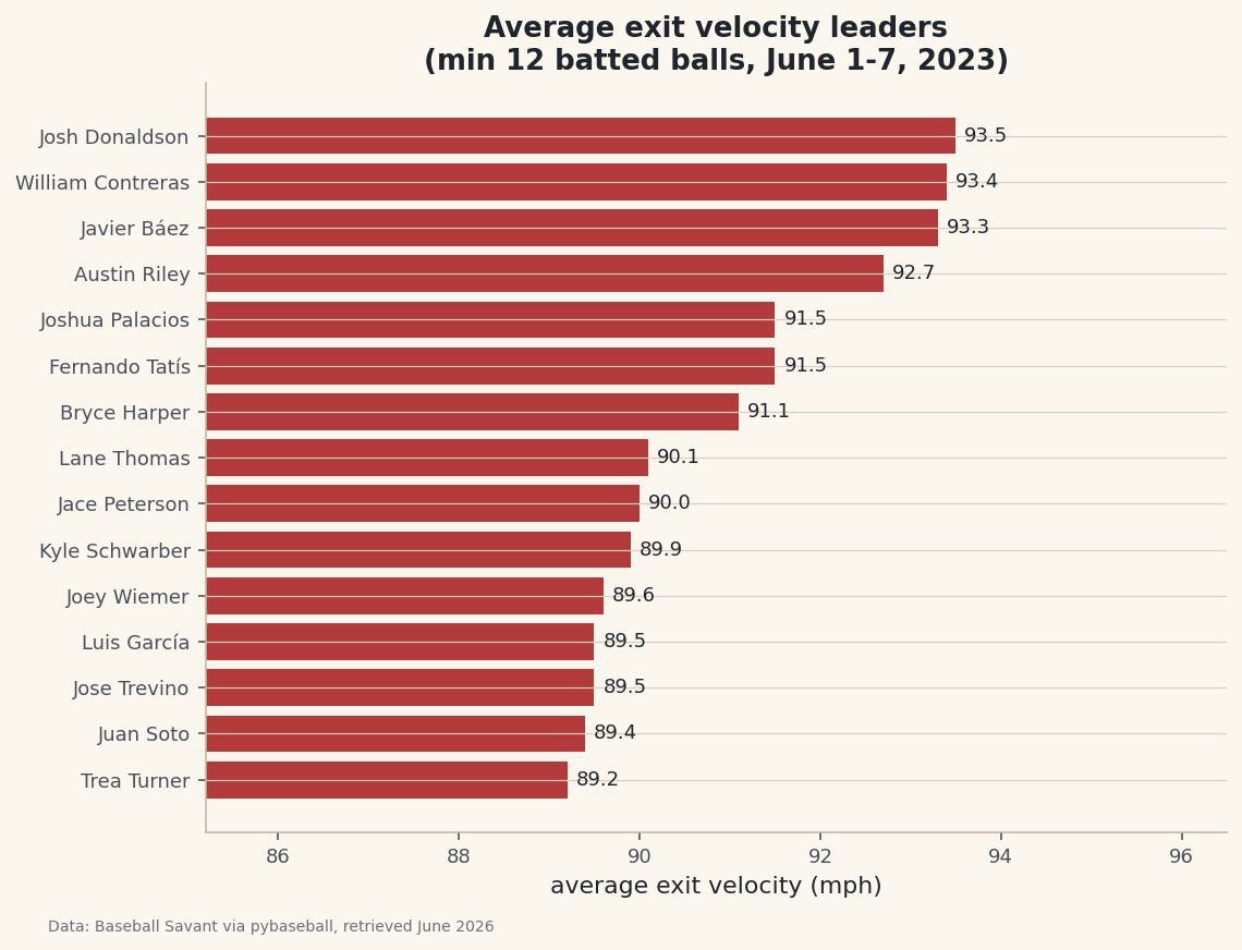
Read the leaderboard
Here's the finished table. These are real hitters and real exit velocities from that week - the kind of names you'd expect near the top, which is a good sign the pipeline is correct.
The leaderboardplayer bbe avg_ev max_ev 1 Josh Donaldson 15 93.5 111.0 2 William Contreras 23 93.4 108.8 3 Javier Báez 20 93.3 107.0 4 Austin Riley 24 92.7 111.5 5 Fernando Tatís 34 91.5 110.1 6 Joshua Palacios 13 91.5 107.7 7 Bryce Harper 30 91.1 110.7 8 Lane Thomas 27 90.1 109.8 9 Jace Peterson 19 90.0 107.1 10 Kyle Schwarber 31 89.9 116.2 11 Joey Wiemer 29 89.6 111.9 12 Luis García 26 89.5 106.2 13 Jose Trevino 12 89.5 103.4 14 Juan Soto 28 89.4 110.0 15 Trea Turner 40 89.2 111.7
Notice the two stories in the numbers:
avg_evrewards consistent hard contact, whilemax_evshows raw peak power. Kyle Schwarber's 116 mph max stands out even though his average sits mid-pack. -
Draw it as a chart
A horizontal bar chart reads exactly like a leaderboard - longest bar on top. We sort ascending so matplotlib stacks the best hitter at the top, and label each bar with its value.
python import matplotlib.pyplot as plt plot_df = board.sort_values("avg_ev") fig, ax = plt.subplots(figsize=(8.4, 6.2)) bars = ax.barh(plot_df["player"], plot_df["avg_ev"], color="#B23A3A") ax.bar_label(bars, fmt="%.1f", padding=4) ax.set_xlim(plot_df["avg_ev"].min() - 4, plot_df["avg_ev"].max() + 3) ax.set_xlabel("average exit velocity (mph)") fig.savefig("leaderboard.png", dpi=144, bbox_inches="tight")Data: Baseball Savant via pybaseball, retrieved June 2026 Setting
set_xlimto start near the lowest value zooms in on the part of the axis where the differences actually live - without it, every bar would look nearly identical.
Troubleshooting
The first pull is slow or shows a progress bar
That's normal. statcast() downloads one request per day, so a week is seven requests the first time. Because we called pyb.cache.enable(), the second run reads from disk and is nearly instant. If it feels stuck, give it 20-30 seconds before worrying.
KeyError: 'batter' or an empty leaderboard
This usually means the date range returned no games (an off-day, or a future date). Pick dates inside a regular season and check len(data) is non-zero before grouping.
SettingWithCopyWarning when you add a column
Pandas is warning that you might be editing a view of another DataFrame. We avoided it by calling .copy() right after dropna(). If you see it, add .copy() where you first slice the data.
Challenge yourself
Rank by max_ev instead of avg_ev and see how much the leaderboard reshuffles - peak power and consistent power are different skills. Then add a fourth column for the share of each hitter's batted balls that were "barrels" (95+ mph and a launch angle between 26° and 30°) and sort by that. Who climbs?
Get the code
Here's the complete, working script for this tutorial. It runs exactly as shown.
Download the finished script (07_build_a_statcast_exit_velocity_leaderboard.py)This script imports a small shared helper (and reads any bundled sample data) that live next to it in /downloads/ — grab these into the same folder so it runs as-is: sdt_common.py.