Make a Pitch-Location Heatmap in Python
What you'll build
A pitch-location heatmap for one pitcher with the strike zone drawn on top.
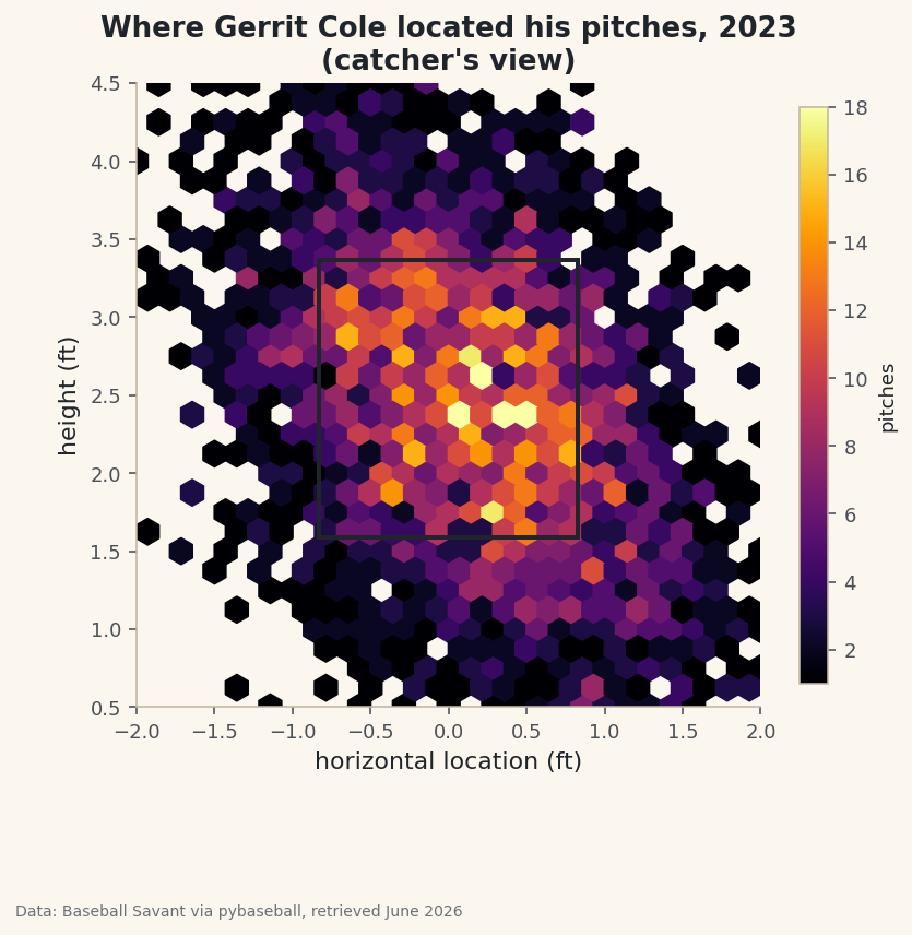
A pitcher's command is invisible in a box score but obvious in a heatmap. Plot where every pitch crossed the plate and the strategy just appears: the corners he lives on, the spots he avoids, the zone he owns. To get there I'll pull a full season for one pitcher - Gerrit Cole - from Statcast, sort out the plate_x / plate_z coordinate system (which trips up nearly everyone the first time), and render thousands of pitch locations as a density heatmap with the strike zone drawn on top.
This builds on your first pybaseball pull, so if you've run that, your cache is warm and pybaseball is already installed. The data is Baseball Savant via pybaseball, retrieved June 2026.
-
Pull one pitcher's whole season
Last time we used
statcast()to grab every pitch in the league across a few days. Here we want the opposite: every pitch from one pitcher across a whole season. The functionstatcast_pitcher(start, end, player_id)does exactly that, and because it asks Savant for a single player it stays fast even over six months.python import matplotlib.pyplot as plt import pybaseball as pyb pyb.cache.enable() # statcast_pitcher pulls a single pitcher, which is fast even over months. PITCHER_ID = 543037 # Gerrit Cole pitches = pyb.statcast_pitcher("2023-04-01", "2023-09-30", PITCHER_ID) pitches = pitches.dropna(subset=["plate_x", "plate_z"])That
543037is Gerrit Cole's MLBAM ID - Statcast identifies players by number, not name. We immediately drop any pitch missing a plate location, because a heatmap needs coordinates for every point it draws. (You'll see in the troubleshooting section how to look up any other pitcher's ID.) -
Turn the ID back into a name
We'll want the pitcher's name for the chart title, so we run pybaseball's reverse lookup on the single ID and stitch the first and last names together.
python name_row = pyb.playerid_reverse_lookup([PITCHER_ID], key_type="mlbam").iloc[0] pitcher = f"{name_row['name_first'].title()} {name_row['name_last'].title()}"The lookup takes a list of IDs even when you only have one, which is why we wrap it in brackets and then take
.iloc[0]to grab the first (only) row..title()fixes the all-lowercase names the lookup returns. -
Inspect the coordinates
Before plotting, always look at the raw numbers. Let's print how many located pitches we have and a few sample rows showing the columns we care about.
python print(f"{pitcher}: {len(pitches):,} located pitches in 2023") sdt.show_df(pitches[["pitch_type", "plate_x", "plate_z", "description"]], n=6)A sample of Cole's located pitchesGerrit Cole: 3,186 located pitches in 2023 pitch_type plate_x plate_z description 0 FF -0.292139 3.275998 hit_into_play 1 SL 1.904432 0.303974 ball 2 FF 0.166596 2.117997 called_strike 3 FC 0.330272 1.823457 hit_into_play 4 FF 0.061357 3.247644 swinging_strike 5 KC 0.202904 1.858533 foul
Over three thousand located pitches in the season - plenty for a smooth density picture. Now study the two coordinate columns, because they are the whole game here.
plate_xis the horizontal position where the pitch crossed the front of home plate, in feet, measured from the catcher's point of view: 0 is dead center, negative is to the catcher's left, positive to the catcher's right.plate_zis the height above the ground, in feet. So the row withplate_x = -0.29, plate_z = 3.28is a high-ish fastball just off center, and the one atplate_x = 1.90, plate_z = 0.30is a slider in the dirt, way off the plate - a classic chase pitch, which fits itsballdescription. -
Define the strike zone
To make the heatmap legible we'll outline the strike zone on top of it. The zone is 17 inches wide (the width of home plate) plus a little for the ball's diameter, which works out to about 0.83 feet on each side of center. The height of the zone is different: it depends on each batter's stance, so Statcast records a top and bottom for every pitch. We take the median of those to get one representative zone.
python # The strike zone: the plate is ~17 inches wide, and the top/bottom vary by batter, # so we use the median of Statcast's per-pitch sz_top / sz_bot. zone_x = 0.83 # half-plate + a ball, in feet zone_bot = pitches["sz_bot"].median() zone_top = pitches["sz_top"].median()Using the median rather than a fixed textbook height keeps the zone honest for the actual batters this pitcher faced, while still giving us one clean rectangle instead of thousands of slightly different ones.
-
Draw the density with a hexbin
With thousands of points, a plain scatter plot turns into an unreadable blob - the dots pile on top of each other and you can't tell a busy spot from a quiet one. A hexbin solves this: it tiles the plane with little hexagons and colors each one by how many pitches fell inside it. Bright means many pitches, dark means few.
python fig, ax = plt.subplots(figsize=(6.4, 6.8)) hb = ax.hexbin(pitches["plate_x"], pitches["plate_z"], gridsize=28, extent=(-2, 2, 0.5, 4.5), cmap="inferno", mincnt=1)gridsize=28sets how fine the hexagons are;extentfixes the window so the plot doesn't auto-zoom to a few stray pitches; andmincnt=1hides empty hexagons so the warm-paper background shows through where no pitches landed. Theinfernocolormap runs dark-to-bright, which reads intuitively as cold-to-hot. -
Overlay the strike zone and finish the plot
Now we drop the strike-zone rectangle on top, lock the axes to real-world proportions, and label everything from the catcher's view so the picture matches how a coach would describe it.
python # strike zone rectangle ax.add_patch(plt.Rectangle((-zone_x, zone_bot), 2 * zone_x, zone_top - zone_bot, fill=False, edgecolor="#20242B", linewidth=2)) ax.set_xlim(-2, 2) ax.set_ylim(0.5, 4.5) ax.set_aspect("equal") ax.set_title(f"Where {pitcher} located his pitches, 2023\n(catcher's view)") ax.set_xlabel("horizontal location (ft)") ax.set_ylabel("height (ft)") ax.grid(False) cb = fig.colorbar(hb, ax=ax, shrink=0.7) cb.set_label("pitches", fontsize=9) fig.savefig("pitch_heatmap.png", dpi=144, bbox_inches="tight")Two details matter a lot here.
set_aspect("equal")forces one foot horizontal to equal one foot vertical, so the zone looks like a real rectangle instead of a stretched one. And the rectangle is anchored at its bottom-left corner(-zone_x, zone_bot)with a width of2 * zone_xand a height ofzone_top - zone_bot- that's how matplotlib'sRectanglealways works, so it's worth committing to memory.Data: Baseball Savant via pybaseball, retrieved June 2026 Read it like a scouting report. The brightest cells cluster around the edges and corners of the zone rather than its center - the signature of a pitcher who lives on the borders and tries to miss bats just off the plate. The black rectangle gives your eye an anchor: anything bright outside it is a chase pitch, anything bright inside it is a strike the hitter had to deal with.
Troubleshooting
You don't know a pitcher's MLBAM ID
Look it up by name with pyb.playerid_lookup("cole", "gerrit"). It returns a small table; the key_mlbam column is the number to drop into PITCHER_ID. The first call builds a lookup file and can take a few seconds, then it's cached.
The heatmap looks stretched or squashed
You're missing ax.set_aspect("equal"), or you set it before fixing the limits. With unequal aspect, one foot sideways won't match one foot up, and the strike zone won't look square. Keep the set_aspect call after set_xlim/set_ylim.
The whole plot is one giant blob of color
Your gridsize is too small or the extent is too tight, so every pitch crams into a few hexagons. Raise gridsize toward 28-35 for a finer grid, and keep the extent roughly (-2, 2, 0.5, 4.5) so the view covers the plate and a normal pitch's height.
The left and right sides look backwards
Remember these are catcher's-view coordinates: negative plate_x is the catcher's left, which is a right-handed batter's inside corner. Nothing is wrong - it's just the opposite of the TV broadcast angle. Mislabeling this is the most common heatmap mistake.
Challenge yourself
Filter pitches to a single pitch type (say pitches[pitches["pitch_type"] == "FF"] for four-seam fastballs) and make a heatmap for just that pitch - then compare it to the slider's map. A pitcher's fastball and breaking ball usually live in completely different parts of the zone, and seeing the two side by side is genuinely illuminating. For a different sport's take on location plots, try building an NHL shot-location plot.
Get the code
Here's the complete, working script for this tutorial. It runs exactly as shown.
Download the finished script (08_make_a_pitch_location_heatmap_in_python.py)This script imports a small shared helper (and reads any bundled sample data) that live next to it in /downloads/ — grab these into the same folder so it runs as-is: sdt_common.py.