Build a Shot-Location Plot for an NHL Team
What you'll build
One team's shot attempts plotted on a drawn rink from real play-by-play.
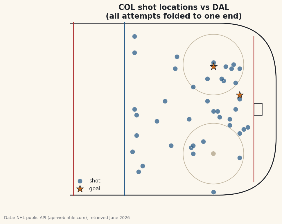
Where a team shoots from tells you how it tries to score. Here's where most plots of this go wrong, though: teams switch ends between periods, so the raw play-by-play has a team's shots flying at both nets, and if you plot it as-is you get a meaningless scatter on both sides of the rink. The fix — folding every shot onto one attacking end — is the tricky, satisfying part of this. I'll pull a single NHL game, isolate one team's attempts, highlight the goals, and sort out that geometry. The Colorado Avalanche (COL) are the example.
This builds directly on your first NHL API pull, where we set up the polite session we'll reuse here. The data is the NHL public API (api-web.nhle.com), retrieved June 2026.
-
Find one finished game
We start from the team's season schedule and pick the first game that has actually been played. The schedule endpoint returns every game, including ones not yet started, so we filter for a finished state - the API marks those
OFForFINAL.python import matplotlib.patches as mp import matplotlib.pyplot as plt import pandas as pd TEAM = "COL" SEASON = "20242025" session = sdt.polite_session(referer="https://www.nhl.com/") # 1. Find one finished game on the team's schedule. sched = session.get(f"https://api-web.nhle.com/v1/club-schedule-season/{TEAM}/{SEASON}", timeout=30).json() finished = [g for g in sched["games"] if g.get("gameState") in ("OFF", "FINAL")] game = finished[0] game_id = game["id"]Using
.get("gameState")rather than["gameState"]is a small safety habit: if a game record is missing that field,.getreturnsNoneinstead of crashing. We keep only finished games and take the first one. -
Pull the play-by-play and find our team's ID
Every game has a play-by-play feed - a long list of events, each tagged with a type and, for shots, a location. We fetch it, then figure out Colorado's numeric team ID by checking whether they were the home or away side, and grab the opponent's abbreviation for our chart title.
python # 2. Pull that game's play-by-play and find our team's id. pbp = session.get(f"https://api-web.nhle.com/v1/gamecenter/{game_id}/play-by-play", timeout=30).json() team_id = pbp["homeTeam"]["id"] if pbp["homeTeam"]["abbrev"] == TEAM else pbp["awayTeam"]["id"] opp = pbp["awayTeam"]["abbrev"] if pbp["homeTeam"]["abbrev"] == TEAM else pbp["homeTeam"]["abbrev"]The two conditional expressions read as "if Colorado is the home team, use the home ID and the away opponent; otherwise flip it." We need the numeric
team_idbecause the play events identify the shooting team by ID, not by abbreviation. -
Keep this team's shot attempts
Now we walk every play and keep only Colorado's shot attempts. "Shot attempt" covers three event types: a
shot-on-goal(the goalie had to stop it), agoal, and amissed-shot(it sailed wide). We skip everything else, skip the other team's shots, and skip any event without coordinates.python # 3. Keep this team's shot attempts (on goal, goals, and misses). SHOTS = {"shot-on-goal", "goal", "missed-shot"} rows = [] for play in pbp["plays"]: if play["typeDescKey"] not in SHOTS: continue d = play.get("details", {}) if d.get("eventOwnerTeamId") != team_id or d.get("xCoord") is None: continue x, y = d["xCoord"], d["yCoord"] if x < 0: # fold every shot onto the right-hand goal x, y = -x, -y rows.append({"x": x, "y": y, "type": play["typeDescKey"]}) shots = pd.DataFrame(rows)The crucial line is the fold. The rink is measured in feet with center ice at
x = 0, one net nearx = +89and the other nearx = -89. Because teams trade ends each period, Colorado's shots land at both extremes. By flipping any shot with negativex- negating bothxandyto rotate it 180° - we stack every attempt onto the same attacking end. Without this, your plot would look like two teams shooting at each other. -
Inspect the shots
Let's see what we collected: a count of attempts, a breakdown by type, and a few rows of folded coordinates.
python print(f"{TEAM} vs {opp}, game {game_id}: {len(shots)} shot attempts") print(shots["type"].value_counts().to_string()) sdt.show_df(shots, n=6)Colorado's shot attempts, folded to one endCOL vs DAL, game 2024010017: 43 shot attempts type shot-on-goal 28 missed-shot 13 goal 2 x y type 0 45 4 shot-on-goal 1 31 -3 shot-on-goal 2 69 -41 missed-shot 3 51 26 shot-on-goal 4 77 -8 shot-on-goal 5 86 -9 shot-on-goalIn this game Colorado vs Dallas, Colorado put up 43 shot attempts: 28 on goal, 13 that missed, and 2 goals. Look at the
xvalues in the sample - they're all positive and bunched in the offensive zone (45, 31, 69, 51, 77, 86), which confirms the fold worked. Theyvalues run from about -41 to +26, spreading the shots across the width of the ice. Every number here is real, pulled live from the game feed. -
Draw a simple rink
A shot plot needs a rink under it for context, but we don't need a broadcast-perfect diagram - just enough landmarks to read positions: the boards (a rounded rectangle), the center and blue lines, the goal line, the net, and a couple of faceoff circles. We wrap it in a function so the drawing logic stays separate from the data.
python def draw_rink(ax): """A simple half-rink: boards, lines, and the goal, in NHL feet coordinates.""" ax.add_patch(mp.FancyBboxPatch((-100, -42.5), 200, 85, boxstyle="round,pad=0,rounding_size=28", fill=False, edgecolor="#20242B", linewidth=1.6)) ax.axvline(0, color=sdt.SPORT_COLORS["baseball"], linewidth=2) # center line ax.axvline(25, color=sdt.sport_color("hockey"), linewidth=2) # blue line ax.plot([89, 89], [-36, 36], color=sdt.SPORT_COLORS["baseball"], linewidth=1.2) # goal line ax.add_patch(mp.Rectangle((89, -3), 4, 6, fill=False, edgecolor="#20242B", linewidth=1.3)) # net for fy in (-22, 22): # faceoff dots ax.add_patch(mp.Circle((69, fy), 15, fill=False, edgecolor="#C2B7A1", linewidth=1)) ax.add_patch(mp.Circle((69, fy), 1, color="#C2B7A1"))Each landmark is just a matplotlib patch placed at its real-feet coordinate: the goal line at
x = 89, the offensive blue line atx = 25, faceoff circles centered atx = 69. Because we're using genuine rink coordinates, the shots we plot next will line up with these landmarks automatically. -
Plot the shots, highlighting goals
Finally we draw the rink, split the shots into goals and everything else, and plot them with different markers so the goals jump out. Regular attempts are small blue dots; goals are big stars.
python fig, ax = plt.subplots(figsize=(8, 5.4)) draw_rink(ax) goals = shots[shots["type"] == "goal"] other = shots[shots["type"] != "goal"] ax.scatter(other["x"], other["y"], s=70, color=sdt.sport_color("hockey"), alpha=0.75, edgecolor="#FBF7EE", linewidth=0.6, label="shot") ax.scatter(goals["x"], goals["y"], s=180, marker="*", color=sdt.SPORT_COLORS["basketball"], edgecolor="#20242B", linewidth=0.7, label="goal", zorder=5) ax.set_xlim(-2, 101) ax.set_ylim(-43, 43) ax.set_aspect("equal") ax.axis("off") ax.legend(loc="lower left", fontsize=9, frameon=False) ax.set_title(f"{TEAM} shot locations vs {opp}\n(all attempts folded to one end)") fig.savefig("shot_plot.png", dpi=144, bbox_inches="tight")Data: NHL public API (api-web.nhle.com), retrieved June 2026 Two finishing touches make this readable.
set_aspect("equal")keeps the rink from squashing, so distances look true. Andzorder=5on the goals forces the stars to draw on top of the dots, so a goal is never hidden behind a nearby attempt. The story jumps out: most attempts cluster in front of the net and around the faceoff circles - the high-danger areas - and the two goal stars sit right where you'd expect goals to come from.
Troubleshooting
All the shots land on the wrong half of the rink
You probably folded on the wrong condition or forgot to flip y along with x. The rule is: if x < 0, set x, y = -x, -y. Negating only x mirrors the shot to the wrong side of the ice; you must rotate both to fold it correctly onto one end.
KeyError: 'details' or missing coordinates
Not every play has a details block or coordinates - stoppages and penalties don't. That's why we read with play.get("details", {}) and skip rows where d.get("xCoord") is None. If you index with square brackets instead, those events will crash the loop.
The shot plot is empty or has very few dots
Check that team_id matched correctly - if the home/away comparison picked the wrong side, you filtered out all of your own team's shots. Print pbp["homeTeam"]["abbrev"] and confirm it's either your team or the opponent, and that TEAM exactly matches the API's three-letter code.
The rink looks stretched and the circles are ovals
You're missing ax.set_aspect("equal"). Hockey coordinates span 200 feet long by 85 wide, so without an equal aspect ratio matplotlib stretches the rink to fill the figure and the faceoff circles flatten into ovals.
Challenge yourself
Right now we plot a single game. Loop over several finished games, collect all of Colorado's shots into one big DataFrame, and plot the season's shot map - the high-danger areas will sharpen into a clear hot zone. Then try sizing or coloring each dot by shot type, or computing the share of attempts that came from inside the faceoff circles. For a baseball spin on the same location-plotting idea, revisit making a pitch-location heatmap.
Get the code
Here's the complete, working script for this tutorial. It runs exactly as shown.
Download the finished script (19_build_a_shot_location_plot_for_an_nhl_team.py)This script imports a small shared helper (and reads any bundled sample data) that live next to it in /downloads/ — grab these into the same folder so it runs as-is: sdt_common.py.