Basketball
Beginner
Pull Your First NBA Data with nba_api
Pull NBA standings with nba_api, with the browser headers and retry logic stats.nba.com demands. Includes exactly what to do when the endpoint refuses to answer.
The NBA's stats API is powerful but picky. Learn to pull it politely, then build standings, ratings and shot charts.
No tutorials match that filter.
Pull NBA standings with nba_api, with the browser headers and retry logic stats.nba.com demands. Includes exactly what to do when the endpoint refuses to answer.
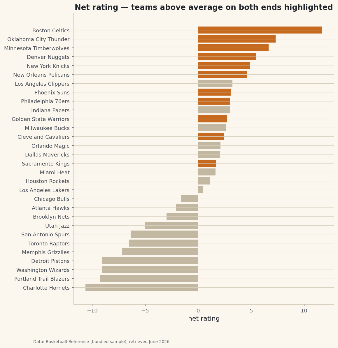
Ask your data a question: use boolean masks and .query() to select the rows that match multiple conditions, then highlight that filtered set on a chart of every team.
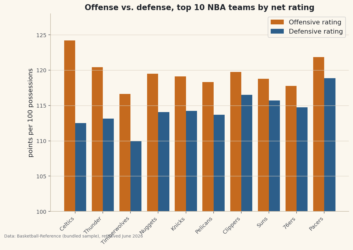
A stacked bar shows composition; a grouped bar shows comparison. Nudge two bar series apart with a half-width offset to put each team's offense and defense next to each other - the chart for 'which is bigger, A or B, within each group?'
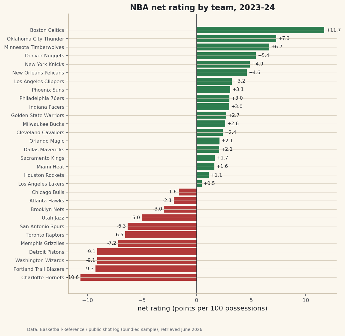
Combine offensive and defensive ratings into a ranked net-rating table, then style it into a dashboard-quality figure you can drop into a report.
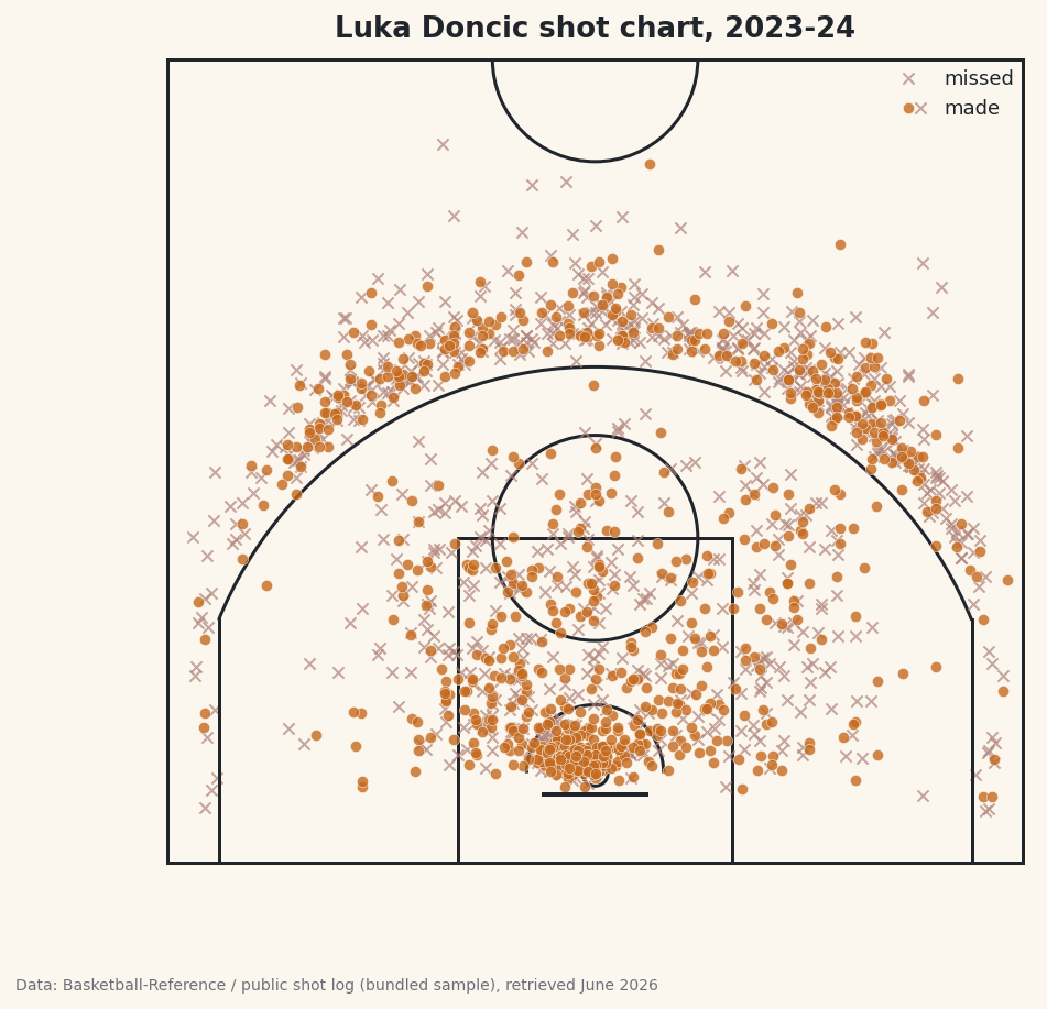
Draw a regulation half-court from scratch in matplotlib, then plot a player's makes and misses in court coordinates for a real, shareable shot chart.
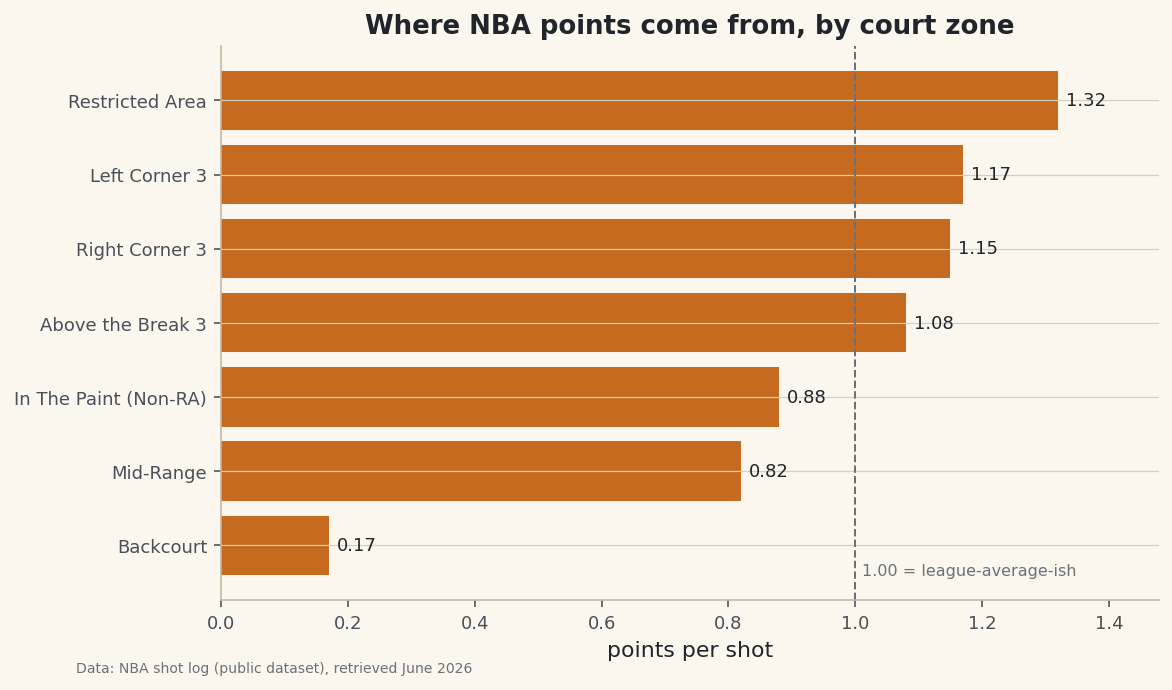
Group a season of NBA shots by court zone to see where points really come from: frequency, field-goal percentage, and points per shot for the rim, mid-range, and three.
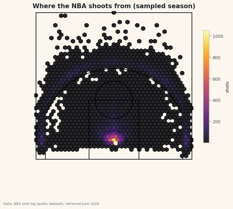
Plot thousands of NBA shots as a hexbin density heatmap on a court you draw yourself, revealing the modern shot-selection fingerprint: the rim and the three-point line.
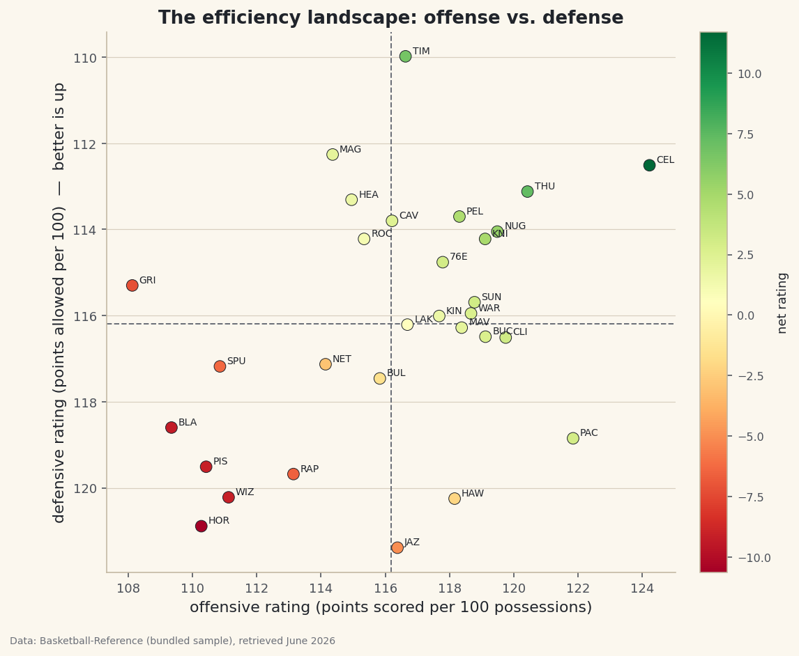
One scatter separates contenders from rebuilders. Plot every NBA team's offensive rating against its defensive rating, add league-average crosshairs, and color each team by net rating.
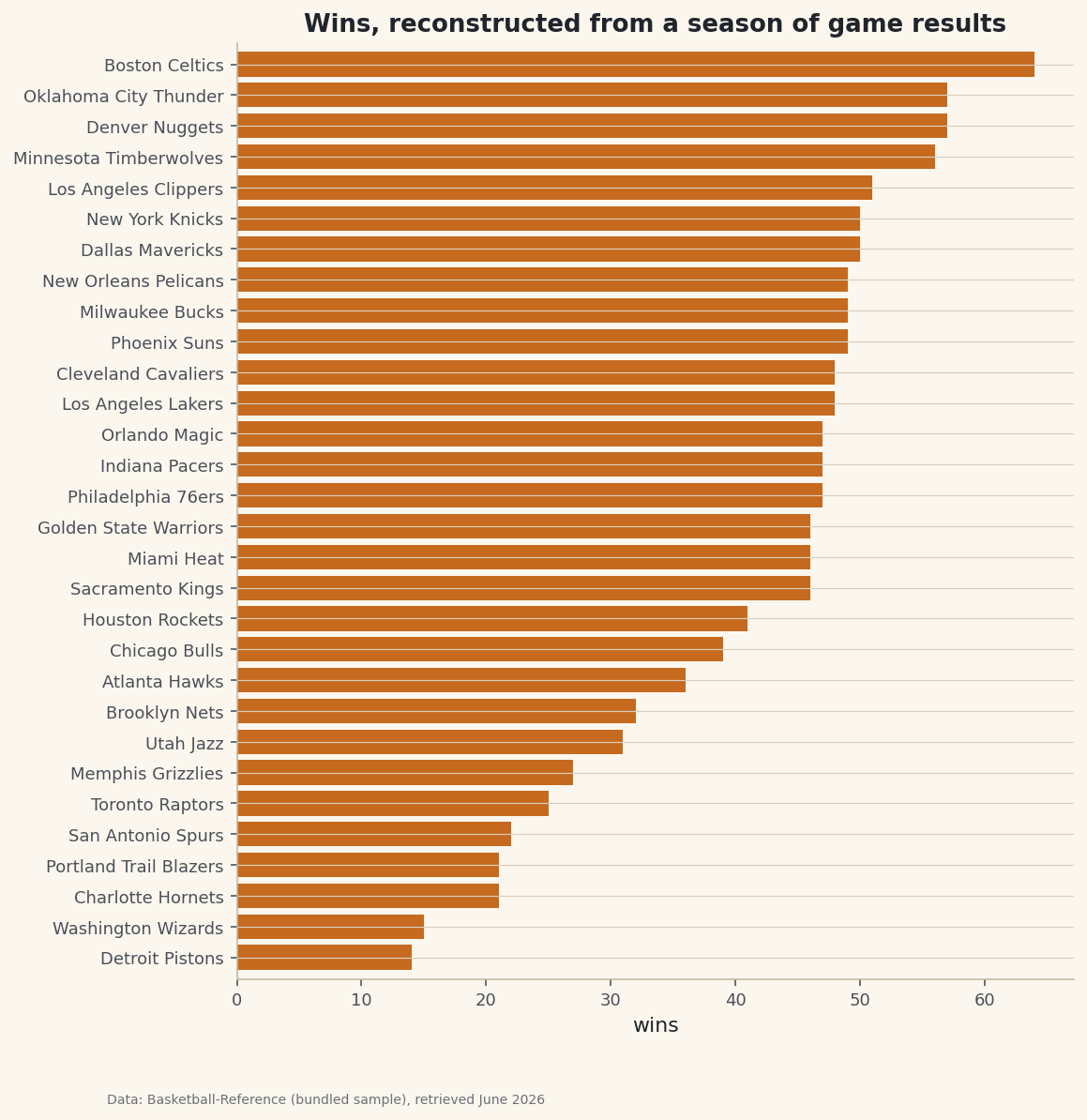
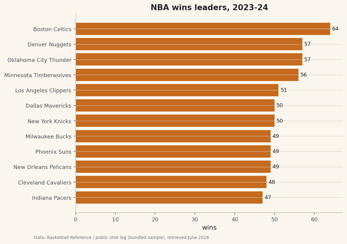
Turn a long game-by-game results log into a final standings table. One concat plus one groupby collapses a whole season of scores into wins, losses, and win percentage.
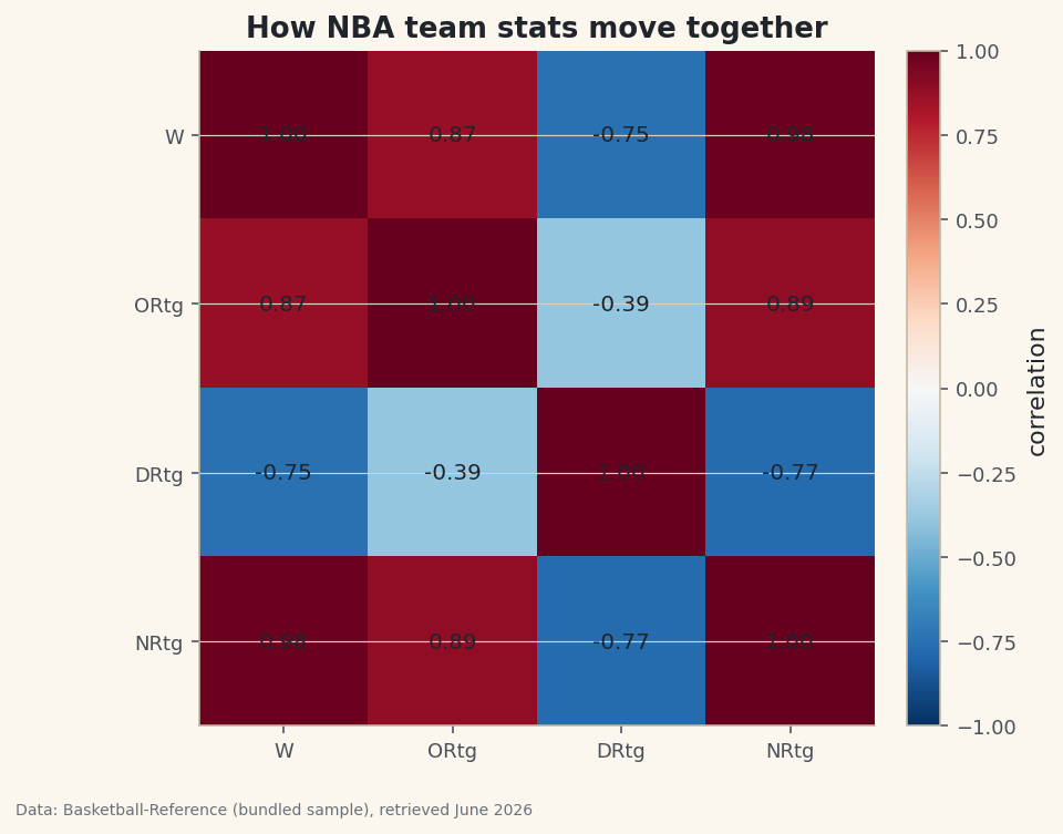
Compute a correlation matrix with .corr() and render it as a heatmap, so you can see at a glance which stats rise and fall together - and which move in opposite directions.
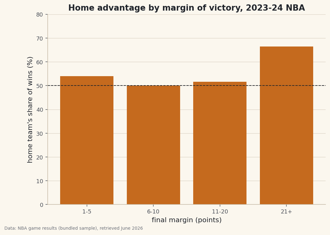
Turn a hunch into a table. pd.crosstab() counts how two categorical variables co-occur - here who won against how big the margin was - and normalize='index' converts those counts into the rates that reveal how home advantage grows with the blowout.
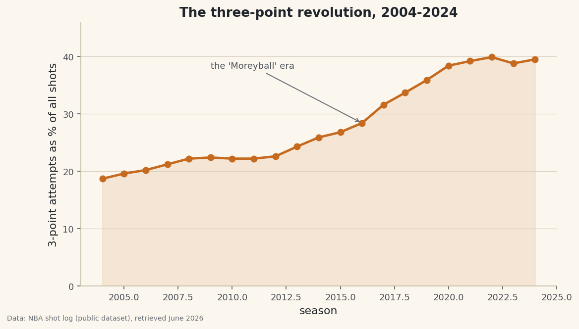
Aggregate shot data across twenty seasons to chart basketball's biggest tactical shift - the three-point revolution - and quantify exactly how shot selection changed.