Build a Team Net-Rating Dashboard Table
What you'll build
A ranked net-rating table styled like a real dashboard, exported as an image.
Net rating is the one number I'd keep if I could keep only one to judge an NBA team. It folds offense and defense into a single figure - and it predicts who's actually good far better than a won-lost record, which is noisy and schedule-dependent. So we'll go get it: every team's advanced ratings for 2023-24, ranked into a clean dashboard table, then a diverging bar chart that splits the league into the good, the bad, and the merely average.
This builds on your first NBA pull - same headers, same fallback pattern, a different endpoint. If you haven't set up nba_api yet, start there; here we assume it's installed and reuse the shared NBA_HEADERS.
As with every NBA tutorial, the live pull below works on your home connection but times out from data-center and VPN IPs, so this page was built from a bundled real sample - team ratings from Basketball-Reference. The numbers are genuine; on your machine the same code fetches them live.
-
What net rating actually measures
Net rating answers a clean question: per 100 possessions, how many more points does a team score than it allows? It's built from two halves. Offensive rating (ORtg) is points scored per 100 possessions; defensive rating (DRtg) is points allowed per 100 possessions. Net rating is simply the difference:
python net_rating = off_rating - def_rating # ORtg - DRtgWhy "per 100 possessions" instead of "per game"? Because teams play at different paces. A fast team and a slow team can score wildly different raw point totals while being equally efficient. Normalizing to possessions strips pace out, so a +6 net rating means the same thing for the run-and-gun Pacers as it does for a grind-it-out defense. A positive number means you outscore opponents; a negative number means you're getting outscored.
-
Pull advanced team stats
Basic box-score endpoints won't give you ratings - you need the advanced measure type. The endpoint is
LeagueDashTeamStats, and the key argument ismeasure_type_detailed_defense="Advanced", which switches the response from raw totals to the efficiency metrics we want. As always, we pass our browser headers and a timeout.python from nba_api.stats.endpoints import leaguedashteamstats s = leaguedashteamstats.LeagueDashTeamStats( season="2023-24", measure_type_detailed_defense="Advanced", headers=NBA_HEADERS, timeout=30) df = s.get_data_frames()[0] ratings = pd.DataFrame({ "Team": df["TEAM_NAME"], "ORtg": df["OFF_RATING"], "DRtg": df["DEF_RATING"], "NRtg": df["NET_RATING"], })The advanced response already includes
NET_RATING, so we don't have to compute it - but it's exactlyOFF_RATING - DEF_RATING, and it's a good habit to verify that yourself once with(ratings["ORtg"] - ratings["DRtg"]).round(1). The numbers should match theNRtgcolumn to a rounding error. -
Wrap it with the live-or-bundled fallback
Same defensive structure as before: try the live call, and if the server blocks us, load the bundled real ratings instead. The helper retries with exponential backoff and returns a
sourcelabel so the chart can credit its data honestly.python def bundled_loader(): return sdt_nba.bundled("nba_ratings.csv")[["Team", "ORtg", "DRtg", "NRtg"]] ratings, source = sdt_nba.live_or_bundled( live_call, bundled_loader, "advanced team stats") ratings = ratings.sort_values("NRtg", ascending=False).reset_index(drop=True)Sorting by
NRtgdescending puts the best team first. Thereset_index(drop=True)renumbers the rows cleanly so we can build a 1-based rank in the next step. If you're running at home,live_callnever fails and the bundled loader is simply never reached. -
Build the ranked dashboard table
Now we turn the DataFrame into something that reads like a real leaderboard: a 1-based rank index, every column rounded to one decimal, the whole league from best to worst.
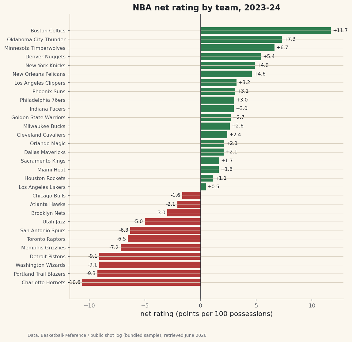
python show = ratings.round(1).copy() show.index = range(1, len(show) + 1) print("Team net-rating table, 2023-24 (best to worst):") print(show.to_string())Full net-rating table, 2023-24Team net-rating table, 2023-24 (best to worst): Team ORtg DRtg NRtg 1 Boston Celtics 124.2 112.5 11.7 2 Oklahoma City Thunder 120.4 113.1 7.3 3 Minnesota Timberwolves 116.6 110.0 6.6 4 Denver Nuggets 119.5 114.0 5.4 5 New York Knicks 119.1 114.2 4.9 6 New Orleans Pelicans 118.3 113.7 4.6 7 Los Angeles Clippers 119.8 116.5 3.2 8 Phoenix Suns 118.8 115.7 3.1 9 Philadelphia 76ers 117.8 114.8 3.0 10 Indiana Pacers 121.8 118.8 3.0 11 Golden State Warriors 118.7 116.0 2.7 12 Milwaukee Bucks 119.1 116.5 2.6 13 Cleveland Cavaliers 116.2 113.8 2.4 14 Orlando Magic 114.4 112.3 2.1 15 Dallas Mavericks 118.4 116.3 2.1 16 Sacramento Kings 117.7 116.0 1.7 17 Miami Heat 115.0 113.3 1.6 18 Houston Rockets 115.3 114.2 1.1 19 Los Angeles Lakers 116.7 116.2 0.5 20 Chicago Bulls 115.8 117.5 -1.6 21 Atlanta Hawks 118.2 120.2 -2.1 22 Brooklyn Nets 114.1 117.1 -3.0 23 Utah Jazz 116.4 121.4 -5.0 24 San Antonio Spurs 110.8 117.2 -6.3 25 Toronto Raptors 113.1 119.7 -6.5 26 Memphis Grizzlies 108.1 115.3 -7.2 27 Detroit Pistons 110.4 119.5 -9.1 28 Washington Wizards 111.1 120.2 -9.1 29 Portland Trail Blazers 109.3 118.6 -9.3 30 Charlotte Hornets 110.3 120.9 -10.6Read it top to bottom. The Boston Celtics weren't just the best team - they were in a tier of their own at +11.7, built on a 124.2 offense and a 112.5 defense, both elite. Oklahoma City is a distant second at +7.3. Down at the bottom, Charlotte sits at -10.6, scoring 110.3 and bleeding 120.9 the other way. The whole spread, from +11.7 to -10.6, is what separates a 64-win juggernaut from a lottery team.
Two teams worth a second look: Indiana posted a sky-high 121.8 offense but a leaky 118.8 defense, netting just +3.0 - elite scoring dragged back to mid-pack by defense. Memphis is the mirror image of bad luck, with the league's weakest offense at 108.1. Net rating makes those trade-offs visible in a way win totals never could.
-
Draw the diverging "dashboard" chart
A diverging bar chart is the perfect picture of net rating because the metric has a natural zero. We color bars green above the line (winning teams) and red below it (losing teams), draw a vertical axis at zero, and label each bar with a signed value so the sign is unmistakable.
python import matplotlib.pyplot as plt plot_df = ratings.sort_values("NRtg") colors = [sdt.sport_color("soccer") if v >= 0 else sdt.SPORT_COLORS["baseball"] for v in plot_df["NRtg"]] fig, ax = plt.subplots(figsize=(8, 8.4)) ax.barh(plot_df["Team"], plot_df["NRtg"], color=colors) ax.axvline(0, color="#20242B", linewidth=0.8) ax.bar_label(ax.containers[0], fmt="%+.1f", padding=3, fontsize=8) ax.set_title("NBA net rating by team, 2023-24") ax.set_xlabel("net rating (points per 100 possessions)") ax.tick_params(axis="y", labelsize=8) sdt.save_fig(fig, "net_rating_table", source=source)Data: stats.nba.com via nba_api, retrieved June 2026 The list comprehension that builds
colorsis the key trick: it walks the net-rating column and picks green or red per team. The"%+.1f"format string forces a leading+or-on every label, andaxvline(0, ...)draws the dividing line the whole chart pivots around. The footer credit reads "bundled sample" here because the build server is blocked; on your home machine it will instead credit the livestats.nba.compull.
Troubleshooting
The live call hangs, then raises ReadTimeout
Expected on a server, and not a bug in your code. stats.nba.com geoblocks data-center and VPN IP addresses, so the request is dropped and eventually fails with requests.exceptions.ReadTimeout. Fixes, in order: (1) run from a home internet connection, not a server, Colab, or VPN; (2) send the full NBA_HEADERS; (3) raise the timeout to 30-60 seconds; (4) add exponential backoff for a second chance; (5) keep to about one request per second to avoid rate-limiting. This is exactly why the table and chart here were built from the bundled real sample.
The ratings look like raw totals, not per-100 numbers
You forgot the measure type. Without measure_type_detailed_defense="Advanced", LeagueDashTeamStats returns basic box-score totals (points, rebounds, assists) and there's no OFF_RATING column at all. Set that argument and the advanced metrics appear.
My NRtg doesn't equal ORtg minus DRtg
It should, to within a tenth. If it's off by more, you're probably mixing columns from two different measure types or comparing a rounded display value to an unrounded one. Recompute it yourself with (ratings["ORtg"] - ratings["DRtg"]).round(1) and compare - they'll line up.
The team labels are cut off on the chart
Long names like "Portland Trail Blazers" need room. We pass bbox_inches="tight" when saving (inside save_fig), which expands the canvas to fit the labels. If they still clip, increase the figure height or shrink the y-tick font with ax.tick_params(axis="y", labelsize=7).
Challenge yourself
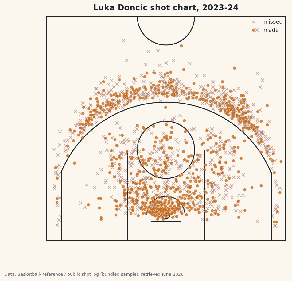
A diverging bar shows net rating but hides how a team got there. Build a scatter plot instead: offensive rating on the x-axis, defensive rating on the y-axis (inverted, so good defenses sit at the top), with one dot per team. Draw league-average lines through the middle to split it into four quadrants - good-both, good-offense-only, good-defense-only, and bad-both - and label the Celtics and the Hornets. Then pull last season's table too and chart which teams moved the most. Once you're comfortable with team-level data, try going inside a single team's offense with an NBA shot chart.
Get the code
Here's the complete, working script for this tutorial. It runs exactly as shown.
Download the finished script (10_build_an_nba_net_rating_dashboard_table.py)This script imports a small shared helper (and reads any bundled sample data) that live next to it in /downloads/ — grab these into the same folder so it runs as-is: sdt_common.py, sdt_nba.py, nba_ratings.csv.