Draw an NBA Shot Chart with matplotlib
What you'll build
A half-court drawn in matplotlib with a player's makes and misses plotted on it.
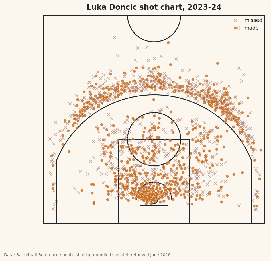
A shot chart is one of the most recognizable images in basketball analytics: a half-court dotted with makes and misses, telling you in one glance where a player lives on the floor. You'll build one from scratch - a regulation NBA half-court drawn in matplotlib line by line, then Luka Doncic's makes and misses plotted on top. Here's the part most walkthroughs gloss over: the whole thing only works if two coordinate systems agree, and getting them to agree is where I spend the most care.
This builds on your first NBA pull for the data side, and it's a cousin of the NHL shot-location plot - same idea, a very different rink. Here the challenge isn't the data, it's the geometry.
The usual NBA caveat applies: the live nba_api shot pull works from home but times out from data-center and VPN IPs, so this page was built from a bundled real sample drawn from a public NBA shot log. Luka's shots and counts are genuine; on your machine the same code pulls them live.
-
The court coordinate system
Before any drawing, decide on units. We'll work in feet, with the origin at the center of the baseline directly under the hoop. So x runs left-to-right across the court (negative on the left, positive on the right), and y runs from the baseline (
y = 0) up toward half-court. The rim sits at(0, 5.25)- dead center, 5.25 feet out from the baseline, which is where the center of an NBA hoop actually is.Real dimensions anchor everything else: the court is 50 feet wide (so x spans -25 to 25), the paint is 16 feet wide and 19 feet deep, the three-point arc is 23.75 feet from the rim at the top and 22 feet in the corners, and half-court is 47 feet from the baseline. Keep those numbers handy - every line we draw is one of them.
-
Draw the court furniture
matplotlib draws shapes with patches - circles, arcs, rectangles - that you add to an axis. We wrap the whole court in one function so we can reuse it. Each line below is one real court marking; read the comments as a tour of the floor.
python import matplotlib.patches as mp def draw_court(ax): """A regulation NBA half-court in feet: baseline at y=0, hoop at (0, 5.25).""" line = "#20242B" ax.add_patch(mp.Circle((0, 5.25), 0.75, fill=False, color=line, lw=1.5)) # rim ax.plot([-3, 3], [4, 4], color=line, lw=2) # backboard ax.add_patch(mp.Rectangle((-8, 0), 16, 19, fill=False, color=line, lw=1.5)) # paint ax.add_patch(mp.Circle((0, 19), 6, fill=False, color=line, lw=1.5)) # FT circle ax.add_patch(mp.Arc((0, 5.25), 8, 8, theta1=0, theta2=180, color=line, lw=1.5)) # restricted # three-point line: straight corners then the arc ax.plot([-22, -22], [0, 14.2], color=line, lw=1.5) ax.plot([22, 22], [0, 14.2], color=line, lw=1.5) ax.add_patch(mp.Arc((0, 5.25), 47.5, 47.5, theta1=22.1, theta2=157.9, color=line, lw=1.5)) ax.add_patch(mp.Arc((0, 47), 12, 12, theta1=180, theta2=360, color=line, lw=1.5)) # center ax.plot([-25, 25], [47, 47], color=line, lw=1.5) # half-court ax.add_patch(mp.Rectangle((-25, 0), 50, 47, fill=False, color=line, lw=1.5)) # boundaryA few of these reward a closer look. The rim is a small
Circleof radius 0.75 ft centered at(0, 5.25). The paint is aRectanglewhose bottom-left corner is at(-8, 0), 16 feet wide and 19 deep. The restricted-area arc and the three-point arc are bothArcpatches centered on the rim; anArctakes a full width and height (so47.5is the diameter, giving the 23.75-ft radius) plus a start and end angle. The corner threes are straight vertical lines that meet the arc at about y = 14.2 feet, which is why we stop them there. -
Pull the shots and convert the coordinates
Here's the subtle part. The
ShotChartDetailendpoint returns each shot's location, but in a different system than ours:nba_apimeasures in tenths of a foot, with the origin at the hoop. To plot those on our court we must do two conversions - divide by 10 to get feet, and shift the y-axis so the origin moves from the hoop down to the baseline by adding the hoop's 5.25-ft offset.python from nba_api.stats.endpoints import shotchartdetail PLAYER_ID, TEAM_ID = 1629029, 1610612742 # Luka Doncic, Dallas s = shotchartdetail.ShotChartDetail( team_id=TEAM_ID, player_id=PLAYER_ID, season_nullable="2023-24", season_type_all_star="Regular Season", context_measure_simple="FGA", headers=NBA_HEADERS, timeout=30) df = s.get_data_frames()[0] # nba_api: tenths of a foot, origin at the hoop -> feet, origin at the baseline. shots = pd.DataFrame({"x": df["LOC_X"] / 10, "y": df["LOC_Y"] / 10 + 5.25, "made": df["SHOT_MADE_FLAG"] == 1})Read the two transformed columns carefully.
LOC_X / 10turns tenths-of-a-foot into feet; left-right stays the same because both systems put x = 0 at the center.LOC_Y / 10 + 5.25does the same unit conversion and slides the origin: a shot taken at the rim hasLOC_Ynear 0 in the API, which becomes y = 5.25 on our court - exactly where the rim sits. Thecontext_measure_simple="FGA"argument asks for all field-goal attempts (makes and misses), andSHOT_MADE_FLAG == 1turns the make/miss code into a clean boolean. -
Use the live-or-bundled fallback
Same pattern as the other NBA tutorials. The bundled sample is already stored in our feet-from-the-baseline system, so its loader is a straight passthrough - no conversion needed - while the live path does the tenths-to-feet math above.
python def bundled_loader(): d = sdt_nba.bundled("nba_player_shots.csv") return pd.DataFrame({"x": d["LOC_X"], "y": d["LOC_Y"], "made": d["SHOT_MADE"].astype(bool)}) shots, source = sdt_nba.live_or_bundled( live_call, bundled_loader, f"{PLAYER}'s shots")That the bundled data is pre-converted is deliberate: it means the plotting code that follows is identical whether the shots came live or from the sample. Only the
sourcecredit on the chart differs. -
Count the makes and misses
Before plotting, it's worth printing a one-line summary so you know the data loaded sanely and to sanity-check the conversion. We sum the boolean
madecolumn (True counts as 1), divide by the total, and peek at the first few rows.python made = int(shots["made"].sum()) print(f"{PLAYER}: {made} makes on {len(shots)} attempts " f"({made / len(shots):.1%}).") sdt.show_df(shots, n=6)Luka's shot totalsLuka Doncic: 804 makes on 1652 attempts (48.7%). x y made 0 -1.6 7.85 True 1 16.9 24.05 False 2 8.6 30.35 True 3 -3.2 6.35 False 4 3.8 7.25 False 5 6.7 13.25 TrueLuka took 1,652 field-goal attempts and made 804 of them - a 48.7% clip across the season. Glance at the sample rows too: every
yis positive and most cluster between 6 and 30, exactly the range you'd expect for shots measured from the baseline. If youryvalues came out negative or centered on zero, you'd know the 5.25 shift went missing. -
Plot the shots on the court
Now we put it together: draw the court, split the shots into makes and misses, and scatter each group with its own marker. Misses get a faint
x, makes get a filledoin the basketball accent color. Setting an equal aspect ratio is essential - without it, the court would stretch and your nice circular arcs would turn into ellipses.python import matplotlib.pyplot as plt fig, ax = plt.subplots(figsize=(7.2, 6.8)) draw_court(ax) makes = shots[shots["made"]] misses = shots[~shots["made"]] ax.scatter(misses["x"], misses["y"], marker="x", s=26, linewidths=1, color="#B0837A", alpha=0.7, label="missed") ax.scatter(makes["x"], makes["y"], marker="o", s=26, color=sdt.sport_color("basketball"), alpha=0.8, edgecolor="#FBF7EE", linewidth=0.3, label="made") ax.set_xlim(-25.5, 25.5) ax.set_ylim(-1, 47.5) ax.set_aspect("equal") ax.axis("off") ax.legend(loc="upper right", fontsize=9, frameon=False) ax.set_title(f"{PLAYER} shot chart, 2023-24") sdt.save_fig(fig, "shot_chart", source=source)Data: stats.nba.com via nba_api, retrieved June 2026 The shape of Luka's season jumps out: a dense cluster at the rim, a thick band of three-point attempts beyond the arc, and a noticeable scatter of step-back jumpers just inside it - his signature shot. The
alphatransparency lets you read density where shots pile up, and turning the axes off withax.axis("off")leaves just the court and the dots. The footer credits the bundled sample here because the build server is blocked; at home it will credit your livestats.nba.compull.
Troubleshooting
The live call hangs, then raises ReadTimeout
Expected from a server, and not a bug in your code. stats.nba.com geoblocks data-center and VPN IP addresses, so the shot pull is dropped and eventually fails with requests.exceptions.ReadTimeout. Fixes, in order: (1) run from a home internet connection, not a server, Colab, or VPN; (2) send the full NBA_HEADERS; (3) raise the timeout to 30-60 seconds; (4) add exponential backoff; (5) keep to about one request per second. That's why this page's chart was built from the bundled real sample - the build server can't reach the live endpoint, but your machine can.
The shots land in the wrong place on the court
Almost always a coordinate mismatch. Remember the live endpoint returns tenths of a foot from the hoop: you must divide LOC_X and LOC_Y by 10 and add 5.25 to y to move the origin to the baseline. If shots cluster near y = 0 or go negative, the 5.25 shift is missing; if the court looks tiny next to the dots, you forgot to divide by 10.
The arcs look like ellipses, not circles
You're missing ax.set_aspect("equal"). Without it, matplotlib scales the x and y axes independently to fill the figure, squashing the court. Setting the aspect to equal forces one foot on x to equal one foot on y, so circles stay circular.
Makes hide behind misses (or vice versa)
Whichever you scatter last sits on top. We plot misses first, then makes, so the makes read clearly. Tune alpha and marker size s to balance them, and give makes a thin light edgecolor so they pop against the court lines.
Challenge yourself
Dots tell you where shots happened; they don't tell you where a player is efficient. Replace the scatter with a hexbin (ax.hexbin) colored by field-goal percentage in each cell, so hot and cold zones light up. Then add the league-average mark at each distance and shade where Luka beats it - that's the difference between a volume map and a true efficiency chart. For a different shape of the same idea, see how a rink changes everything in the NHL shot-location plot.
Get the code
Here's the complete, working script for this tutorial. It runs exactly as shown.
Download the finished script (11_draw_an_nba_shot_chart_with_matplotlib.py)This script imports a small shared helper (and reads any bundled sample data) that live next to it in /downloads/ — grab these into the same folder so it runs as-is: sdt_common.py, sdt_nba.py, nba_player_shots.csv.