Foundations
Beginner
Setting Up Python for Sports Analytics: A Complete Beginner's Walkthrough
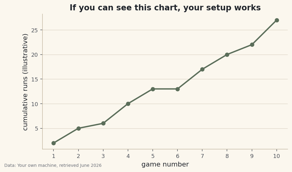
Install Python, a code editor, and the core data libraries the right way, then prove your setup works by running a tiny script that imports pandas and matplotlib.