Dual-Axis Charts: Plot Two Scales with twinx()
What you'll build
A combo chart with runs scored as bars on the left axis and win percentage as a line on the right.
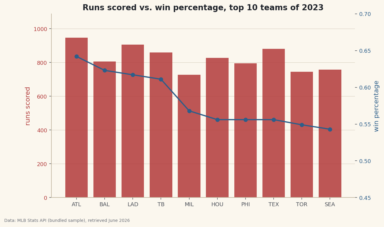
Some comparisons span two scales at once. Runs scored count in the hundreds; win percentage is a fraction hovering near 0.5. Plot them on the same y-axis and the win-percentage line flatlines along the bottom, invisible. A second y-axis via ax.twinx() fixes that — one chart, two scales, both readable. It's a genuinely useful tool, and also one of the easiest ways to mislead, so we'll cover both.
This builds on Your First Visualization. The data is the bundled sample_standings.csv (real 2023 MLB standings), so it runs offline.
-
Two columns, two scales
We'll compare each top team's runs scored (hundreds) against its win percentage (a fraction). Their ranges barely overlap — exactly the situation a dual axis is built for.
python import pandas as pd df = pd.read_csv("sample_standings.csv") top = df.sort_values("W", ascending=False).head(10).reset_index(drop=True) print(top[["Abbr", "RS", "WinPct"]].to_string())Runs scored vs win percentageAbbr RS WinPct 0 ATL 947 0.642 1 BAL 807 0.623 2 LAD 906 0.617 3 TB 860 0.611 4 MIL 728 0.568 5 HOU 827 0.556 6 PHI 796 0.556 7 TEX 881 0.556 8 TOR 746 0.549 9 SEA 758 0.543
Runs scored runs from ~700 to ~950; win percentage from ~0.54 to ~0.64. On a single axis, the second series would be a flat line glued to zero.
-
twinx() shares the x, splits the y
ax2 = ax1.twinx()creates a second axes that sharesax1's x-axis but has its own y-axis on the right. Draw one series on each, and color each axis label to match its data so readers know which scale belongs to which.python import matplotlib.pyplot as plt fig, ax1 = plt.subplots(figsize=(9, 5.5)) ax1.bar(top["Abbr"], top["RS"], color="#B23A3A", alpha=0.85) # left: runs ax1.set_ylabel("runs scored", color="#B23A3A") ax1.tick_params(axis="y", labelcolor="#B23A3A") ax2 = ax1.twinx() # share x, new right y ax2.plot(top["Abbr"], top["WinPct"], color="#2C5E8A", marker="o", lw=2) ax2.set_ylabel("win percentage", color="#2C5E8A") ax2.tick_params(axis="y", labelcolor="#2C5E8A") ax2.grid(False) # avoid clashing gridlines fig.savefig("dual_axis.png", dpi=144, bbox_inches="tight")Data: Bundled sample (2023 MLB standings), retrieved June 2026 One detail that saves headaches: turn the grid off on one axis. Two sets of gridlines at different scales never align and just add noise. Color-coding each axis to its series is the other must — without it, a dual axis is a puzzle.
-
The honesty caveat
A dual axis has real power to deceive: because you choose each axis's range, you can make two series cross, diverge, or track together almost at will. Slide one axis up and a "relationship" appears that's pure axis choice. Use a dual axis only when the two series genuinely share an x-axis and you're showing levels, not implying a correlation. If your real claim is "these two move together", a scatter plot of one against the other is the honest chart — it can't be faked with axis limits. When in doubt, two stacked single-axis charts beat one clever dual axis.
Troubleshooting
The second series disappeared
You probably drew it on ax1 instead of ax2, so it's crushed against the first scale. Every call for the second series must go through the twinx() handle (ax2).
The two grids clash into a mess
Turn one off with ax2.grid(False). Gridlines from two different scales can't line up, so keep only the left axis's grid as the reference.
My legend only shows one series
Each axes has its own legend. Either call ax1.legend() and ax2.legend() separately, or collect both handles: h1,l1 = ax1.get_legend_handles_labels(), same for ax2, then ax1.legend(h1+h2, l1+l2).
Challenge yourself
Make the dual axis "lie", then fix it. Set ax2.set_ylim() to a tight range so the win-percentage line dramatically tracks the run bars, screenshotting the false impression. Then replace the whole thing with a scatter of runs scored (x) against win percentage (y) — the honest view of whether they actually relate, immune to axis games.
Get the code
Here's the complete, working script for this tutorial. It runs exactly as shown.
Download the finished script (59_dual_axis_charts_with_twinx.py)This script imports a small shared helper (and reads any bundled sample data) that live next to it in /downloads/ — grab these into the same folder so it runs as-is: sdt_common.py.