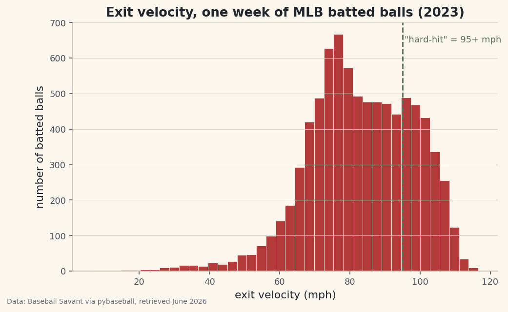
fill_between: Shade Above and Below a Baseline
What you'll build
A run-differential line shaded green above the league average and red below it.
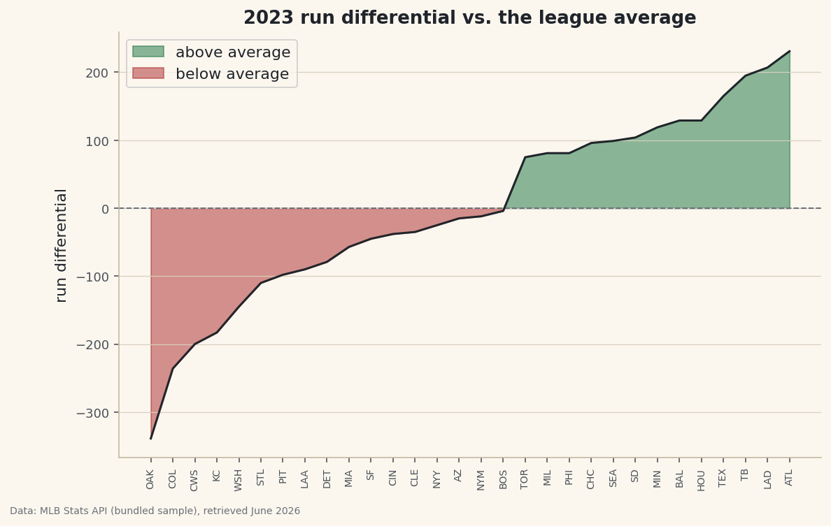
A line shows a trend; shading shows a verdict. That distinction is the whole point of fill_between(): it paints the area between two lines, and the where= argument masks that fill so "above the baseline" goes green and "below it" goes red in one chart. Color a row of numbers that way and the who-beat-average story reads at a glance. The same tool, pointed elsewhere, gives you confidence bands, projection ranges, and highlighted regions — but the green/red verdict is where I'd start.
This builds on Your First Visualization. The data is the bundled sample_standings.csv (real 2023 MLB standings), so it runs offline.
-
Set up a line and a baseline
Sort the teams by run differential so the line sweeps low to high, then compute the baseline we'll shade against — the league mean, which for run differential is essentially zero.
python import numpy as np import pandas as pd df = pd.read_csv("sample_standings.csv").sort_values("RunDiff").reset_index(drop=True) x = np.arange(len(df)) rd = df["RunDiff"].values mean = rd.mean() print("mean:", round(mean, 1), "| teams above:", int((rd >= mean).sum()))The baseline and how many clear itLeague mean run differential: 0.0 (≈0, as it must be) Teams above the mean: 13 of 30
With the data sorted, every team left of the crossover sits below average and every team right of it sits above — the shape
fill_betweenwill color in. -
Two fills, split by a where mask
Call
fill_betweentwice with the same line and baseline but opposite boolean masks.interpolate=Trueis the detail that matters: it closes each shaded wedge exactly where the line crosses the baseline, instead of leaving a ragged gap at the last data point.python import matplotlib.pyplot as plt fig, ax = plt.subplots(figsize=(9, 5.5)) ax.plot(x, rd, color="#20242B", lw=1.5) ax.axhline(mean, color="#6C7079", lw=1, ls="--") ax.fill_between(x, rd, mean, where=(rd >= mean), interpolate=True, color="#2E7D4F", alpha=0.55, label="above average") ax.fill_between(x, rd, mean, where=(rd < mean), interpolate=True, color="#B23A3A", alpha=0.55, label="below average") ax.set_xticks(x); ax.set_xticklabels(df["Abbr"], rotation=90) ax.legend() fig.savefig("fill_between.png", dpi=144, bbox_inches="tight")Data: Bundled sample (2023 MLB standings), retrieved June 2026 The eye reads the split instantly: a red basin of below-average teams on the left rising through the crossover into a green slope of above-average teams on the right. One chart, one glance, the whole league sorted into beat-average and didn't.
-
The same tool draws a band
fill_betweenisn't just for baselines. Give it a lower and an upper series instead of a line and a constant, and it shades the band between them — the standard way to draw a ±1 standard-deviation range, a min-max envelope, or a projection's uncertainty around a rolling average.python # Sketch: a shaded ±1σ band around a baseline sd = rd.std() ax.fill_between(x, mean - sd, mean + sd, color="#9A8F79", alpha=0.2) # the "typical" zoneThat one idea — the area between two curves — covers a huge share of the shaded charts you see in analytics: error bands on a forecast, the gap between expected and actual, or simply the region a value spends most of its time in.
Troubleshooting
The fill has ragged gaps at the crossover
Add interpolate=True. Without it, fill_between only switches the mask at actual data points, so the colored region stops short of where the line truly crosses the baseline. Interpolation fills right up to the crossing.
Both colors overlap into mud
Your two where masks aren't exclusive, or you forgot one. Use strict complements like rd >= mean and rd < mean so every point belongs to exactly one fill, and keep alpha below 1 so the line stays visible on top.
Nothing shades on a time-series x-axis
fill_between needs the x values as its first argument, the same array you plotted against. With dates, pass the datetime x to both plot and fill_between — a mismatch (one using an index, the other dates) draws nothing.
Challenge yourself
Swap the constant baseline for the ±1 standard-deviation band sketched above: shade the typical zone in light gray, then keep the green/red fills only for teams that finish outside it. The result highlights the genuinely exceptional teams — the ones beyond one sigma — instead of everyone above the line.
Get the code
Here's the complete, working script for this tutorial. It runs exactly as shown.
Download the finished script (58_fill_between_shaded_ranges.py)This script imports a small shared helper (and reads any bundled sample data) that live next to it in /downloads/ — grab these into the same folder so it runs as-is: sdt_common.py.