Your First Sports Data Visualization with matplotlib
What you'll build
A clean, labeled bar chart of team run totals - your first real figure.
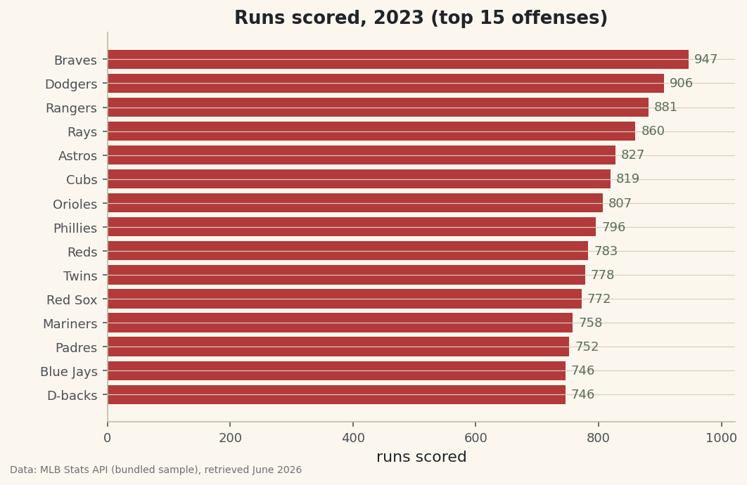
By the end of this page you'll have a clean, labeled bar chart of the highest-scoring offenses of 2023, saved as an image you'd actually be willing to put in front of someone. But the chart is almost beside the point. What I really want you to walk away with is matplotlib's figure and axes model - because once that clicks, every other chart on this site is a variation on the same three or four lines, and you stop copy-pasting plotting code you don't understand.
Most beginners (me, a few years ago) learn matplotlib by collecting magic incantations off Stack Overflow and never quite knowing why they work. We're going to do the opposite: learn the small mental model first, then the chart almost draws itself. We'll use the same bundled sample_standings.csv from the last tutorial - the 2023 MLB regular-season standings I pulled from the MLB Stats API in June 2026 - so you should already be comfortable loading a CSV and picking columns from the pandas tutorial.
-
Load and shape the data
We load the standings, then prepare exactly the slice we want to draw: the 15 top-scoring teams. There's a small trick in the sort. We sort descending to find the top 15, then sort that subset ascending again, because a horizontal bar chart draws its first row at the bottom — sorting ascending makes the longest bar land on top where the eye expects it.
python import pandas as pd df = pd.read_csv("sample_standings.csv") top = df.sort_values("RS", ascending=False).head(15).sort_values("RS") print(top[["Team", "RS", "RA", "RunDiff"]].tail(5).to_string())The five highest-scoring teamsTeam RS RA RunDiff 5 Astros 827 698 129 3 Rays 860 665 195 7 Rangers 881 716 165 2 Dodgers 906 699 207 0 Braves 947 716 231
Because
topis sorted ascending, its last five rows are the biggest offenses — which is why we print.tail(5)here. The Braves' 947 runs sit at the very bottom of this printout but will sit at the very top of the chart. Always look at the data you're about to plot; it's the cheapest way to catch a mistake before it becomes a misleading picture. -
Understand the figure/axes model
This is the one concept worth slowing down for.
plt.subplots()returns two things:- a figure (
fig) — the whole canvas, including margins, title area, and the file you eventually save; - an axes (
ax) — the actual plotting rectangle with its x- and y-axis, where the bars, labels, and ticks live.
You draw onto the axes and you save the figure. Almost every method we call —
ax.barh,ax.set_title,ax.set_xlabel— is a message to the axes. Keeping that distinction straight is what stops chart code from feeling like guesswork.python import matplotlib.pyplot as plt fig, ax = plt.subplots(figsize=(8, 5))The
figsizeis in inches (width, height). At 8 by 5 we get a landscape rectangle with room for fifteen team labels stacked down the side without crowding. - a figure (
-
Draw the bars and label everything
Now we draw.
ax.barhmakes a horizontal bar chart — the right choice when your categories are text labels like team names, because horizontal labels are far easier to read than rotated vertical ones. We pass the team names for the y-axis and runs scored for the bar lengths.python bars = ax.barh(top["Team"], top["RS"], color="#B23A3A") ax.set_title("Runs scored, 2023 (top 15 offenses)") ax.set_xlabel("runs scored") ax.set_ylabel("") ax.bar_label(bars, fmt="%d", padding=4, fontsize=9) ax.margins(x=0.08)Three touches turn a rough plot into a finished one. A clear title and x-axis label tell the reader what they're looking at without a caption.
ax.bar_labelprints each bar's exact value at its end — thefmt="%d"formats them as whole numbers — so readers get both the visual comparison and the precise figure. Andax.margins(x=0.08)adds a little breathing room on the right so those value labels don't collide with the edge of the plot. We deliberately blank the y-axis label withset_ylabel("")because the team names already make it obvious. -
Save it at publication resolution
A chart you can't share isn't finished. We save the figure — remember, the whole canvas — to a PNG. Two arguments matter most:
dpi=144gives a crisp image that holds up on high-resolution screens, andbbox_inches="tight"trims excess whitespace so the saved file is snug around the chart.python fig.savefig("runs_per_team.png", dpi=144, bbox_inches="tight")Data: Bundled sample (2023 MLB standings), retrieved June 2026 There it is — the Braves' 947 runs lead at the top, exactly as the data preview promised, with every bar carrying its precise value. Notice we never called
plt.show(); saving straight to a file is how charts are produced on this site, and it's also how you'd generate images in a script or report without a window ever popping up. Open the PNG and admire your first real visualization.
Troubleshooting
The bars are in the wrong order (smallest on top)
Horizontal bar charts plot the first row at the bottom, so a descending sort puts your smallest bar on top — the opposite of what reads well. Sort the data you actually plot ascending, as we do with the second .sort_values("RS"), and the longest bar lands on top.
The value labels are cut off at the right edge
The text printed by bar_label extends past the longest bar and runs out of room. Add margin on the value axis with ax.margins(x=0.08), or save with bbox_inches="tight" so the figure expands to include the labels. Both are in the code above for exactly this reason.
The saved image looks blurry or pixelated
The default resolution is low for modern screens. Pass dpi=144 (or higher) to savefig. If text still looks soft, your image viewer may be upscaling a small file — check the PNG's actual pixel dimensions before blaming matplotlib.
Challenge yourself
Make a second version that charts run differential (RunDiff) instead of runs scored. This one is more interesting to style, because differentials go negative — try coloring bars below zero differently from bars above it (build a list of colors with a comprehension and pass it to color=), and add a vertical line at zero with ax.axvline(0). You'll end up with a chart that instantly separates the contenders from the cellar-dwellers.
Get the code
Here's the complete, working script for this tutorial. It runs exactly as shown.
Download the finished script (03_your_first_sports_data_visualization_matplotlib.py)This script imports a small shared helper (and reads any bundled sample data) that live next to it in /downloads/ — grab these into the same folder so it runs as-is: sdt_common.py, sample_standings.csv.