Pie and Donut Charts: Showing Part-to-Whole (and When Not To)
What you'll build
A pie and a donut of each division's share of league-wide runs, plus when a bar beats both.
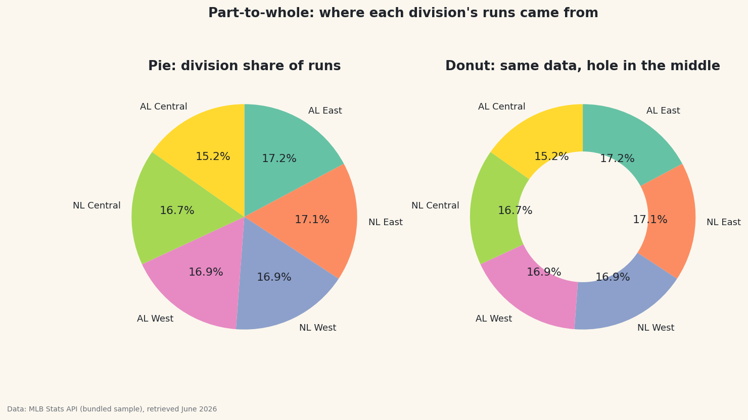
I'll defend the pie chart, but only just. They earn their bad reputation most of the time — yet they do one job genuinely well: showing what share of a whole each part takes. Give a pie (or its hollow cousin, the donut) a few categories that sum to a meaningful total and it reads instantly. I'll build both for each division's share of league-wide runs, then show you the case where a plain bar is the honest choice instead.
This builds on Your First Visualization. The data is the bundled sample_standings.csv (real 2023 MLB standings), so it runs offline.
-
A real part-to-whole
Pies only make sense when the slices genuinely sum to a whole. "Each division's share of all runs scored" qualifies: every run belongs to exactly one division, and the six shares add to 100%.
python import pandas as pd df = pd.read_csv("sample_standings.csv") runs_by_div = df.groupby("Division")["RS"].sum().sort_values(ascending=False) shares = (runs_by_div / runs_by_div.sum() * 100).round(1) print(shares.to_string())Each division's share of league-wide runsShare of league-wide runs scored, by division: Division AL East 17.2 NL East 17.1 NL West 16.9 AL West 16.9 NL Central 16.7 AL Central 15.2
Already a warning sign: the shares are all bunched between ~15% and ~17%. Hold that thought — it's exactly the pattern pies handle badly, and we'll come back to it.
-
Pie and donut, side by side
ax.pie()takes the values and draws the slices;autopctprints each percentage. A donut is just a pie with a hole, set bywedgeprops=dict(width=...)— the hole is handy for a title or total in the center, and many find it easier to read.python import matplotlib.pyplot as plt colors = plt.cm.Set2(range(len(runs_by_div))) fig, (ax1, ax2) = plt.subplots(1, 2, figsize=(11, 5.5)) ax1.pie(runs_by_div, labels=runs_by_div.index, colors=colors, autopct="%1.1f%%", startangle=90, counterclock=False) ax2.pie(runs_by_div, labels=runs_by_div.index, colors=colors, autopct="%1.1f%%", startangle=90, counterclock=False, wedgeprops=dict(width=0.42)) # the hole makes it a donut fig.savefig("pie_donut.png", dpi=144, bbox_inches="tight")Data: Bundled sample (2023 MLB standings), retrieved June 2026 startangle=90, counterclock=Falsestarts the first slice at the top and goes clockwise — the order people instinctively read. Without it, pies start at 3 o'clock and run counterclockwise, which feels subtly wrong. -
When a bar wins
Look at the chart: six slices all near one-sixth. Can you tell, by eye, whether the AL East or NL East slice is bigger? Almost nobody can — the human eye judges lengths far better than angles or areas. That's the pie's fatal flaw: when values are close, or when there are many of them, the slices are indistinguishable and the reader leans entirely on the printed numbers (at which point you've drawn a table, not a chart). A pie earns its place only with few categories and clearly different sizes (think 60/30/10). For ranking near-equal values like these, a sorted bar chart shows the differences honestly. Choose the pie for "it's roughly two-thirds versus one-third," and a bar for everything else.
Troubleshooting
My pie is an oval, not a circle
The axes aren't square. Call ax.set_aspect("equal") (or ax.axis("equal")) so the pie renders as a true circle regardless of figure shape.
The slices start in a weird place
Add startangle=90, counterclock=False to begin at the top and read clockwise. Matplotlib's default (start at 3 o'clock, go counterclockwise) confuses most readers.
The percent labels overlap on small slices
Too many tiny slices is the pie telling you it's the wrong chart. Group small categories into an "Other" slice, or switch to a bar. You can also push labels out with pctdistance/labeldistance, but fixing the chart choice is better.
Challenge yourself
Make the honest version: plot the same six division shares as a horizontal bar chart sorted high to low. Now the ranking the pie hid is obvious. Then build a pie where a pie actually works — collapse the data to just American League vs National League total runs (two clearly comparable slices) and see how the chart type finally fits the question.
Get the code
Here's the complete, working script for this tutorial. It runs exactly as shown.
Download the finished script (61_pie_and_donut_part_to_whole.py)This script imports a small shared helper (and reads any bundled sample data) that live next to it in /downloads/ — grab these into the same folder so it runs as-is: sdt_common.py.