Grouped Bar Charts: Compare Two Metrics Side by Side
What you'll build
A side-by-side bar chart of offensive and defensive rating for the top NBA teams.
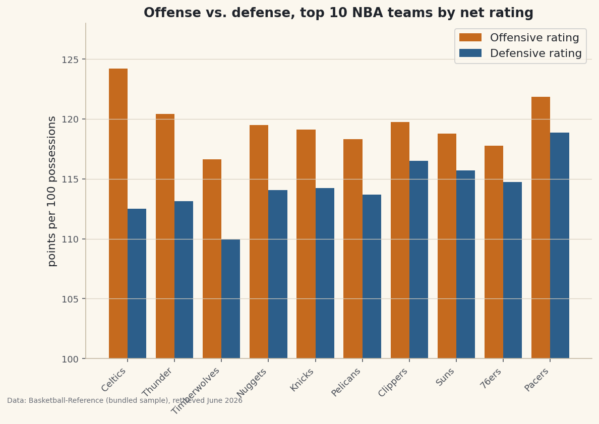
The entire trick is half a bar's width. Nudge two bar series apart by that much and you've got a grouped bar — which answers a different question than the stacked bar does. Stacked asks "what is this total made of?"; grouped asks "within each team, which is bigger — A or B?" When you want to set a team's offense beside its defense rather than pile one on the other, that half-width offset is the move. The example below is a grouped offense-vs-defense chart for the NBA's best teams.
This builds on Your First Visualization. The data is the bundled nba_ratings.csv (real 2023-24 NBA team ratings), so it runs offline.
-
The data: two ratings per team
Each team has an offensive rating (points scored per 100 possessions) and a defensive rating (points allowed per 100). We take the ten best teams by net rating and shorten the names to nicknames for tidy axis labels.
python import pandas as pd df = pd.read_csv("nba_ratings.csv") df["Short"] = df["Team"].str.split().str[-1] # "Boston Celtics" -> "Celtics" top = df.sort_values("NRtg", ascending=False).head(10).reset_index(drop=True) print(top[["Short", "ORtg", "DRtg", "NRtg"]].to_string())Offense and defense for the top 10Short ORtg DRtg NRtg 0 Celtics 124.23 112.51 11.71 1 Thunder 120.43 113.12 7.31 2 Timberwolves 116.63 109.98 6.65 3 Nuggets 119.49 114.05 5.44 4 Knicks 119.11 114.22 4.89 5 Pelicans 118.31 113.70 4.61 6 Clippers 119.75 116.51 3.24 7 Suns 118.78 115.69 3.09 8 76ers 117.79 114.76 3.02 9 Pacers 121.85 118.85 2.99
Notice the ratings cluster between roughly 108 and 125 — a narrow band where the differences that matter are only a few points. That will shape how we set up the axis.
-
The half-width offset
Make one set of evenly spaced x positions with
np.arange, then draw the first series shifted left by half a bar and the second shifted right by half a bar. They share each team's slot without overlapping.python import numpy as np import matplotlib.pyplot as plt x = np.arange(len(top)) # 0, 1, 2, ... one slot per team width = 0.4 fig, ax = plt.subplots(figsize=(9, 6)) ax.bar(x - width/2, top["ORtg"], width, label="Offensive rating", color="#C56A1E") ax.bar(x + width/2, top["DRtg"], width, label="Defensive rating", color="#2C5E8A") ax.set_xticks(x) ax.set_xticklabels(top["Short"], rotation=45, ha="right") ax.set_ylim(100, 128) # zoom to the band the ratings actually occupy ax.legend() fig.savefig("grouped_bars.png", dpi=144, bbox_inches="tight")Data: Bundled sample (NBA team ratings), retrieved June 2026 Setting the x-ticks to the bare
xpositions (not the offset ones) centers each label under its pair. With more than two series, the pattern generalizes: for n series, offset bar i by(i − (n−1)/2) × width. -
The zoomed axis: useful, but flag it
We set
ylim(100, 128)so a three-point rating gap is visible instead of being a rounding error against a bar that starts at zero. That's a legitimate choice for comparing values in a narrow band — but it's also the classic way a chart can exaggerate small differences. The honest move is to make the truncation obvious: keep the axis labeled clearly, and when a difference looks dramatic, remember the bars don't start at zero. For an audience that might over-read the gaps, plot net rating directly instead, which is naturally centered.
Troubleshooting
My bars overlap or sit on top of each other
Either you didn't offset the positions, or the offset is too big for the width. Keep width under 0.5 and shift by exactly width/2 in each direction. If you pass the same x to both bar calls, they draw in the same place.
The x-tick labels are off-center under the pairs
Set the ticks to the original x array, not x - width/2. The label belongs under the center of the slot, which is x itself, halfway between the two offset bars.
Three or more series get cramped
Shrink width (try 0.8 / n for n series) and widen the figure. Past three or four series a grouped bar gets busy — consider small multiples (one mini-chart per group) instead.
Challenge yourself
Add a third bar per team for net rating, using the n-series offset formula above — then notice net rating is just offense minus defense, so it's redundant with the other two. Swap it out: instead, sort the teams by ORtg and add a thin horizontal line at the league-average offensive rating so each bar reads as above or below par.
Get the code
Here's the complete, working script for this tutorial. It runs exactly as shown.
Download the finished script (54_grouped_bar_chart_comparisons.py)This script imports a small shared helper (and reads any bundled sample data) that live next to it in /downloads/ — grab these into the same folder so it runs as-is: sdt_common.py, sdt_nba.py.