Stacked Bar Charts: Win-Loss Composition
What you'll build
Wins and losses stacked into a single bar per team to show composition.
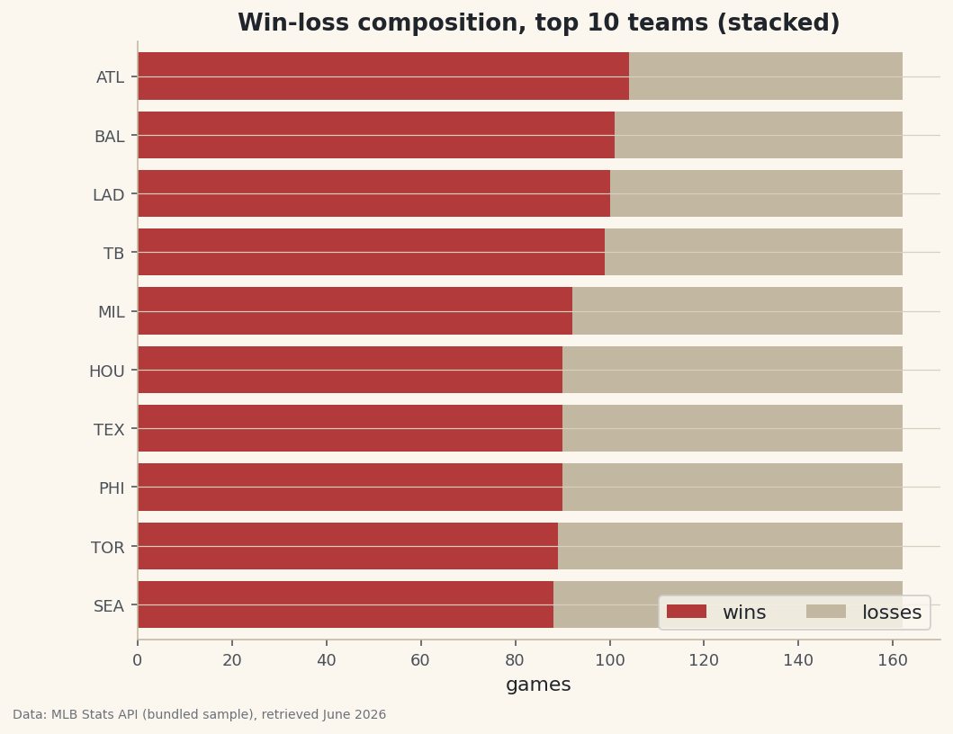
Here's the catch nobody mentions: a stacked bar chart is great until it quietly lies to you, and most tutorials never show you the difference. A plain bar compares totals; a stacked bar shows what those totals are made of — stack a team's wins and losses into one bar and the bar's length is games played, while the split inside shows the record. We'll build a win-loss stacked bar for the best teams of 2023, then pin down the one situation where stacking genuinely helps and the one where it misleads.
This builds on Your First Visualization. The data is the bundled sample_standings.csv (real 2023 MLB standings), so it runs offline.
-
The data: two parts of one whole
Each team's season splits cleanly into wins and losses that sum to games played — the natural shape for a stacked bar.
python import pandas as pd df = pd.read_csv("sample_standings.csv") print(df.sort_values("W", ascending=False)[["Team", "W", "L", "G"]].head(6).to_string())Wins, losses, and gamesTeam W L G 0 Braves 104 58 162 1 Orioles 101 61 162 2 Dodgers 100 62 162 3 Rays 99 63 162 4 Brewers 92 70 162 5 Astros 90 72 162
Every team played 162 games, so the Braves' 104–58 and the Dodgers' 100–62 will produce bars of identical length — what differs is where the wins-to-losses line falls inside each.
-
Stack with the left argument
Stacking is just drawing the second series starting where the first ends. For a horizontal chart, that means giving the losses a
left=equal to the wins, so they begin at the end of the win segment.python import matplotlib.pyplot as plt top = df.sort_values("W", ascending=False).head(10).sort_values("W") fig, ax = plt.subplots(figsize=(8, 6)) ax.barh(top["Abbr"], top["W"], label="wins") ax.barh(top["Abbr"], top["L"], left=top["W"], label="losses") # stack starts at W ax.set_xlabel("games"); ax.legend(loc="lower right") fig.savefig("win_loss_stacked.png", dpi=144, bbox_inches="tight")Data: Bundled sample (2023 MLB standings), retrieved June 2026 For a vertical bar chart the same idea uses
bottom=instead ofleft=. Either way, the rule is: each layer starts where the stack so far ends. Here every bar reaches 162, and the eye reads each team's record off where the color changes. -
When stacking helps — and when it lies
Stacking shines when the parts genuinely sum to a meaningful whole and you care about composition: win-loss out of games, or scoring broken into singles/doubles/etc. It works because the first segment shares a common baseline (zero), so those segments are easy to compare. The trap is the upper segments: because losses all start at different points, comparing loss totals by eye is hard — your eye has to subtract. If the losses were the comparison you cared about, a grouped bar (or just plotting losses alone) would be honest where a stack is not. Choose the chart for the comparison you want the reader to make.
Troubleshooting
The two series overlap instead of stacking
You forgot the offset. The second barh needs left=top["W"] (or bottom= for vertical bars) so it starts at the end of the first. Without it, both draw from zero and the shorter one just hides in front.
My stack is in the wrong order or misaligned
Both layers must use the same categories in the same order. Sort once into top and pass top["Abbr"] to both calls — don't re-sort between them, or the wins and losses will belong to different teams.
Three-plus segments — how do I keep stacking?
Keep a running total. For each new segment, set left (or bottom) to the sum of all previous segments — e.g., left = seg1 + seg2 for the third. A small running-sum variable updated in a loop handles any number of layers.
Challenge yourself
Make a 100% stacked version: divide each segment by games played so every bar runs 0–1 and shows win percentage rather than counts — better when teams have played different numbers of games. Then add a vertical line at 0.5 to mark a winning record at a glance.
Get the code
Here's the complete, working script for this tutorial. It runs exactly as shown.
Download the finished script (52_stacked_bar_win_loss.py)This script imports a small shared helper (and reads any bundled sample data) that live next to it in /downloads/ — grab these into the same folder so it runs as-is: sdt_common.py.