Small Multiples: Compare Every Team at Once with Subplots
What you'll build
A grid of mini-charts, one per division, sharing the same scale.
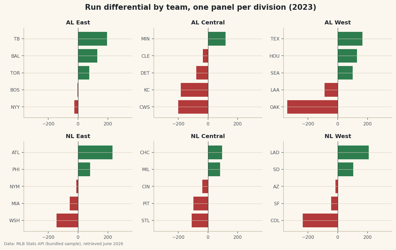
The instinct when you have many groups to compare is to cram them onto one busy chart — thirty bars in a column, six colors fighting for attention. Resist it. Small multiples do the opposite: you draw the same little chart once per group and lay the copies out in a grid. Every panel looks identical and shares the same scale, so the reader's eye compares them effortlessly. Our version is a 2-by-3 grid of run-differential charts, one panel per MLB division, with the whole 2023 league sitting on one honest screen.
This follows on from your first sports data visualization with matplotlib, so you'll be comfortable with axes and bars already. We use the bundled CSV of the real 2023 MLB final standings (MLB Stats API, retrieved June 2026). The new idea is plt.subplots(2, 3) and the discipline of a shared scale across panels.
-
Load the standings and confirm the groups
We read the bundled CSV and list the six divisions in the order we want them arranged - American League across the top row, National League across the bottom. Before plotting, a quick sanity check that every division has the teams we expect.
python import os import matplotlib.pyplot as plt import pandas as pd import sdt_common as sdt HERE = os.path.dirname(os.path.abspath(__file__)) df = pd.read_csv(os.path.join(HERE, "sample_standings.csv")) divisions = ["AL East", "AL Central", "AL West", "NL East", "NL Central", "NL West"] print("Teams per division:") print(df["Division"].value_counts().sort_index().to_string())How many teams in each divisionTeams per division: Division AL Central 5 AL East 5 AL West 5 NL Central 5 NL East 5 NL West 5
Perfect - five teams in every division, thirty in all. That uniformity matters for small multiples: when each panel holds the same number of items, the grid reads cleanly and no panel feels lopsided.
value_counts()tallies the rows per division andsort_index()puts those labels in alphabetical order so the check is easy to scan. The explicitdivisionslist is what lets us control the layout order rather than leaving it to chance. -
Create the grid of axes
This one line is the whole technique.
plt.subplots(2, 3)returns the figure plus a 2-by-3 array of axes - six little canvases arranged in two rows and three columns, ready to be filled one at a time.python fig, axes = plt.subplots(2, 3, figsize=(9.6, 6)) vmax = df["RunDiff"].abs().max() + 25axescomes back as a 2-D array, which we'll soon flatten so we can pair each panel with a division. The second line computes a single shared limit: the largest run differential in the whole league (in absolute value), plus a little padding. We'll apply this samevmaxto every panel, and that shared scale is the entire point - without it, small multiples lie. -
Draw one panel per division
Now we loop.
axes.flatturns the 2-D grid into a simple sequence, andzipmarries each panel to a division in order. Inside the loop we filter to that division's teams, sort them, color the bars by sign, and draw a horizontal bar chart - the same recipe in all six panels.python for ax, div in zip(axes.flat, divisions): sub = df[df["Division"] == div].sort_values("RunDiff") colors = [sdt.sport_color("soccer") if v >= 0 else sdt.SPORT_COLORS["baseball"] for v in sub["RunDiff"]] ax.barh(sub["Abbr"], sub["RunDiff"], color=colors) ax.axvline(0, color="#20242B", linewidth=0.6) ax.set_title(div, fontsize=10, fontweight="bold") ax.set_xlim(-vmax, vmax) ax.tick_params(labelsize=8)The crucial line is
ax.set_xlim(-vmax, vmax), applied identically inside every iteration. Because the samevmaxwe computed earlier pins every panel to the same horizontal range, a bar of a given length means the same number of runs no matter which division you're looking at. We use the shortAbbrcolumn for team labels because full names would never fit in a panel that small, and we color bars green for positive and baseball-red for negative so good and bad seasons are obvious at a glance. The zero line in each panel gives the bars a shared anchor. -
Add a shared title and tidy the spacing
A grid of panels needs one overall heading that explains the whole figure, plus a layout pass so nothing overlaps.
fig.suptitleplaces a super-title above all six axes, andfig.tight_layoutautomatically nudges everything apart so titles and labels don't collide.python fig.suptitle("Run differential by team, one panel per division (2023)", fontsize=13, fontweight="bold") fig.tight_layout()Data: Bundled sample (2023 MLB standings), retrieved June 2026 Step back and take in the whole grid. Even though each panel is tiny, you can read the entire league in one glance: the AL East panel is almost all green, a division of strong teams, while the AL Central is dominated by long red bars stretching left. Because every panel shares the same x-range, you can compare a team in the NL West directly against one in the AL East just by bar length - no mental rescaling required. That is the quiet power of small multiples: a lot of data, arranged so the comparison does itself.
tight_layoutis what keeps it from looking cramped, automatically reserving room for each panel's title and tick labels.
Troubleshooting
AttributeError: 'numpy.ndarray' object has no attribute 'barh'
You're calling a plotting method on the whole axes array instead of one panel. With subplots(2, 3), axes is a 2-D grid - you have to index into it (axes[0, 1]) or iterate axes.flat to get an individual ax. The for ax, div in zip(axes.flat, divisions) loop hands you one panel at a time.
The panels have different scales, so the comparison feels misleading
That's what happens when each panel auto-scales to its own data - it's the cardinal sin of small multiples. Fix it by computing one shared limit (our vmax) and calling ax.set_xlim(-vmax, vmax) on every panel. Identical scales are non-negotiable; they're the reason the technique works at all.
Panel titles and labels overlap or collide
Crowding is normal before you lay the grid out. Call fig.tight_layout() after drawing everything to space the panels automatically. If a super-title still overlaps the top row, give it a little headroom by passing rect to tight_layout, e.g. fig.tight_layout(rect=[0, 0, 1, 0.96]).
Challenge yourself
Swap the metric: redraw the grid using wins (W) instead of run differential, and notice how you'll want a different shared x-range that starts near the lowest win total rather than centering on zero. Then try plt.subplots(2, 3, sharex=True) and see how passing sharex directly can replace your manual set_xlim calls - a cleaner way to guarantee a common scale. For a bigger project, build small multiples of the rolling-form line from rolling averages and form, one panel per team in a single division, so you can compare five teams' whole seasons side by side.
Get the code
Here's the complete, working script for this tutorial. It runs exactly as shown.
Download the finished script (39_small_multiples_one_chart_per_team.py)This script imports a small shared helper (and reads any bundled sample data) that live next to it in /downloads/ — grab these into the same folder so it runs as-is: sdt_common.py.