A Correlation Heatmap: Which Team Stats Move Together
What you'll build
A correlation matrix of team ratings, drawn as an annotated heatmap.
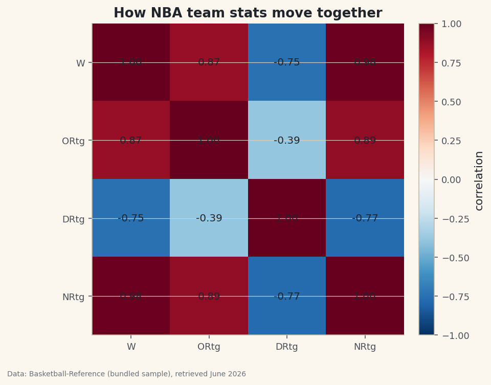
Hand me a table with six numeric columns and my first question is always the same: which of these move together? A correlation matrix answers it for every pair at once, and a heatmap turns that grid of numbers into something you can read in a glance — warm where stats rise together, cool where one rises as the other falls. Run it on NBA team ratings and the picture makes it obvious which number actually tracks winning.
This builds on Summary Statistics and Distributions. The data is the bundled nba_ratings.csv (per-100-possession team ratings, Basketball-Reference), so it runs offline.
-
One line builds the matrix
.corr()computes the Pearson correlation between every pair of numeric columns — a value from −1 (perfect opposite) through 0 (no linear relationship) to +1 (perfect agreement).python import pandas as pd df = pd.read_csv("nba_ratings.csv") cols = ["W", "ORtg", "DRtg", "NRtg"] corr = df[cols].corr().round(2) print(corr.to_string())The correlation matrixW ORtg DRtg NRtg W 1.00 0.87 -0.75 0.98 ORtg 0.87 1.00 -0.39 0.89 DRtg -0.75 -0.39 1.00 -0.77 NRtg 0.98 0.89 -0.77 1.00
Read down the
W(wins) column. Net rating correlates with wins at 0.98 — almost perfectly, as you'd hope from a stat built to summarize team quality. Offensive rating sits at 0.87. Defensive rating is −0.75: negative because a lower defensive rating is better, so allowing fewer points per 100 goes with winning more. The diagonal is all 1.00 — every column correlates perfectly with itself. -
Turn the grid into a heatmap
imshowdraws the matrix as colored cells. A diverging colormap centered at zero is the right choice, so positive and negative correlations read as opposite colors; we annotate each cell so the exact value is there too.python import matplotlib.pyplot as plt fig, ax = plt.subplots(figsize=(6.5, 5.5)) im = ax.imshow(corr.values, cmap="RdBu_r", vmin=-1, vmax=1) ax.set_xticks(range(len(cols))); ax.set_xticklabels(cols) ax.set_yticks(range(len(cols))); ax.set_yticklabels(cols) for i in range(len(cols)): for j in range(len(cols)): ax.text(j, i, f"{corr.values[i, j]:.2f}", ha="center", va="center") fig.colorbar(im, ax=ax) fig.savefig("corr_heatmap.png", dpi=144, bbox_inches="tight")Data: Bundled sample (NBA team ratings), retrieved June 2026 Setting
vmin=-1, vmax=1pins the color scale so zero is always the neutral midpoint — without it, matplotlib would stretch the colors to the data's range and exaggerate weak correlations. The deep-red wins/net-rating cell and the blue defensive-rating row tell the whole story at a glance. -
Read it honestly
Two cautions. First, correlation measures only a linear relationship, and it is not causation — net rating correlates with wins because it's essentially a restatement of them, not because it causes them. Second, a near-zero correlation means no linear link, not "no relationship" (a U-shaped pattern can hide at zero). A heatmap is a fast way to find leads worth investigating, not a verdict. For quantifying a single relationship properly, fit a line — see correlation and regression.
Troubleshooting
.corr() throws an error or drops columns
It only works on numeric columns; a text column (like team name) is excluded or, in older pandas, raises. Select the numeric columns explicitly as we did, or call df.corr(numeric_only=True).
The colors exaggerate weak correlations
You didn't fix the scale. Pass vmin=-1, vmax=1 to imshow so the full correlation range maps to the full color range and zero stays neutral. A diverging colormap (like RdBu_r) makes the sign obvious.
The whole heatmap is deep red
Often expected when your columns are near-duplicates (net rating is built from offensive and defensive rating, so they're bound to correlate). Add more distinct stats, or mask the diagonal/upper triangle to focus on the pairs you care about.
Challenge yourself
Add a couple more columns to the matrix (compute pace or a rate stat first), and try masking the upper triangle so each pair shows once: build a boolean mask with numpy.triu and set those cells to nan before plotting. It's the difference between a busy grid and a clean, publishable one.
Get the code
Here's the complete, working script for this tutorial. It runs exactly as shown.
Download the finished script (51_correlation_heatmap.py)This script imports a small shared helper (and reads any bundled sample data) that live next to it in /downloads/ — grab these into the same folder so it runs as-is: sdt_common.py, sdt_nba.py.