Correlation and Regression: What Actually Predicts Winning?
What you'll build
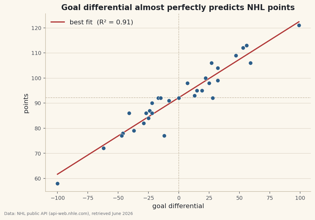
A scatter of goal differential vs points with a fitted trend line and R-squared.
"Goal differential predicts winning." Every analyst says it, but how strongly? Twice as strongly as shot attempts? Ninety percent of the story, or fifty? Eyeballing a scatter plot and saying "looks related" isn't an answer - it's a vibe. So let's replace the vibe with three real numbers: a correlation that measures how tightly two things move together, a best-fit line that turns the relationship into a formula, and an R-squared that says how much of the variation you've actually explained. I run it on NHL standings here, but the technique is sport-agnostic - it works for any two columns you suspect are linked.
This builds on pulling your first NHL data from the public API, where you learned to fetch the standings and flatten the JSON; here we take that same data and ask a quantitative question of it. The data comes from the NHL public API (api-web.nhle.com), retrieved June 2026.
-
Pull the standings into a tidy table
We open a polite session - the same well-mannered HTTP helper from the NHL tutorial - hit the standings endpoint, and build one clean record per team with just the columns we need: the team's abbreviation, its goal differential (goals for minus goals against), and its points.
python import numpy as np import pandas as pd session = sdt.polite_session(referer="https://www.nhl.com/") teams = session.get("https://api-web.nhle.com/v1/standings/now", timeout=30).json()["standings"] df = pd.DataFrame([{ "team": t["teamAbbrev"]["default"], "goal_diff": t["goalFor"] - t["goalAgainst"], "points": t["points"], } for t in teams])This is a list comprehension building one dictionary per team. The text field
teamAbbrevarrives as a little language object, so we reach into["default"]for the plain string;goalForandgoalAgainstare plain numbers we subtract on the spot to get the differential. The result is a two-variable table - exactly what correlation and regression want: an x (goal_diff) and a y (points). -
Measure the correlation
Correlation, written r, is a single number between -1 and +1 that says how tightly two columns move together. +1 is a perfect upward line, 0 is no linear relationship, -1 is a perfect downward line. NumPy computes it in one call - though it hands back a small matrix, so we pluck out the one off-diagonal cell.
python r = float(np.corrcoef(df["goal_diff"], df["points"])[0, 1])Why the
[0, 1]?np.corrcoefreturns a 2×2 matrix: the diagonal is each variable's correlation with itself (always 1.0), and the off-diagonal cells[0, 1]and[1, 0]hold the number we want - goal differential against points. We grab one of them and wrap it infloatfor a clean scalar. -
Fit the best-fit line
Correlation tells you how tight; regression tells you the actual relationship - the straight line that best threads through the cloud of points.
np.polyfit(x, y, 1)fits a degree-1 polynomial (a line) and returns its slope and intercept. Squaring the correlation gives R-squared, which we'll interpret in a moment.python slope, intercept = np.polyfit(df["goal_diff"], df["points"], 1) r2 = r ** 2The
1is the key argument: it asks for a first-degree fit, a line of the formpoints = slope × goal_diff + intercept. The slope is the heart of it - it answers "for each extra unit of goal differential, how many more points?" The intercept is where the line crosses x = 0: the points you'd expect from a team that scored exactly as many goals as it allowed. -
Read the three numbers
Let's print everything in plain language, including a "rule of thumb" that inverts the slope into something a fan can repeat at a bar: how many goals of differential buy one extra standings point.
python print(f"Correlation (r) : {r:.3f}") print(f"R-squared : {r2:.3f} ({r2:.0%} of the variation in points explained)") print(f"Best-fit line : points = {slope:.3f} x goal_diff + {intercept:.1f}") print(f"Rule of thumb : about {1 / slope:.1f} goals of differential per extra point")Correlation and regression resultsCorrelation (r) : 0.954 R-squared : 0.910 (91% of the variation in points explained) Best-fit line : points = 0.305 x goal_diff + 92.2 Rule of thumb : about 3.3 goals of differential per extra point
Now read what the data said. The correlation is 0.954 - extraordinarily tight, almost a straight line. The R-squared of 0.910 means goal differential alone explains 91% of the variation in standings points; almost nothing else matters once you know how many more goals a team scores than it allows. The fitted line is
points = 0.305 × goal_diff + 92.2, and inverting that slope gives the memorable rule: roughly 3.3 goals of differential per extra point in the standings. That's the kind of statement you simply cannot make from staring at a chart - it took the math to earn it. -
Understand R-squared (the intuition)
R-squared deserves a sentence of intuition because it's the number people misuse most. It's the fraction of the up-and-down spread in your y-variable that the line accounts for, on a 0-to-1 scale. An R-squared of 0 means the line is useless - knowing x tells you nothing about y. An R-squared of 1 means every point sits exactly on the line - x tells you y perfectly. Our 0.91 sits near the top of that range: goal differential is very nearly the whole story of who finishes where.
One honest caveat to carry forward: a high R-squared shows a strong relationship, not causation. Goal differential and points are almost two views of the same thing here, so the tight fit makes mechanical sense. Apply this to two genuinely independent quantities and expect a weaker number - and resist calling correlation proof of cause.
-
Chart the scatter and the fit
The picture makes the relationship visible. We scatter every team as a dot, then draw the best-fit line straight through the cloud by evaluating
slope × x + interceptat the smallest and largest goal-differential values. Reference lines at the average points and at zero differential give the eye an anchor.python import matplotlib.pyplot as plt xs = np.array([df["goal_diff"].min(), df["goal_diff"].max()]) fig, ax = plt.subplots(figsize=(8, 5.4)) ax.scatter(df["goal_diff"], df["points"], color="#2C5E8A", s=45, zorder=3, edgecolor="#FBF7EE", linewidth=0.5) ax.plot(xs, slope * xs + intercept, color="#B23A3A", linewidth=2, label=f"best fit (R² = {r2:.2f})") ax.axhline(df["points"].mean(), color="#C2B7A1", linewidth=0.8, linestyle="--") ax.axvline(0, color="#C2B7A1", linewidth=0.8, linestyle="--") ax.set_xlabel("goal differential") ax.set_ylabel("points") ax.set_title("Goal differential almost perfectly predicts NHL points") ax.legend(frameon=False) fig.savefig("regression.png", dpi=144, bbox_inches="tight")Data: NHL public API (api-web.nhle.com), retrieved June 2026 Two tricks make the line correct and clean. Because a straight line is fully defined by two points, we only need to evaluate it at the minimum and maximum x -
xs- and matplotlib connects them. Andzorder=3lifts the dots above the reference lines so they stay readable. The visual confirms the numbers: the dots hug the red line so closely there's barely any scatter around it, which is exactly what a 0.91 R-squared looks like - tight, steep, and convincing.
Troubleshooting
np.corrcoef returns nan
One of your columns has no variation or contains missing values. Correlation is undefined if a variable never changes (every team with identical points) or if NaNs sneak in. Run df[["goal_diff", "points"]].describe() to check the spread, and drop or fill missing rows with df.dropna(subset=["goal_diff", "points"]) before computing.
The fitted line looks flat or points the wrong way
Check the argument order to np.polyfit(x, y, 1) - x comes first, y second. Swapping them fits the inverse relationship and gives a slope that won't match your scatter. Also confirm you passed 1 (a line); a higher degree fits a curve, which won't plot correctly as a two-point line.
The request hangs or times out
The polite session passes timeout=30 and retries the flaky status codes automatically with backoff, so a single hiccup shouldn't stop you. If it still fails you may be offline or rate-limited; wait a moment and rerun rather than hammering the endpoint. The data-pulling details are covered in the NHL data tutorial.
A high R-squared, but the conclusion feels too good
Be suspicious when two variables are near-restatements of each other - as goal differential and points partly are. The math is right, but the strong fit reflects that wins both come from outscoring opponents and define points. Try the same code on two truly separate quantities and you'll see a more modest, more informative R-squared.
Challenge yourself
Now turn the line into a predictor. Pick a team, plug its goal differential into slope * goal_diff + intercept, and compare your predicted points to its actual points - the gap (the "residual") flags teams that are over- or under-performing what their goals say they should. Then test a weaker relationship: swap goal_diff for goals-for alone and watch the R-squared fall, proving that defense is half the story. For another sport's version of the same statistical move, see how home advantage is quantified across leagues in quantifying home advantage across five leagues.
Get the code
Here's the complete, working script for this tutorial. It runs exactly as shown.
Download the finished script (38_correlation_and_regression_what_predicts_winning.py)This script imports a small shared helper (and reads any bundled sample data) that live next to it in /downloads/ — grab these into the same folder so it runs as-is: sdt_common.py.