Summary Statistics and Distributions with pandas
What you'll build
A run-differential histogram with the mean and median marked, plus the one-line summary that describes any column.
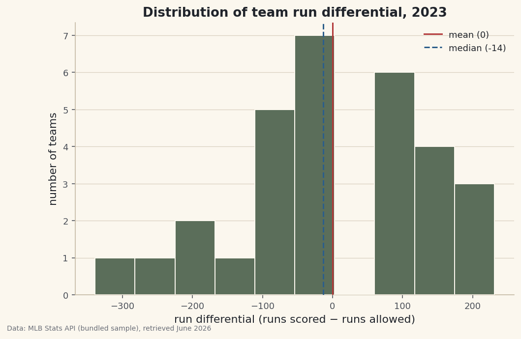
Before you chart anything, meet your data. The fastest introduction pandas offers is describe() — one line that hands back the count, average, spread, and range of every numeric column. But a handful of summary numbers can hide as much as they reveal, which is why the next move is a histogram to see the actual shape those numbers only hint at. Working from team run differentials in the bundled 2023 standings, you'll also pick up the single most useful habit in data analysis: checking the mean against the median.
This builds on Pandas for Sports Data. The data is the bundled sample_standings.csv (2023 MLB regular season, MLB Stats API, retrieved June 2026), so it runs offline.
-
Summarize every column in one line
describe()is the first thing to run on any new table. Point it at a few numeric columns and read down the output.python import pandas as pd df = pd.read_csv("sample_standings.csv") print(df[["W", "RS", "RA", "RunDiff"]].describe().round(1).to_string())describe() on wins, runs, and run differentialW RS RA RunDiff count 30.0 30.0 30.0 30.0 mean 81.0 747.7 747.7 0.0 std 13.1 82.9 82.1 139.9 min 50.0 585.0 647.0 -339.0 25% 75.2 680.0 697.2 -87.2 50% 82.0 742.5 721.0 -13.5 75% 89.8 792.8 813.2 102.8 max 104.0 947.0 957.0 231.0
Each row is a question answered.
countconfirms all 30 teams are present (no missing rows).meanandstdgive the center and spread — wins average 81 (half a 162-game season, as they must) with a standard deviation of about 13.min, the quartiles (25%/50%/75%), andmaxtrace the range: run differential runs from −339 all the way to +231. -
The habit that catches skew: mean vs. median
Look closely at run differential. The
meanis 0.0 — which has to be true, since every run scored by one team is a run allowed by another, so league-wide they cancel. But themedian(the50%row) is about −13.5. When the mean sits well above the median, the distribution is right-skewed: a few exceptional values are pulling the average up.python mean = df["RunDiff"].mean() # 0.0 -- runs are zero-sum across the league median = df["RunDiff"].median() # about -13.5 extremes = df.sort_values("RunDiff", ascending=False).iloc[[0, 1, -2, -1]] print(extremes[["Team", "W", "RS", "RA", "RunDiff"]].to_string())The extremes that pull the averagemean run differential = 0.0, median = -13.5 Team W RS RA RunDiff 0 Braves 104 947 716 231 2 Dodgers 100 906 699 207 27 Rockies 59 721 957 -236 29 Athletics 50 585 924 -339There they are. A small number of dominant teams — the Braves at +231, the Dodgers at +207 — drag the mean upward, while the bulk of the league sits just below zero. The cellar is even more extreme: the Athletics' −339 is a far longer tail than anything on the positive side. That asymmetry is exactly what "skew" means, and it's why the median is the more honest "typical" team here.
-
Draw the distribution
A histogram buckets the values and counts how many fall in each bucket, turning the column into a shape. We'll mark the mean and median so the skew we just spotted is visible, not just asserted.
python import matplotlib.pyplot as plt fig, ax = plt.subplots(figsize=(8, 5)) ax.hist(df["RunDiff"], bins=10, color="#5B6E5A", edgecolor="#FBF7EE") ax.axvline(mean, color="#B23A3A", label=f"mean ({mean:.0f})") ax.axvline(median, color="#2C5E8A", ls="--", label=f"median ({median:.0f})") ax.set_xlabel("run differential (runs scored - runs allowed)") ax.set_ylabel("number of teams") ax.legend() fig.savefig("rundiff_distribution.png", dpi=144, bbox_inches="tight")Data: Bundled sample (2023 MLB standings), retrieved June 2026 The picture confirms the numbers: a tall cluster near zero, a gentle right shoulder of strong teams, and a long left tail reaching out to the Athletics. The solid mean line and dashed median line sit just apart — a small visual gap that is the whole story of skew. The number of
binsis a judgment call: too few hides the shape, too many turns it into noise. Ten is a sensible start for thirty teams.
Troubleshooting
describe() skips a column I expected to see
By default it only summarizes numeric columns, so a number stored as text is silently dropped. Check with df.dtypes; if a column reads as object, convert it with pd.to_numeric(df["col"], errors="coerce"). Or run df.describe(include="all") to see text columns too.
The histogram looks spiky or blocky
That's the bins setting. Too many bins for a small dataset makes every bar one or two teams tall (spiky); too few flattens the shape. Try a few values — bins=8 to bins=15 for thirty teams — and pick the one that shows the shape without inventing detail.
My mean and median are identical — is that wrong?
Not necessarily. A symmetric distribution has a mean very close to its median; that's the signal of no skew. You only worry when they diverge. Here run differential is mildly right-skewed, so they part by about thirteen runs.
Challenge yourself
Run describe() on RS and RA separately and draw their two histograms on the same axes with alpha=0.5 so they overlap. Do runs scored and runs allowed have the same shape? Then try df.groupby("League")["RunDiff"].describe() to compare the AL and NL at a glance — the same one-line summary, now split into two stories.
Get the code
Here's the complete, working script for this tutorial. It runs exactly as shown.
Download the finished script (43_summary_statistics_and_distributions.py)This script imports a small shared helper (and reads any bundled sample data) that live next to it in /downloads/ — grab these into the same folder so it runs as-is: sdt_common.py.