Box Plots: Comparing Distributions Across Groups
What you'll build
A box plot comparing run-differential distributions between the AL and NL.
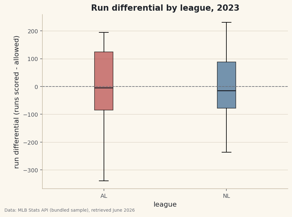
An average is a single number standing in for a whole group, and it hides everything interesting: the spread, the shape, the outliers. When you want to compare groups — American League versus National, one division versus another, this era versus that one — a box plot shows all of that at once. Can the AL and NL really be told apart by run differential, or do two averages just look different by chance? Plot the run differential of both leagues side by side and the five numbers a box plot draws will answer that better than any mean ever could.
This builds on Summary Statistics and Distributions, where we met describe() and the histogram. The data is the bundled sample_standings.csv (real 2023 MLB standings), so it runs offline.
-
Start with the averages — then distrust them
A quick
groupbygives the mean of each league. It's a fine first look, and also a trap.python import pandas as pd df = pd.read_csv("sample_standings.csv") print(df.groupby("League")[["W", "RS", "RA", "RunDiff"]].mean().round(1).to_string())League averagesMean by league: W RS RA RunDiff League AL 79.9 737.7 740.7 -2.9 NL 82.1 757.7 754.8 2.9The averages are nearly mirror images — the AL at about −3 run differential, the NL at about +3 — which makes sense, since one league's interleague runs are the other's to concede. But "the average AL team was roughly break-even" tells us nothing about whether the league was tightly bunched or split between juggernauts and cellar-dwellers. For that, we need the distribution.
-
What a box plot shows
A box plot draws five things for each group: the median (the line in the box), the quartiles (the box spans the middle 50% of teams, from the 25th to the 75th percentile), the whiskers (the reach of the bulk of the data), and any outliers (points beyond the whiskers, drawn individually). One glance gives you center, spread, and extremes — the things an average leaves out.
python import matplotlib.pyplot as plt leagues = ["AL", "NL"] data = [df.loc[df["League"] == lg, "RunDiff"] for lg in leagues]The key move is building a list of arrays — one run-differential series per league.
boxplotdraws one box per item in that list. -
Draw and read the box plot
python fig, ax = plt.subplots(figsize=(7, 5)) ax.boxplot(data, tick_labels=leagues, patch_artist=True) ax.axhline(0, color="#6C7079", ls="--") # break-even reference ax.set_ylabel("run differential") fig.savefig("league_boxplot.png", dpi=144, bbox_inches="tight")Data: Bundled sample (2023 MLB standings), retrieved June 2026 Now the comparison is honest. Both leagues center near the break-even line, with similar-sized boxes — the middle half of each league lived within a few dozen runs of even. The story the average buried is in the tails: the AL stretches much further downward, pulled by a team whose run differential sat far below everyone else's (the kind of outlier the box plot draws as its own point). Same rough average, very different bottoms.
Troubleshooting
I get a TypeError or just one box
boxplot wants a list of arrays, one per group, not a single column. Build it with a comprehension like [df.loc[df["League"]==lg, "RunDiff"] for lg in leagues]. Passing one Series draws a single box for the whole dataset.
tick_labels raises an unexpected keyword error
That argument was renamed; older matplotlib used labels instead. Either upgrade matplotlib, or swap tick_labels=leagues for labels=leagues to match your version.
What exactly are the dots beyond the whiskers?
Outliers. By matplotlib's default rule a point is drawn separately if it sits more than 1.5× the box height beyond a quartile. They're not errors — they're real teams worth investigating, which is half the reason to use a box plot at all.
Challenge yourself
Swap the grouping from league to Division to draw six boxes at once and see which division was the toughest. Then try a violin plot (ax.violinplot) on the same data — it shows the full shape of each distribution, not just the quartiles, and the contrast with the box plot is a good lesson in what each chart reveals and hides.
Get the code
Here's the complete, working script for this tutorial. It runs exactly as shown.
Download the finished script (46_box_plots_comparing_al_and_nl.py)This script imports a small shared helper (and reads any bundled sample data) that live next to it in /downloads/ — grab these into the same folder so it runs as-is: sdt_common.py.