A Standings Bump Chart: Visualizing a Season's Twists
What you'll build
A bump chart tracing each team's rank through the season.
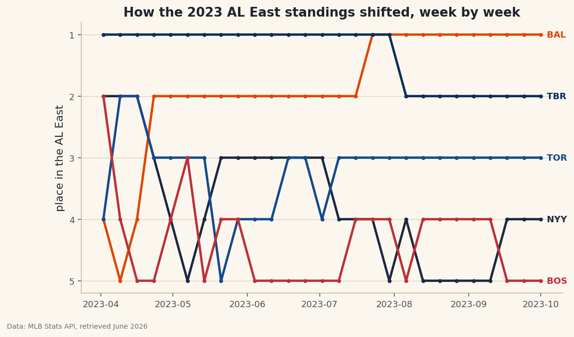
A final standings table tells you who won the division. It says nothing about the journey - the April team that faded, the club that surged from last to first, the September week when two rivals traded the lead. A bump chart restores all of that: it ranks every team at every point in the season and draws their rise and fall as crossing lines. So pick the messiest race you can find and watch the lines knot up. The 2023 AL East is my pick here - four of the five teams won 82 or more games, and reconstructing it week by week from raw game results gives you one of the most satisfying charts in sports.
This is a capstone, and it earns the label by reusing nearly everything the site taught: a polite live API session, cumulative sums and ranking in pandas, time resampling, and a custom matplotlib chart. It leans hardest on rolling averages and form: time-series basics - the same comfort with a date-indexed DataFrame and resample - so make sure that's solid before you start. The data is the MLB Stats API, retrieved June 2026.
-
Set up and name the division
We hit the same MLB Stats API used elsewhere on the site, through the polite session that adds browser headers and retries flaky responses automatically. Then we list the five AL East teams by their numeric team IDs and give each a color for the chart - real club colors so the lines read at a glance.
python import matplotlib.pyplot as plt import pandas as pd import sdt_common as sdt sdt.init("a-standings-bump-chart") session = sdt.polite_session() AL_EAST = {147: "NYY", 110: "BAL", 139: "TBR", 141: "TOR", 111: "BOS"} TEAM_COLORS = {"NYY": "#1C2841", "BAL": "#DF4601", "TBR": "#092C5C", "TOR": "#134A8E", "BOS": "#BD3039"}That
session = sdt.polite_session()is the same well-behaved client we use for every live API on the site - a requests session with a real User-Agent and automatic retry-with-backoff on 429/503 errors, so a season's worth of requests never hammers the server. Each MLB team has a stable numeric ID (the Yankees are 147, the Orioles 110); mapping them to abbreviations now keeps the rest of the code readable. -
Turn one team's games into a cumulative win total
The core of the whole program is a function that asks the schedule endpoint for one team's full regular season and returns its running win total, indexed by date. We walk every game, keep only finals, figure out whether our team was home or away, and record a 1 for a win or 0 for a loss.
python def cumulative_wins(team_id): """A team's cumulative win total, indexed by date.""" data = session.get("https://statsapi.mlb.com/api/v1/schedule", params={"sportId": 1, "season": 2023, "teamId": team_id, "gameType": "R"}, timeout=30).json() recs = [] for day in data["dates"]: for g in day["games"]: if g["status"]["abstractGameState"] != "Final": continue home, away = g["teams"]["home"], g["teams"]["away"] us, them = (home, away) if home["team"]["id"] == team_id else (away, home) if us.get("score") is None or them.get("score") is None: continue recs.append((g["gameDate"][:10], int(us["score"] > them["score"]))) s = pd.DataFrame(recs, columns=["date", "win"]).groupby("date")["win"].sum() return s.sort_index().cumsum()Three details carry this function. The line
us, them = (home, away) if home["team"]["id"] == team_id else (away, home)is a tidy conditional unpacking - it pointsusat whichever side is our team, so the win test reads the same whether we played at home or on the road.int(us["score"] > them["score"])turns the boolean comparison into a clean 1 or 0. And the closing.cumsum()is the magic: it converts a column of per-day wins into the running total that a standings race is really made of. Filtering ongameType: "R"and anabstractGameStateof"Final"keeps us to completed regular-season games only. -
Combine all five teams onto one timeline
We call that function once per team and stitch the results into a single DataFrame - one column per team, one row per date. Because teams have off-days on different dates, we then align everything to a common daily timeline and carry each team's total forward.
python wins = pd.concat({abbr: cumulative_wins(tid) for tid, abbr in AL_EAST.items()}, axis=1) wins.index = pd.to_datetime(wins.index) wins = wins.sort_index().ffill().fillna(0)The dict comprehension inside
pd.concat({...}, axis=1)builds all five win series and glues them together side by side, using each abbreviation as the column name. Converting the index withpd.to_datetimemakes it a real date axis we can resample. The two fills handle the gaps honestly:ffill()carries a team's win total forward across days it didn't play (its total simply hasn't changed), andfillna(0)sets the season's opening rows to zero before anyone has played. -
Sample weekly and rank each week
A line for all 162 games would be a tangle, so we down-sample to one snapshot per week, then convert win totals into standings positions. Ranking is what makes a bump chart a bump chart - we don't plot wins, we plot place.
python weekly = wins.resample("W").last().ffill() ranks = weekly.rank(axis=1, ascending=False, method="min")resample("W").last()groups the daily data into calendar weeks and keeps each team's final total for the week - the standings as they stood that Sunday. Thenrank(axis=1, ...)is the key line:axis=1ranks across the columns within each week, so it compares the five teams to each other rather than ranking a team against its own history.ascending=Falsemakes the most wins rank 1 (first place), andmethod="min"means tied teams share the better rank instead of being split arbitrarily. -
Check the finish line
Before drawing, let's confirm the reconstruction matches reality by printing each team's final win total. If these numbers are right, every step before them was right too.
python final = wins.iloc[-1].sort_values(ascending=False).astype(int) print("Final 2023 AL East wins:") print(final.to_string())Final 2023 AL East win totalsFinal 2023 AL East wins: BAL 101 TBR 99 TOR 89 NYY 82 BOS 78
These are the real final standings, which means our game-by-game accumulation is sound. The Orioles took the division with 101 wins, the Rays right on their heels at 99 - a 100-win team that finished second, the cruelty of a great division. Then a real gap to the Blue Jays at 89, the Yankees at a disappointing 82, and the Red Sox last at 78.
wins.iloc[-1]grabs the final row of the cumulative table (each team's season-ending total), and.astype(int)cleans off the decimals the forward-fill introduced. -
Draw the bump chart
Now the payoff. We plot each team's rank over time as a line with markers, in its club color, and label the line at its right end so we don't need a separate legend. The one counter-intuitive move is inverting the y-axis - in a standings chart, first place belongs at the top, but rank 1 is the smallest number.
python fig, ax = plt.subplots(figsize=(8.8, 5)) for team in ranks.columns: ax.plot(ranks.index, ranks[team], marker="o", markersize=3, linewidth=2.4, color=TEAM_COLORS.get(team), label=team) ax.text(ranks.index[-1], ranks[team].iloc[-1], " " + team, va="center", fontsize=9, fontweight="bold", color=TEAM_COLORS.get(team)) ax.invert_yaxis() ax.set_yticks([1, 2, 3, 4, 5]) ax.set_ylabel("place in the AL East") ax.set_title("How the 2023 AL East standings shifted, week by week") sdt.save_fig(fig, "bump_chart", source="MLB Stats API")Data: MLB Stats API, retrieved June 2026 The single most important line is
ax.invert_yaxis(): without it, the chart would be upside down, with the division leader scraping the bottom. Inverting flips it so rank 1 sits at the top where first place belongs, and the lines read like a standings table you can watch move. Labeling each line in place withax.textatranks.index[-1]- the last week - and leading the label with two spaces nudges the abbreviation just clear of the final marker, which is cleaner than a legend when lines cross as often as these do. We finish withsdt.save_fig, which stamps the chart with its source and the date it was retrieved before saving. -
Read the season in the crossings
A bump chart rewards a slow look. Trace a single line and you can see a team's whole arc - a steady climb, a midseason swoon, a final-week surge. The crossings are where the drama lives: every time two lines swap, a team passed a rival in the standings that week. Watch the Orioles' line work its way to the top and stay there, and the Rays' line shadow it just below after their blazing start. The Yankees' descent toward fourth is a season-long slide you can read at a glance. None of that is visible in the final table - it only shows the destination, while the bump chart shows the trip.
Troubleshooting
A request hangs or returns a 429/503
That's exactly why we route everything through sdt.polite_session() - it retries those flaky status codes with exponential backoff automatically. We also make just five requests total (one per team), which the Stats API handles easily. If a single call genuinely fails, re-run; the cumulative totals are rebuilt from scratch each time, so there's no half-finished state to clean up.
The lines look jagged or a team's rank never changes
Check that you ranked with axis=1. Ranking down the rows (axis=0) compares a team to its own past weeks instead of to its rivals, which produces nonsense. The bump chart needs each week's five totals ranked against each other, which is what axis=1 does.
First place is at the bottom of the chart
You're missing ax.invert_yaxis(). Rank 1 is the smallest number, so by default matplotlib puts it at the bottom of the y-axis. Inverting the axis flips the whole chart so the division leader rides along the top, the way every standings table is read.
KeyError: 'dates' or an empty result
The schedule response is keyed under dates, each holding a games list - print the top-level keys of one response to confirm the shape before looping. An empty result usually means a wrong season or teamId; double-check the IDs in AL_EAST and that you passed gameType: "R" for the regular season.
Challenge yourself
Make the chart breathe. Right now every line is the same weight; redraw it so the team you care about is bold and full-color while the other four fade to light gray - a "highlight one, mute the rest" treatment that turns a tangle into a clear story about a single club's season. Then extend the idea to a whole division of your choosing by swapping the IDs in AL_EAST; the code is league-agnostic, so the NL West or AL Central is one dictionary edit away. For the real capstone, drop the weekly resample and rank by games behind the leader instead of by place - a continuous y-axis that shows not just the order but how far apart the teams were, which a pure bump chart hides.
Get the code
Here's the complete, working script for this tutorial. It runs exactly as shown.
Download the finished script (40_a_standings_bump_chart.py)This script imports a small shared helper (and reads any bundled sample data) that live next to it in /downloads/ — grab these into the same folder so it runs as-is: sdt_common.py.