Publication-Ready Charts: matplotlib Styling and Annotations
What you'll build
A plain bar chart transformed into an annotated, on-brand figure.
Take one plain matplotlib bar chart and rebuild it, step by step, into something you'd put your name on: horizontal bars, meaningful colors, value labels sitting right on the bars, a single annotation that carries the story, clean axes, and a crisp high-resolution export. Same data the whole way through, but a completely different impression at the end. The gap between a chart that works and a chart worth publishing is mostly small decisions — the default version answers the question while quietly making your reader squint at rotated labels, hunt for exact values, and guess what the colors mean.
This assumes you've already drawn a basic chart in your first sports data visualization with matplotlib. We'll use the bundled CSV of the real 2023 MLB final standings (MLB Stats API, retrieved June 2026), ranking teams by run differential - runs scored minus runs allowed, the single best one-number measure of how good a team really was.
-
Load and rank the data
We read the bundled standings, sort by run differential so the best teams come first, then keep the top 10. For the chart we re-sort that top 10 ascending, because matplotlib's horizontal bars stack from the bottom up - sorting ascending puts the best team on top where the eye lands first.
python import os import matplotlib.pyplot as plt import pandas as pd import sdt_common as sdt HERE = os.path.dirname(os.path.abspath(__file__)) df = pd.read_csv(os.path.join(HERE, "sample_standings.csv")).sort_values("RunDiff", ascending=False) top = df.head(10).sort_values("RunDiff") sdt.show_df(df[["Team", "W", "L", "RunDiff"]].head(6), n=6)The six best teams by run differentialTeam W L RunDiff 0 Braves 104 58 231 2 Dodgers 100 62 207 3 Rays 99 63 195 7 Rangers 90 72 165 5 Astros 90 72 129 1 Orioles 101 61 129
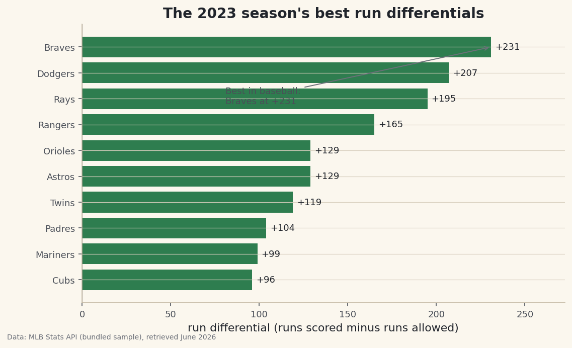
The Braves led baseball at +231, with the Dodgers (+207) and Rays (+195) close behind. Notice the Rangers and Astros both sit at +129 alongside the Orioles - those near-ties will be easy to read once we put values directly on the bars. This is the data both versions of our chart will draw; only the presentation changes.
-
Draw the plain version first
Let's start with the chart most people produce on their first try: vertical bars with the default blue, a terse title, and team names rotated 45 degrees so they don't collide. It's honest and it's fast - but watch what it costs the reader.
python fig, ax = plt.subplots(figsize=(7.8, 4.6)) ax.bar(top["Team"], top["RunDiff"]) ax.set_title("Run differential") plt.setp(ax.get_xticklabels(), rotation=45, ha="right")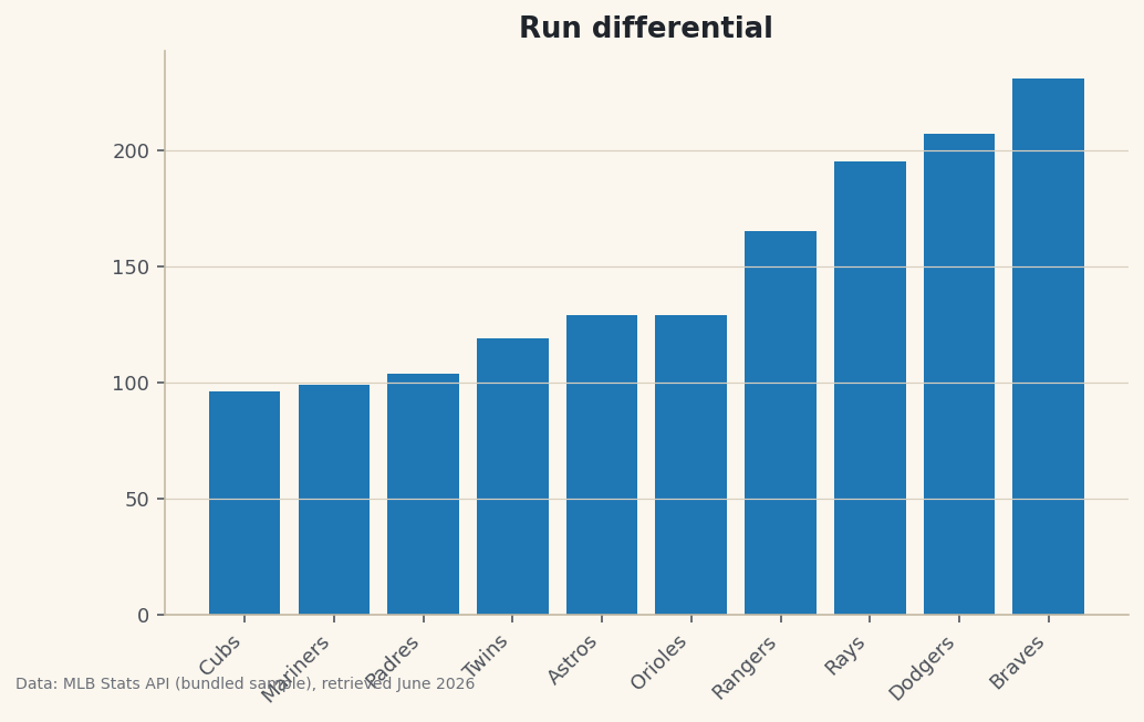
Data: Bundled sample (2023 MLB standings), retrieved June 2026 It's not wrong, but it's working against you. The rotated labels force the reader to tilt their head. There are no values, so you can't tell the Rangers from the Astros without measuring against the axis. The title "Run differential" names the metric but tells no story. And the default color carries no meaning - it's just blue because blue is the default. Every one of those is fixable, so let's fix them all.
-
Flip to horizontal bars with meaningful color
The first two upgrades do the most work. Horizontal bars let the team names read left-to-right like normal text - no rotation needed. And we color each bar by what it means: green for a positive differential, the baseball red for negative. Color should always encode information, never decoration.
python fig, ax = plt.subplots(figsize=(8.6, 5)) colors = [sdt.sport_color("soccer") if v >= 0 else sdt.SPORT_COLORS["baseball"] for v in top["RunDiff"]] bars = ax.barh(top["Team"], top["RunDiff"], color=colors)The list comprehension walks each value in
top["RunDiff"]and picks a color based on its sign, building a list of colors the same length as the bars.ax.barh(note theh) is the horizontal counterpart toax.bar. We keep thebarsobject it returns because the next step needs it to attach labels. -
Label the bars and anchor a zero line
Make the reader's job trivial: print each value at the end of its bar so nobody has to read against the axis, and draw a crisp vertical line at zero as the reference point every bar is measured from.
python ax.bar_label(bars, fmt="%+d", padding=4, fontsize=9) ax.axvline(0, color="#20242B", linewidth=0.8)ax.bar_labelis the modern, one-line way to add data labels - no manual loop over coordinates required. The format string"%+d"is doing something subtle but valuable: the+forces an explicit plus sign on positive numbers, so a reader instantly sees +129 as clearly positive rather than guessing. Theaxvlineat zero gives the bars a baseline to grow from, which matters the moment any value goes negative. -
Add an annotation that tells the story
A great chart has a point of view. Rather than leaving the reader to discover the headline, we draw an arrow to the top bar and spell it out. We grab the best team (the last row, since we sorted ascending) and annotate it.
python best = top.iloc[-1] ax.annotate(f"Best in baseball:\n{best['Team']} at {best['RunDiff']:+d}", xy=(best["RunDiff"], len(top) - 1), xytext=(best["RunDiff"] - 150, len(top) - 3.2), fontsize=9, color="#4A4F58", arrowprops=dict(arrowstyle="->", color="#6C7079"))annotatetakes two coordinate pairs:xyis the point the arrow tips at (the end of the top bar), andxytextis where the text sits. We offset the text down and to the left so it floats in empty space rather than colliding with the bars. Thearrowpropsdictionary styles the connector. Because we used thebestrow to fill the text, the annotation always names the real leader and its real value - never a hard-coded guess. -
Finish with a real title, axis label, and breathing room
The last touches frame the whole chart. A bold, descriptive title that states the takeaway; an x-axis label that defines the metric in plain words for anyone who doesn't know what "run differential" means; and a little margin so the value labels never get clipped at the edge.
python ax.set_title("The 2023 season's best run differentials", fontsize=14, fontweight="bold") ax.set_xlabel("run differential (runs scored minus runs allowed)") ax.margins(x=0.18)Data: Bundled sample (2023 MLB standings), retrieved June 2026 Set the two charts side by side in your mind and the difference is night and day. The polished version reads in seconds: every value is right there, the color reinforces good-versus-bad, the title delivers the point, and the annotation hands the reader the headline.
ax.margins(x=0.18)adds 18% padding on the horizontal axis so the longest label has room to breathe. About exporting: throughout this site charts are saved with the house helper, which writes a 144-DPI PNG and stamps it with the data source. High DPI is what keeps text crisp on a retina screen or in print - never publish a chart at the default 72 DPI if you can help it.
Troubleshooting
My bars are in the wrong order - worst team on top
Horizontal bars stack from the bottom upward, so the first row of your DataFrame lands at the bottom. To get the best team on top, sort ascending before plotting (we do top = df.head(10).sort_values("RunDiff")). It feels backwards, but it's correct for barh.
The value labels or annotation are cut off at the edge
The text is spilling past the axes. Add horizontal padding with ax.margins(x=0.18), and when you save, use bbox_inches="tight" so matplotlib trims to the full content rather than the default figure box. The house save_fig helper already passes bbox_inches="tight" for you.
AttributeError: 'Axes' object has no attribute 'bar_label'
ax.bar_label arrived in matplotlib 3.4. If you're on an older version, upgrade with pip install -U matplotlib, or fall back to a manual loop that calls ax.text at each bar's end coordinate. Upgrading is the easier path and unlocks plenty of other niceties.
Challenge yourself
Take the polished recipe and apply it to the worst 10 teams by run differential - the annotation should now point to the bottom of the league, and you'll see the red color coding earn its keep. Then experiment with the annotation's xytext offsets until the arrow looks natural for that data. For a real test of the skill, go back to a chart you made in an earlier tutorial and give it the full treatment: horizontal where it helps, labels on the bars, one sentence of a title that states the finding, and a hi-res export. The goal is to make these upgrades automatic, so every chart you publish from now on clears the bar.
Get the code
Here's the complete, working script for this tutorial. It runs exactly as shown.
Download the finished script (23_publication_ready_charts_matplotlib_styling.py)This script imports a small shared helper (and reads any bundled sample data) that live next to it in /downloads/ — grab these into the same folder so it runs as-is: sdt_common.py.