Apply and Map: Custom Column Logic in pandas
What you'll build
Win totals bucketed into tiers with .apply(), counted, and charted.
Arithmetic on columns gets you per-game rates and differentials, but a lot of real analysis needs something arithmetic can't do: turn a number into a category, or a code into a label. "Is this an elite team or a rebuild?" "Is AL or American League?" The two tools for this are .apply() — run any function you write on every value — and .map() — translate values through a dictionary. Get the difference between them straight and you'll reach for the right one without thinking. To make it stick, I'll sort all 30 teams into win tiers and relabel their leagues, then chart how many teams land in each tier.
This builds on Computing New Columns. The data is the bundled sample_standings.csv (real 2023 MLB standings), so it runs offline.
-
.apply() runs your function on every row
When the logic is more than a formula — an if/elif ladder, say — write a function and hand it to
.apply(). pandas calls it once per value and collects the results into a new column.python import pandas as pd df = pd.read_csv("sample_standings.csv") def win_tier(w): if w >= 95: return "Elite (95+)" if w >= 85: return "Contender (85-94)" if w >= 75: return "Above .500 (75-84)" if w >= 65: return "Below .500 (65-74)" return "Rebuilding (<65)" df["Tier"] = df["W"].apply(win_tier)Anything a Python function can decide,
.apply()can turn into a column — thresholds, string parsing, lookups, you name it. -
.map() translates values through a dictionary
When you just need to swap each value for another, a dict and
.map()are cleaner than a function.python df["Lg"] = df["League"].map({"AL": "American", "NL": "National"}) print(df.sort_values("W", ascending=False)[["Team", "W", "Lg", "Tier"]].head(8).to_string())New Tier and Lg columns, best teams firstTeam W Lg Tier 0 Braves 104 National Elite (95+) 1 Orioles 101 American Elite (95+) 2 Dodgers 100 National Elite (95+) 3 Rays 99 American Elite (95+) 4 Brewers 92 National Contender (85-94) 5 Astros 90 American Contender (85-94) 6 Phillies 90 National Contender (85-94) 7 Rangers 90 American Contender (85-94) Teams per tier: Tier Above .500 (75-84) 12 Contender (85-94) 7 Elite (95+) 4 Rebuilding (<65) 4 Below .500 (65-74) 3
The 2023 Braves (104 wins), Orioles, Dodgers, and Rays all land in "Elite," with their leagues spelled out. One caution with
.map(): any value not in your dictionary becomesNaN, so a typo'd key silently blanks the cell — useful to know, easy to get burned by. -
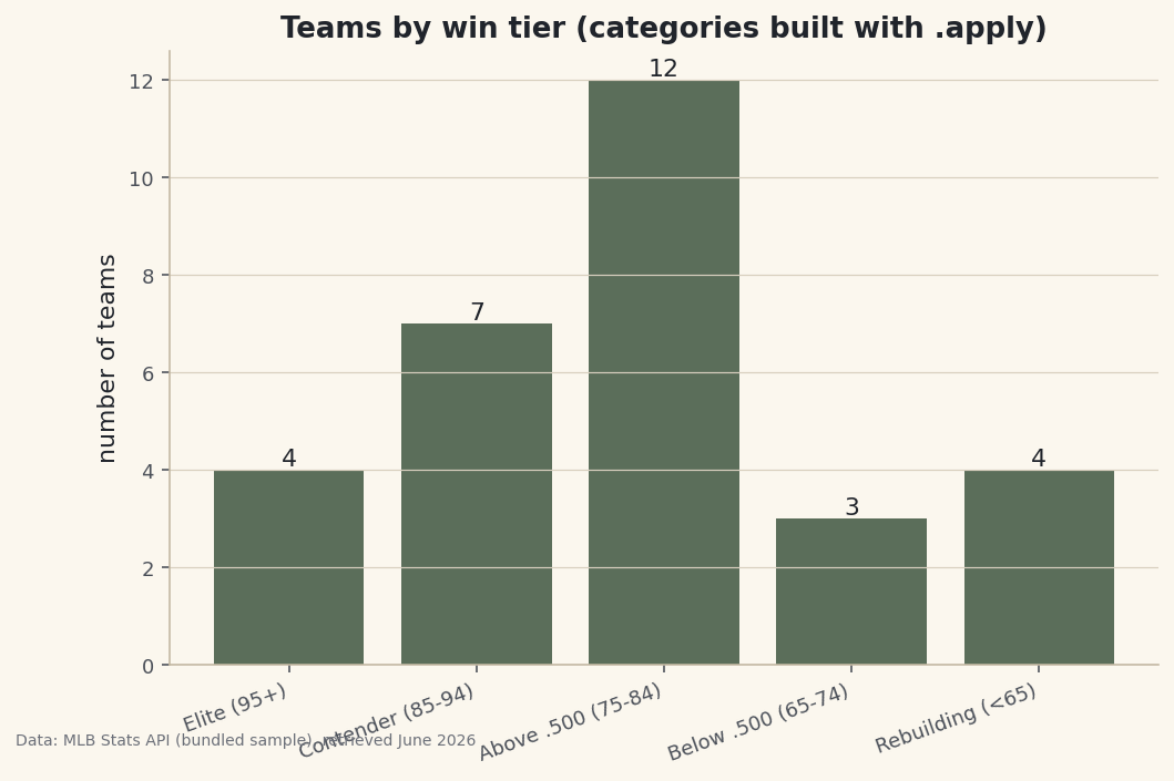
Count the categories and chart them
Once a column is categorical,
value_counts()tallies it, and a bar chart shows the league's shape.python import matplotlib.pyplot as plt order = ["Elite (95+)", "Contender (85-94)", "Above .500 (75-84)", "Below .500 (65-74)", "Rebuilding (<65)"] counts = df["Tier"].value_counts().reindex(order) fig, ax = plt.subplots(figsize=(8, 5)) bars = ax.bar(range(len(counts)), counts.values) ax.set_xticks(range(len(counts))); ax.set_xticklabels(counts.index, rotation=20, ha="right") ax.bar_label(bars) fig.savefig("tier_counts.png", dpi=144, bbox_inches="tight")Data: Bundled sample (2023 MLB standings), retrieved June 2026 The league bunches in the middle — a dozen teams in the "Above .500" band — thinning out toward the elite and the rebuilding extremes. Note the
reindex(order):value_counts()sorts by frequency, but we want the tiers in their natural order, so we reindex to impose it.
Troubleshooting
.apply() is slow on a big dataset
.apply() runs Python once per row, which is far slower than vectorized math. On 30 teams it's instant; on millions of rows, prefer a vectorized alternative like pd.cut() for binning or np.select() for multi-condition logic. Reach for .apply() when the logic genuinely can't be vectorized.
My mapped column is full of NaN
.map() returns NaN for any value missing from the dictionary. Check your keys match the data exactly (case and whitespace included). To leave unmatched values unchanged instead, use .replace() rather than .map().
Should I use a lambda or a named function?
Either works in .apply(). A one-liner like .apply(lambda w: "win" if w > 81 else "loss") is fine; a multi-line if/elif ladder reads better as a named function, as above.
Challenge yourself
Re-create the Tier column with pd.cut(df["W"], bins=[0,65,75,85,95,200], labels=[...]) and confirm it matches your .apply() version — a good lesson in when the vectorized tool is the better tool. Then .map() each division to its league or region and count teams per group.
Get the code
Here's the complete, working script for this tutorial. It runs exactly as shown.
Download the finished script (50_apply_and_map_custom_columns.py)This script imports a small shared helper (and reads any bundled sample data) that live next to it in /downloads/ — grab these into the same folder so it runs as-is: sdt_common.py.