Computing New Columns: Rate Stats and Feature Engineering
What you'll build
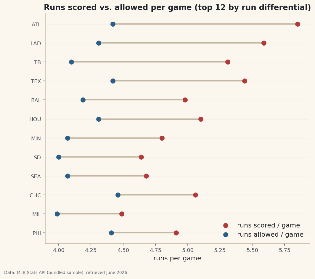
Per-game rate columns derived from season totals, shown in a dumbbell chart.
The columns a dataset ships with are rarely the ones you want to analyze. A standings file gives you season totals — runs scored, runs allowed, games played — but the questions you actually ask are about rates: runs per game, run differential per game, winning percentage. So you build the columns you wish the file came with. That's feature engineering, and in pandas each new column is a single line. Four of those lines, then a dumbbell chart that only makes sense once they exist — that's the whole job here.
This builds on Pandas for Sports Data. The data is the bundled sample_standings.csv (real 2023 MLB standings, MLB Stats API, retrieved June 2026), so it runs offline.
-
Build new columns from old ones
Assigning to a column name that doesn't exist yet creates it. Because pandas math is vectorized, dividing one column by another applies to all 30 rows at once — no loop.
python import pandas as pd df = pd.read_csv("sample_standings.csv") df["RS/G"] = (df["RS"] / df["G"]).round(2) df["RA/G"] = (df["RA"] / df["G"]).round(2) df["RunDiff/G"] = (df["RunDiff"] / df["G"]).round(2) df["WinPct"] = (df["W"] / df["G"]).round(3) print(df.sort_values("RunDiff/G", ascending=False)[["Team","RS/G","RA/G","RunDiff/G","WinPct"]].head(6).to_string())Four engineered columns, best run differential firstTeam RS/G RA/G RunDiff/G WinPct 0 Braves 5.85 4.42 1.43 0.642 2 Dodgers 5.59 4.31 1.28 0.617 3 Rays 5.31 4.10 1.20 0.611 7 Rangers 5.44 4.42 1.02 0.556 5 Astros 5.10 4.31 0.80 0.556 1 Orioles 4.98 4.19 0.80 0.623
Now the table speaks in rates. The 2023 Braves scored 5.85 runs a game and allowed 4.42 — a differential of +1.43 per game, the best in baseball — on the way to a .642 winning percentage. Those numbers existed in the raw file only as totals; one division each surfaced them.
-
Why vectorized beats a loop
You could write a
forloop over rows to compute these, but you shouldn't.df["RS"] / df["G"]hands the whole operation to pandas, which runs it in fast compiled code and returns a new column aligned to the index. It's shorter, faster, and far less error-prone. The same idea extends to any arithmetic: add, subtract, multiply, or combine several columns in one expression. -
Chart two engineered columns at once
A dumbbell chart draws two values per team — here runs scored and allowed per game — as two dots joined by a line, so the gap between them is the run differential. It's a compact way to show offense and defense together.
python import matplotlib.pyplot as plt top = df.sort_values("RunDiff/G", ascending=False).head(12).sort_values("RunDiff/G").reset_index(drop=True) y = range(len(top)) fig, ax = plt.subplots(figsize=(8, 7)) ax.hlines(y=list(y), xmin=top["RA/G"], xmax=top["RS/G"], color="#C2B7A1", lw=2) ax.scatter(top["RS/G"], list(y), label="runs scored / game") ax.scatter(top["RA/G"], list(y), label="runs allowed / game") ax.set_yticks(list(y)); ax.set_yticklabels(top["Abbr"]); ax.legend() fig.savefig("rate_dumbbell.png", dpi=144, bbox_inches="tight")Data: Bundled sample (2023 MLB standings), retrieved June 2026 For every team here the "scored" dot sits to the right of the "allowed" dot — the visual signature of a positive run differential — and the length of each connecting line is exactly the per-game margin we engineered. A chart like this is impossible from the raw totals; it needed the rate columns first.
Troubleshooting
I get a SettingWithCopyWarning
You're assigning a column to a slice of another DataFrame rather than the frame itself. Assign to the original (df["new"] = ...), or take an explicit df = df.copy() first so pandas knows you mean to modify it.
My new column is full of integers, not decimals
In Python 3 the / operator always returns floats, so this is rare — but if a source column was read as text, the math fails or concatenates. Check df.dtypes and convert with pd.to_numeric if needed.
The rounded values don't add up exactly
.round(2) changes what's stored, so rounded rates won't always reconcile to the unrounded totals. If you need exact downstream math, round only for display and keep the full-precision column for calculations.
Challenge yourself
Engineer one more column: a Pythagorean win expectation, df["PythPct"] = df["RS"]**1.83 / (df["RS"]**1.83 + df["RA"]**1.83), then compute the gap between it and the real WinPct to find the luckiest teams — the same idea as our Pythagorean wins tutorial, now as a column you built yourself. Sort by that gap and see who outran their run differential.
Get the code
Here's the complete, working script for this tutorial. It runs exactly as shown.
Download the finished script (47_computing_new_columns_rate_stats.py)This script imports a small shared helper (and reads any bundled sample data) that live next to it in /downloads/ — grab these into the same folder so it runs as-is: sdt_common.py.