Binning Continuous Data into Categories with pd.cut()
What you'll build
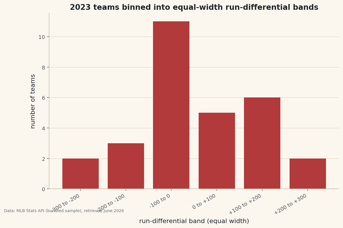
Run differential sliced into equal-width bands, counted, and charted as a bar of teams per band.
Raw numbers are precise but hard to talk about. "A +143 run differential" means less to most readers than "elite." So we bin. Binning turns a continuous column into labeled categories, and pd.cut() is the tool: you hand it the bin edges and it sorts every value into a band. Here's the part people trip over — cut() is the equal-width sibling of qcut() (equal counts), and knowing which one you actually want is the whole lesson.
This builds on Percentile Ranks and Tiers, where qcut() first appeared. The data is the bundled sample_standings.csv (real 2023 MLB standings), so it runs offline.
-
You define the edges
Pass
bins=a list of cut points andlabels=a name for each resulting band. Here, six equal-width 100-run bands span the realistic range of run differential.python import pandas as pd df = pd.read_csv("sample_standings.csv") edges = [-300, -200, -100, 0, 100, 200, 300] labels = ["-300 to -200", "-200 to -100", "-100 to 0", "0 to +100", "+100 to +200", "+200 to +300"] df["RD_band"] = pd.cut(df["RunDiff"], bins=edges, labels=labels)Every team now carries an
RD_bandlabel. Note there are six labels for seven edges — n bins always need n+1 edges, the single most commoncutmistake. -
Count the bands in order
value_counts()tallies each band, andsort=Falsekeeps them in their natural low-to-high order instead of sorting by frequency — essential when the categories have a meaningful sequence.python counts = df["RD_band"].value_counts(sort=False) print(counts.to_string())Teams per equal-width bandTeams per run-differential band: RD_band -300 to -200 2 -200 to -100 3 -100 to 0 11 0 to +100 5 +100 to +200 6 +200 to +300 2 Widest band holds 11 teams; unlike qcut, equal-width bins can be uneven.
This is the key contrast with
qcut: equal-width bins come out uneven. The middle "-100 to 0" band is crowded because most teams cluster near average, while the extreme bands hold only a couple of teams each.qcutwould have forced roughly equal counts by moving the edges;cutkeeps the widths fixed and lets the counts fall where they may. -
Chart the distribution
A bar of the counts is effectively a histogram with bins you chose by hand — useful when the boundaries carry real meaning (a winning record, a playoff cutoff) rather than arbitrary auto-bins.
python import matplotlib.pyplot as plt fig, ax = plt.subplots(figsize=(9, 5.5)) ax.bar(range(len(counts)), counts.values, color="#B23A3A") ax.set_xticks(range(len(counts))) ax.set_xticklabels(counts.index, rotation=30, ha="right") ax.set_ylabel("number of teams") fig.savefig("cut_bands.png", dpi=144, bbox_inches="tight")Data: Bundled sample (2023 MLB standings), retrieved June 2026 The tall middle and short tails are the signature of a roughly bell-shaped distribution. Because you controlled the edges, the chart answers a specific question — "how many teams were within 100 runs of average?" — that auto-binning can't target.
Troubleshooting
Some rows came out NaN
Those values fell outside your outer edges, so cut assigned no bin. Widen the end edges to cover the real min and max, or pass include_lowest=True if a value sits exactly on the lowest edge.
"Bin labels must be one fewer than bins"
You gave the wrong number of labels. For n bands you need n+1 edges and exactly n labels. Count them: 7 edges here, 6 labels.
When should I use cut vs qcut?
Use cut when the boundaries themselves matter (0, a playoff line, round numbers) and you accept uneven group sizes. Use qcut when you want equal-sized groups (quartiles, deciles) and will let the edges land wherever the data requires.
Challenge yourself
Bin the same column both ways and compare. Run pd.qcut(df["RunDiff"], 6) alongside your cut and print both value_counts. The qcut groups will be near-equal in size; the cut groups won't. Then pass cut an integer (bins=6) instead of explicit edges and see where pandas places automatic equal-width boundaries.
Get the code
Here's the complete, working script for this tutorial. It runs exactly as shown.
Download the finished script (60_binning_data_with_pd_cut.py)This script imports a small shared helper (and reads any bundled sample data) that live next to it in /downloads/ — grab these into the same folder so it runs as-is: sdt_common.py.