The ECDF: Read Any Percentile Off a Cumulative Curve
What you'll build
An empirical cumulative distribution of run differential with the median read off the curve.
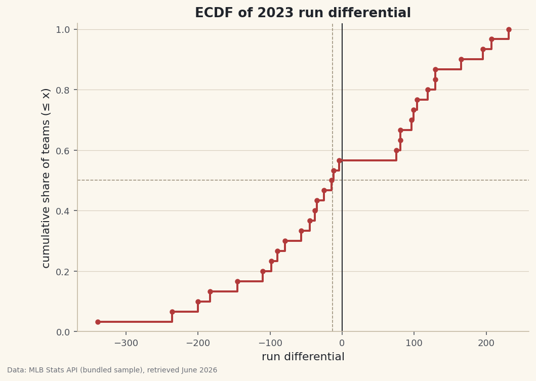
A histogram bins your data and smooths away detail; the bin width is a choice that can hide or invent structure. The empirical cumulative distribution function — ECDF — makes no such choice. It plots every value against the fraction of the data at or below it, so you can read "what share of teams fall below this run differential?" straight off the curve. It's two lines of code and the most underrated distribution chart there is.
This builds on Summary Statistics and Distributions. The data is the bundled sample_standings.csv (real 2023 MLB standings), so it runs offline.
-
Two lines to build it
Sort the values, then give each one its running share of the data: the smallest is at
1/n, the largest at1.0. That pair of arrays is the ECDF.python import numpy as np import pandas as pd df = pd.read_csv("sample_standings.csv") x = np.sort(df["RunDiff"].values) # values, ascending y = np.arange(1, len(x) + 1) / len(x) # cumulative share: 1/n ... 1.0No binning, no bandwidth, no tuning. Every data point is preserved exactly, which is why two analysts will always draw the identical ECDF from the same numbers — not true of histograms or density curves.
-
Read percentiles off the curve
The y-axis is percentiles. Find 0.75 on the y-axis, slide right to the curve, drop down — that x is the 75th percentile.
np.quantilegives the same numbers exactly.python for q in (0.25, 0.50, 0.75, 0.90): print(int(q*100), "th pct:", round(np.quantile(df["RunDiff"], q), 1)) print("share below zero:", round((df["RunDiff"] < 0).mean(), 3))Percentiles, and the share below zero25th percentile run differential: -87.2 50th percentile run differential: -13.5 75th percentile run differential: 102.8 90th percentile run differential: 168.0 Share of teams with a negative run differential: 0.567
Here the median run differential is below zero even though differentials must sum to zero league-wide — a sign the distribution is right-skewed, with a few dominant teams piling up big positive numbers while most teams sit a little under water. A histogram hints at that; the ECDF lets you quantify it precisely.
-
Draw the staircase
step()draws the ECDF as a staircase;where="post"holds each level until the next value. Guide lines from the median show how to read a percentile geometrically.python import matplotlib.pyplot as plt fig, ax = plt.subplots(figsize=(8, 5.5)) ax.step(x, y, where="post", lw=2) ax.scatter(x, y, s=18) # mark the actual data points median = np.quantile(df["RunDiff"], 0.5) ax.axhline(0.5, ls="--"); ax.axvline(median, ls="--") ax.set_xlabel("run differential"); ax.set_ylabel("cumulative share (≤ x)") fig.savefig("ecdf.png", dpi=144, bbox_inches="tight")Data: Bundled sample (2023 MLB standings), retrieved June 2026 Steep stretches of the staircase are where values cluster (many teams close together); long flat stretches are gaps in the data (the lonely outliers at the top). The curve's shape is the distribution's shape, read without ever choosing a bin.
Troubleshooting
My curve looks like a smooth line, not a staircase
You used plot() instead of step(). With only 30 points a plain line interpolates between them; step(..., where="post") draws the true flat-then-jump shape of a cumulative distribution.
The y-axis doesn't quite reach 1.0
Check the numerator. Use np.arange(1, n+1)/n so the last point lands exactly at 1.0. Starting at 0 (np.arange(n)/n) tops out at (n-1)/n instead.
How do I compare two groups?
Plot two ECDFs on the same axes — e.g., AL vs NL run differential. Whichever curve sits to the right is the stronger distribution, and a horizontal gap between them at any height is the difference at that percentile. It's the cleanest two-group distribution comparison there is.
Challenge yourself
Split the teams by league and draw both ECDFs on one chart. Where do the AL and NL curves separate most, and at what percentile? Then add a shaded horizontal band between the 25th and 75th percentiles to highlight the middle half of the league — the interquartile range, read straight off the y-axis.
Get the code
Here's the complete, working script for this tutorial. It runs exactly as shown.
Download the finished script (57_ecdf_cumulative_distribution.py)This script imports a small shared helper (and reads any bundled sample data) that live next to it in /downloads/ — grab these into the same folder so it runs as-is: sdt_common.py.