Group, Pivot, and Reshape: Aggregating Sports Data Like a Pro
What you'll build
A pivot table and a tidy long-format frame from the same standings data.
You have one row per team, but you want a number per division. You have wide columns of stats, but your plotting library wants them long. Raw sports data almost never lands in the shape your question needs, and the gap between those two shapes is where most of my analysis time used to disappear. Four moves close it: groupby, pivot_table, melt, and crosstab. I'll walk through each on real standings, then draw the final pivot as a heatmap.
This picks up where pandas for sports data: 12 operations left off, so I'll assume you're comfortable selecting columns and reading a DataFrame. We'll work entirely offline from a bundled CSV of the real 2023 MLB final standings (sourced from the MLB Stats API, retrieved June 2026), so there's nothing to download and every number you see is the genuine article.
-
Load the standings
The script ships with
sample_standings.csvsitting right next to it, so we build an absolute path from the script's own location and read it. That trick means the code runs the same no matter which folder you launch it from.python import os import matplotlib.pyplot as plt import numpy as np import pandas as pd HERE = os.path.dirname(os.path.abspath(__file__)) df = pd.read_csv(os.path.join(HERE, "sample_standings.csv"))Each row is one of the 30 teams, with columns for wins (
W), losses (L), runs scored (RS), runs allowed (RA), run differential (RunDiff), plus theLeagueandDivisioneach team belongs to. That mix of numbers and categories is exactly what makes it perfect for reshaping practice. -
Recap: groupby for one number per group
You met
groupbylast tutorial; here's the one-line refresher because every other move builds on it. We split the teams into their two leagues, then average three columns within each league.groupbyalways follows the same rhythm: split into groups, apply a calculation, combine the results back into a table.python print(df.groupby("League")[["W", "RS", "RA"]].mean().round(1).to_string())Average wins, runs scored, and runs allowed per leagueW RS RA League AL 79.9 737.7 740.7 NL 82.1 757.7 754.8
Two rows in, two leagues out. The National League averaged 82.1 wins to the American League's 79.9 - a small edge, but the kind of fact you can only see once you've collapsed 30 rows into a per-group summary. Selecting the columns inside the square brackets before
.mean()keeps the output tidy; without it, pandas would try to average every numeric column. -
pivot_table: a two-dimensional summary
A
groupbygives you one grouping key. Apivot_tablegives you a full grid - rows, columns, and an aggregate in each cell - which is how spreadsheet pivot tables work. Here we ask for the average of four stats broken down by division.python pivot = pd.pivot_table(df, index="Division", values=["W", "RunDiff", "RS", "RA"], aggfunc="mean").round(1) print(pivot.to_string())Average team stats by divisionRA RS RunDiff W Division AL Central 759.2 683.6 -75.6 71.6 AL East 697.6 771.6 74.0 89.8 AL West 765.2 758.0 -7.2 78.2 NL Central 762.0 748.2 -13.8 80.8 NL East 745.6 765.2 19.6 84.8 NL West 756.8 759.8 3.0 80.8
Now the story jumps off the page. The AL East averaged 89.8 wins and a +74.0 run differential - the strongest division in baseball that year - while the AL Central averaged just 71.6 wins and a brutal -75.6 differential.
indexsets the rows,valuespicks which columns to summarize, andaggfuncchooses how (we used"mean", but"sum","max", or"count"work the same way). This single table is the backbone of the heatmap we'll draw at the end. -
melt: reshape wide to long
Our table is wide: each metric lives in its own column. Many tools - especially plotting libraries like seaborn - prefer long data, where every observation is its own row tagged with what it measures.
meltis the verb for that transformation. We take just the team name plus runs scored and allowed, and stack them.python long = df[["Team", "RS", "RA"]].melt(id_vars="Team", var_name="metric", value_name="runs") print(long.head(6).to_string())The first six rows, now in long formTeam metric runs 0 Braves RS 947 1 Orioles RS 807 2 Dodgers RS 906 3 Rays RS 860 4 Brewers RS 728 5 Astros RS 827
Read the output carefully: the Braves' 947 runs scored became a single row with
metricequal toRSandrunsequal to 947.id_varsnames the column to keep fixed (the identifier), whilevar_nameandvalue_namelabel the two new columns that hold the former column names and their values. The same teams that had one row now have two - one per metric. This is the shape that lets a chart draw scored-versus-allowed bars side by side with one line of code. -
crosstab: count across two categories
Sometimes you don't want to average anything - you just want to count how things fall into a grid of categories.
crosstabis the specialist for that. First we add a label marking each team as winning or losing, then count those labels within each division.python df["record"] = np.where(df["W"] > df["L"], "winning", "losing") print(pd.crosstab(df["Division"], df["record"]).to_string())Winning vs. losing teams per divisionrecord losing winning Division AL Central 4 1 AL East 1 4 AL West 2 3 NL Central 2 3 NL East 2 3 NL West 2 3
Each cell is a simple count of teams. The AL East had 4 winning teams and just 1 below .500 - lopsided dominance - while the AL Central had the mirror image, 1 winning and 4 losing.
np.whereis the vectorized if/else: it evaluates the condition for all 30 rows at once and returns the matching label.crosstabthen tallies the combinations. Notice each division row sums to 5, which is a nice sanity check that we counted every team exactly once. -
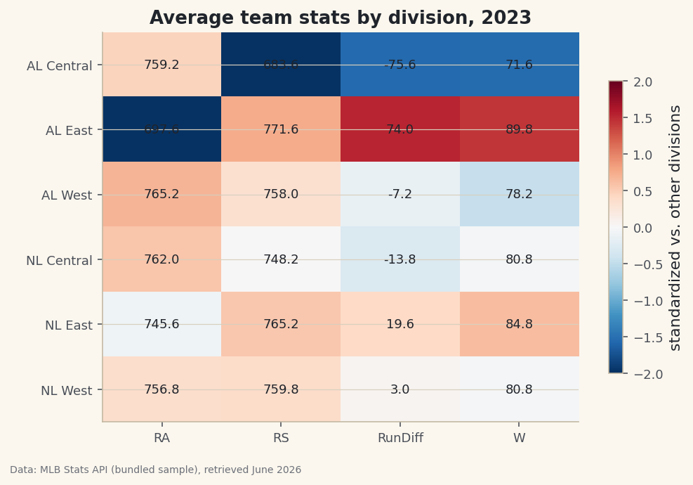
Draw the pivot as a heatmap
A pivot table is just a grid of numbers, and the natural picture of a grid is a heatmap. There's one wrinkle: wins live around 80 while run differential swings from -76 to +74, so raw colors would be dominated by the big-magnitude column. We fix that by standardizing each column to a z-score for the color, while still printing the real averages as text in each cell.
python z = (pivot - pivot.mean()) / pivot.std() fig, ax = plt.subplots(figsize=(7.6, 5)) im = ax.imshow(z.values, cmap="RdBu_r", aspect="auto", vmin=-2, vmax=2) ax.set_xticks(range(len(pivot.columns)), pivot.columns) ax.set_yticks(range(len(pivot.index)), pivot.index) for i in range(pivot.shape[0]): for j in range(pivot.shape[1]): ax.text(j, i, pivot.values[i, j], ha="center", va="center", fontsize=9, color="#20242B") ax.set_title("Average team stats by division, 2023") fig.colorbar(im, ax=ax, shrink=0.75, label="standardized vs. other divisions")Data: Bundled sample (2023 MLB standings), retrieved June 2026 The colors tell the story at a glance: the AL East row glows red for the good stats and the AL Central row runs cold. Standardizing with
(pivot - pivot.mean()) / pivot.std()puts every column on the same -2 to +2 scale, so a hot cell always means "well above average for this stat" regardless of the stat's natural range. The nested loop withax.textoverlays the true number on each tile, giving you both the instant visual and the exact value. That combination - honest color, honest labels - is what separates a useful heatmap from a misleading one.
Troubleshooting
FileNotFoundError: sample_standings.csv
The CSV must sit in the same folder as the script. We build the path with os.path.dirname(os.path.abspath(__file__)) precisely so the location is found no matter your working directory. If you copied just the snippet into a notebook, that __file__ trick won't work - point pd.read_csv at the file's full path instead.
DataError or "No numeric types to aggregate"
This means you handed an aggregation a text column. In pivot_table and groupby, only list numeric columns in values (here, W, RS, RA, RunDiff). The Team and Division columns are labels and belong in index, not values.
My melted table has way more rows than I expected
That's melt working as designed - it multiplies your row count by the number of value columns. Two metrics over 30 teams becomes 60 rows. If it ballooned further, you probably forgot to list a column in id_vars, so pandas melted it too. Keep every identifier column in id_vars.
Challenge yourself
Swap aggfunc="mean" for aggfunc="sum" in the pivot and see how the picture changes when you total runs instead of averaging them. Then build a second crosstab that adds normalize="index" so each division's row shows the share of winning teams rather than the raw count - which division had the highest winning percentage of teams? Finally, melt all four stat columns at once and try grouping the long table back up with groupby("metric") to prove you can travel between shapes in both directions.
Get the code
Here's the complete, working script for this tutorial. It runs exactly as shown.
Download the finished script (21_group_pivot_reshape_aggregating_sports_data.py)This script imports a small shared helper (and reads any bundled sample data) that live next to it in /downloads/ — grab these into the same folder so it runs as-is: sdt_common.py.