NBA Shooting by Zone: Build a Shot-Zone Efficiency Table
What you'll build
A table of shot volume and efficiency for every area of the floor.
Ask a casual fan why the NBA stopped shooting mid-range jumpers and you'll get a shrug. Ask the data and you'll get a number, and that number is points per shot. So I'll group a real season's worth of NBA shots by court zone and build a small efficiency table — the kind of table that explains the biggest shift in modern basketball, why teams crowd the rim and the three-point line and abandon everything between. The surprise is how little code it takes: one groupby and one carefully chosen metric.
This builds on drawing an NBA shot chart, where you met the half-court and the shot data; here we stop plotting individual shots and start summarizing thousands of them at once. One note on the data: stats.nba.com blocks data-center IPs, so instead of the live nba_api we read a bundled nba_league_shots.csv - a real public NBA shot-log sample. The live route is covered in the shot-chart tutorial; the analysis below is identical either way. Data retrieved June 2026.
-
Load the shot log
Every row in the file is one field-goal attempt, tagged with the zone it came from (
BASIC_ZONE), whether it went in (SHOT_MADE, a 0/1 flag), and what kind of shot it was (SHOT_TYPE, the text "2PT Field Goal" or "3PT Field Goal"). We read it with pandas the same way you'd read any CSV.python import os import pandas as pd HERE = os.path.dirname(os.path.abspath(__file__)) shots = pd.read_csv(os.path.join(HERE, "nba_league_shots.csv"))Reading the CSV relative to the script's own folder (that
HEREdance) means the code runs no matter what directory you launch it from - a small habit that saves a lot of "file not found" grief later. -
Turn makes into points
Here is the idea the whole tutorial hinges on. Field-goal percentage treats every make as equal, but a made three is worth 50% more than a made layup. To compare zones fairly we need points, not just makes. So we build a points column: a shot is worth 3 if its type starts with "3" and the ball went in, 2 if it's a two and went in, and 0 if it missed.
python shots["points"] = shots["SHOT_TYPE"].str.startswith("3").map({True: 3, False: 2}) * shots["SHOT_MADE"]Read this right-to-left.
str.startswith("3")gives a True/False per row;.map({True: 3, False: 2})turns that into the shot's point value (3 or 2); multiplying bySHOT_MADEzeroes out every miss, because a miss is worth nothing no matter where it came from. The result is the actual points each attempt produced. -
Group by zone and aggregate
Now the workhorse move.
groupby("BASIC_ZONE")splits the shots into one bucket per court area, andaggcomputes three numbers for each bucket in a single pass: how many attempts it saw, the field-goal percentage (the mean of the 0/1SHOT_MADEflag), and the average points per shot. We sort by attempts so the busiest zones sit on top.python zone = (shots.groupby("BASIC_ZONE") .agg(attempts=("SHOT_MADE", "size"), fg_pct=("SHOT_MADE", "mean"), pts_per_shot=("points", "mean")) .sort_values("attempts", ascending=False))The named-aggregation syntax -
fg_pct=("SHOT_MADE", "mean")- reads as "make a column calledfg_pctby taking themeanofSHOT_MADE." Because the made flag is just 0s and 1s, its mean is the make rate. And"size"simply counts the rows in each group. Three summary columns, one clean expression. -
Add a frequency share and round
Raw attempt counts are hard to feel; a percentage of total shots is instantly readable. We add a
freq%column - each zone's attempts as a share of all attempts - and round the decimals so the table prints clean.python zone["freq%"] = (100 * zone["attempts"] / zone["attempts"].sum()).round(1) zone = zone.round({"fg_pct": 3, "pts_per_shot": 2})Dividing each zone's attempts by
zone["attempts"].sum()and multiplying by 100 turns counts into percentages that add up to 100 across the whole table. Rounding to three places for the rate and two for points-per-shot keeps the numbers honest without a wall of trailing digits. -
Read the table
Here's the finished efficiency table. Print just the four columns we care about, in attempt order.
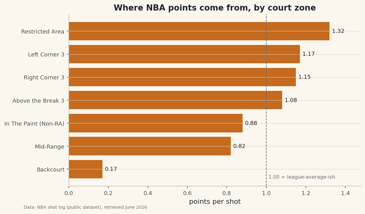
python print("Shooting by zone (sampled season):") print(zone[["attempts", "freq%", "fg_pct", "pts_per_shot"]].to_string())Shooting by zoneShooting by zone (sampled season): attempts freq% fg_pct pts_per_shot BASIC_ZONE Restricted Area 7379 29.5 0.658 1.32 Above the Break 3 7255 29.0 0.360 1.08 In The Paint (Non-RA) 4971 19.9 0.442 0.88 Mid-Range 2779 11.1 0.409 0.82 Left Corner 3 1310 5.2 0.389 1.17 Right Corner 3 1253 5.0 0.382 1.15 Backcourt 53 0.2 0.057 0.17Now watch the story emerge. The two most-used zones are the Restricted Area (29.5% of all shots) and Above the Break 3 (29.0%) - together nearly 60% of everything. The Restricted Area converts at a blistering 65.8% for 1.32 points per shot; the above-the-break three goes in only 36.0% of the time, yet still returns 1.08 points per shot because each make is worth three. Now look at the Mid-Range: it makes 40.9% of its shots - a perfectly respectable hit rate - but earns just 0.82 points per shot, the second-worst on the floor. That single comparison is the whole modern game: a worse-looking three (36%) beats a better-looking mid-range two (41%) on the only scoreboard that matters.
-
Chart points per shot
A horizontal bar chart of points-per-shot makes the hierarchy impossible to miss. We sort ascending so matplotlib stacks the most efficient zone on top, label each bar with its value, and draw a reference line near 1.0 so you can see at a glance which zones clear the bar.
python import matplotlib.pyplot as plt plot_df = zone.sort_values("pts_per_shot") fig, ax = plt.subplots(figsize=(8.4, 5)) bars = ax.barh(plot_df.index, plot_df["pts_per_shot"], color="#C56A1E") ax.bar_label(bars, fmt="%.2f", padding=4, fontsize=9) ax.axvline(1.0, color="#6C7079", linestyle="--", linewidth=1) ax.set_xlabel("points per shot") ax.set_title("Where NBA points come from, by court zone") ax.margins(x=0.12) fig.savefig("zone_efficiency.png", dpi=144, bbox_inches="tight")Data: NBA shot log (public dataset), retrieved June 2026 The picture is the argument. The Restricted Area and all three of the three-point zones (above-the-break, left corner, right corner) sit above the 1.0 line; the Mid-Range and the non-restricted paint sit below it. The corners are quietly excellent - the corner three is the shortest three on the court, so it converts a touch better than the longer above-the-break version and lands right around 1.15 to 1.17 points per shot. That dashed line is the visual cutoff between shots a modern offense hunts and shots it actively avoids.
Troubleshooting
FileNotFoundError for nba_league_shots.csv
The script looks for the CSV in its own folder. Make sure nba_league_shots.csv sits next to the script, and that you build the path with os.path.join(HERE, ...) rather than a bare filename - otherwise the lookup is relative to wherever you happened to launch Python, which is usually not where the file lives.
Every pts_per_shot comes out as a whole number or all zeros
The points column was built wrong. SHOT_MADE must be a numeric 0/1 flag for the multiplication to zero out misses; if it loaded as text ("True"/"False"), convert it first with shots["SHOT_MADE"].astype(int). Check shots["points"].value_counts() - you should see only 0, 2, and 3.
The zones don't match the names you expected
NBA shot data labels regions with the exact strings in the BASIC_ZONE column - "Restricted Area", "Above the Break 3", "In The Paint (Non-RA)", and so on. Run shots["BASIC_ZONE"].unique() to see the precise spellings before you try to filter or rename any of them; a stray space or capital will silently drop rows.
Challenge yourself
Points per shot tells you which zones are efficient, but not which teams or players actually live there. If your shot log has a team or player column, add it to the groupby (group by both zone and team) and find which teams take the highest share of their shots from the rim and the three combined - those are your "Moreyball" offenses. Then turn the same table into a map: send these zone numbers over to a league-wide shot heatmap and see the mid-range desert appear as a hole in the floor.
Get the code
Here's the complete, working script for this tutorial. It runs exactly as shown.
Download the finished script (27_nba_shooting_by_zone_efficiency_table.py)This script imports a small shared helper (and reads any bundled sample data) that live next to it in /downloads/ — grab these into the same folder so it runs as-is: sdt_common.py, sdt_nba.py.