Draw a League-Wide NBA Shot Heatmap
What you'll build
A hexbin heatmap of where the entire league takes its shots.
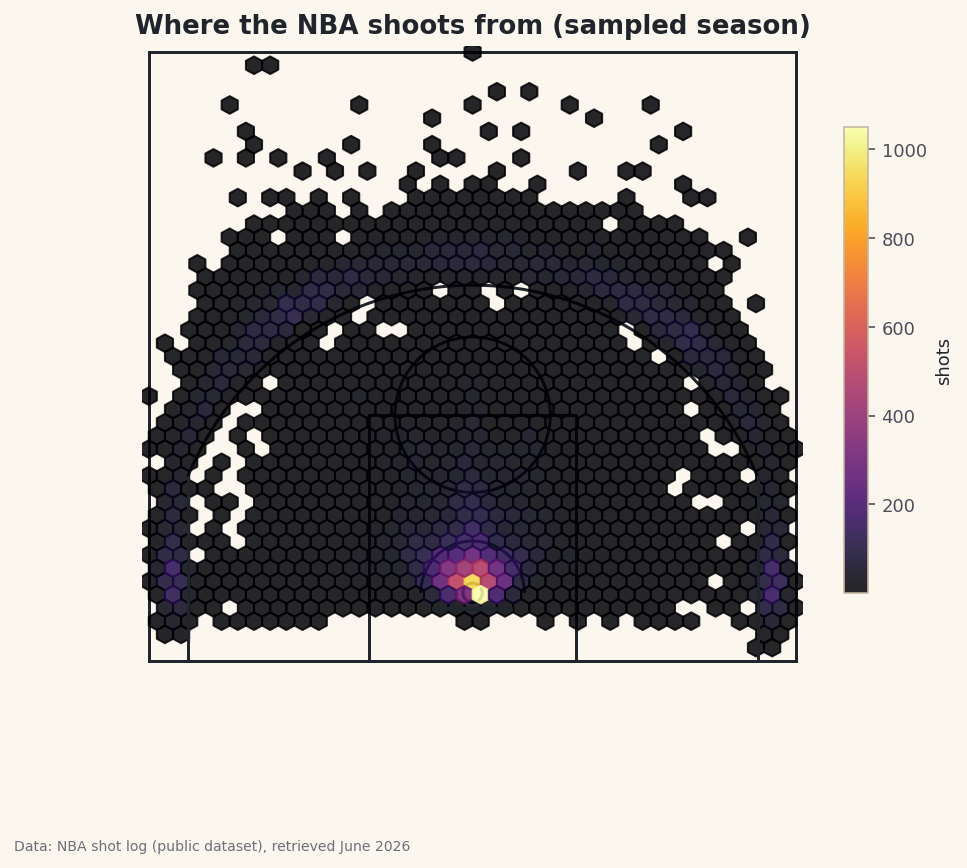
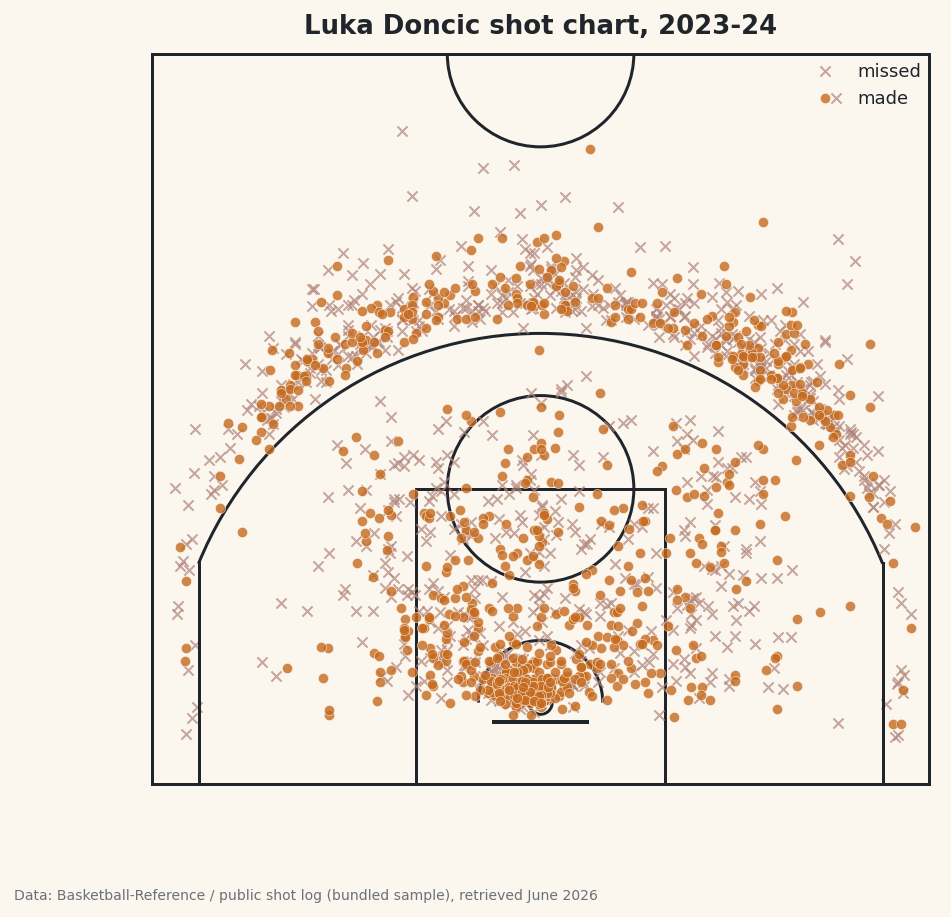
Plot one player's shots and you get a portrait; plot the whole league's shots and you get a fingerprint - and the modern NBA's fingerprint is unmistakable. Draw a regulation half-court, lay a density heatmap over nearly 25,000 real shots, and let the busiest spots on the floor glow. When it renders, two bright zones and a dim band between them jump out: the rim, the three-point line, and the famous "mid-range desert." The whole thing hangs on one matplotlib function you may not have met yet - hexbin.
This builds directly on drawing an NBA shot chart, which set up the half-court geometry we'll reuse here; the difference is that scatter plots individual dots while a heatmap summarizes density. One data note: because stats.nba.com blocks data-center IPs, we read a bundled nba_league_shots.csv - a real public NBA shot-log sample - instead of the live nba_api (the live route is in the shot-chart tutorial). Data retrieved June 2026.
-
Load the shots and trim the backcourt
Each row is one field-goal attempt with court coordinates:
LOC_Xruns left-to-right (negative on the left, positive on the right) andLOC_Yruns from the baseline up toward half-court, both in feet. We keep only half-court shots by dropping the handful of desperation backcourt heaves, which sit far up the floor and would only stretch the plot.python import os import pandas as pd HERE = os.path.dirname(os.path.abspath(__file__)) shots = pd.read_csv(os.path.join(HERE, "nba_league_shots.csv")) shots = shots[shots["LOC_Y"] < 47] # drop rare backcourt heavesHalf-court is 47 feet from the baseline, so
LOC_Y < 47keeps everything in the offensive half and discards the long heaves. Those shots are real but rare, and including them would force the y-axis to stretch toward the far basket, shrinking the part of the court you actually care about into a thin strip. -
Draw the court
We reuse the half-court drawing function from the shot-chart tutorial. matplotlib builds courts out of patches - circles, arcs, and rectangles added to an axis - and wrapping them in one function keeps the plotting code below clean. Each line is one real court marking, measured in feet, with the hoop centered at
(0, 5.25).python import matplotlib.patches as mp def draw_court(ax): """A regulation NBA half-court in feet: baseline at y=0, hoop at (0, 5.25).""" line = "#20242B" ax.add_patch(mp.Circle((0, 5.25), 0.75, fill=False, color=line, lw=1.5)) # rim ax.plot([-3, 3], [4, 4], color=line, lw=2) # backboard ax.add_patch(mp.Rectangle((-8, 0), 16, 19, fill=False, color=line, lw=1.5)) # paint ax.add_patch(mp.Circle((0, 19), 6, fill=False, color=line, lw=1.5)) # FT circle ax.add_patch(mp.Arc((0, 5.25), 8, 8, theta1=0, theta2=180, color=line, lw=1.5)) # restricted ax.plot([-22, -22], [0, 14.2], color=line, lw=1.5) # left corner 3 ax.plot([22, 22], [0, 14.2], color=line, lw=1.5) # right corner 3 ax.add_patch(mp.Arc((0, 5.25), 47.5, 47.5, theta1=22.1, theta2=157.9, color=line, lw=1.5)) # arc ax.add_patch(mp.Rectangle((-25, 0), 50, 47, fill=False, color=line, lw=1.5)) # boundaryThe arcs are the parts worth a second look. The three-point arc is an
Arccentered on the rim with a width and height of47.5feet (that's the diameter, so a 23.75-ft radius), drawn only between the angles where it leaves the straight corner segments. If you want the full tour of why each number is what it is, the shot-chart tutorial walks the court line by line. -
Confirm what you loaded
Before plotting, print how many shots survived the trim and where most of them came from. A quick
value_countson the zone column is a cheap sanity check that the data is sane and the heatmap will have something to show.python print(f"Plotting {len(shots):,} shots.") print("Most shots come from two places:") print(shots["BASIC_ZONE"].value_counts().head(4).to_string())Shot counts by zonePlotting 24,946 shots. Most shots come from two places: BASIC_ZONE Restricted Area 7379 Above the Break 3 7254 In The Paint (Non-RA) 4971 Mid-Range 2779
That's 24,946 shots heading into the plot - a big enough sample that the density pattern will be smooth, not noisy. And the top of the count already foreshadows the picture: the Restricted Area (7,379 shots) and Above the Break 3 (7,254) tower over everything, while the Mid-Range (2,779) trails far behind despite covering a huge chunk of the floor. The heatmap is about to turn those counts into geography.
-
Lay down the hexbin
Now the heatmap itself. A hexbin tiles the court with hexagons and colors each one by how many shots fall inside it - brighter means more shots. We draw the court first, then the hexbin on top, fixing the binning region to the court's dimensions so the hexagons line up with the floor.
python import matplotlib.pyplot as plt fig, ax = plt.subplots(figsize=(7.4, 7)) draw_court(ax) hb = ax.hexbin(shots["LOC_X"], shots["LOC_Y"], gridsize=40, extent=(-25, 25, 0, 47), cmap="inferno", mincnt=1, alpha=0.85)Each argument earns its place.
gridsize=40sets how fine the hexagons are - higher is more detailed but noisier.extent=(-25, 25, 0, 47)pins the binning grid to the exact court rectangle so the hexagons don't drift.mincnt=1hides empty cells, leaving the bare court showing through where no one shoots. Andcmap="inferno"gives that dark-to-bright "heat" ramp where the most-used spots blaze. The slightalpha=0.85lets the court lines stay faintly visible beneath the color. -
Finish the court and add a color scale
A heatmap is only readable with a legend for its colors, so we add a colorbar labeled "shots." We also lock the aspect ratio to equal - non-negotiable for a court, or the circles would squash into ovals - turn the axes off, and set the limits to frame the floor neatly.
python ax.set_xlim(-25.5, 25.5) ax.set_ylim(-1, 47.5) ax.set_aspect("equal") ax.axis("off") cb = fig.colorbar(hb, ax=ax, shrink=0.6) cb.set_label("shots", fontsize=9) ax.set_title("Where the NBA shoots from (sampled season)") fig.savefig("shot_heatmap.png", dpi=144, bbox_inches="tight")Data: NBA shot log (public dataset), retrieved June 2026 And there's the fingerprint. The single brightest cell sits right at the rim, where layups and dunks pile up. A second band of color traces the three-point line - hottest in the corners and across the top of the arc. Between them, the mid-range glows dimly: the "desert" you read about in the shot-zone efficiency table is now something you can see, an actual hollow in the floor.
shrink=0.6just keeps the colorbar from towering over the square court, andax.axis("off")strips the plot frame so nothing competes with the heat.
Troubleshooting
The court looks squashed and the arcs are ellipses
You're missing ax.set_aspect("equal"). Without it, matplotlib scales the x and y axes independently to fill the figure, stretching the court. Setting the aspect to equal forces one foot on x to equal one foot on y, so circles stay circular and the heatmap sits where it should.
The whole plot is one solid color, or the hexbin floats off the court
The extent doesn't match your coordinates. hexbin bins over the rectangle you pass in extent=(-25, 25, 0, 47); if your LOC_X/LOC_Y are in different units (for instance tenths of a foot from the live API), the points land far outside that box. Confirm your coordinates are in feet from the baseline first - the shot-chart tutorial covers converting the live endpoint's units.
The heatmap looks blocky and noisy
Your gridsize is too high for the sample size, so many hexagons hold only a shot or two. Lower gridsize (try 30) to pool more shots per cell and smooth the picture, or gather more shots. There's a genuine trade-off between detail and smoothness; tune it to your data.
Empty parts of the court are filled with dark color instead of bare floor
Add mincnt=1 to hexbin. Without it, cells with zero shots are still drawn in the colormap's lowest color, painting over the court. With mincnt=1, only cells that actually contain a shot are colored, and the empty court shows through.
Challenge yourself
A density map shows where shots happen, not where they succeed. Swap the plain count for efficiency: pass C=shots["SHOT_MADE"] and reduce_C_function=np.mean to hexbin so each hexagon is colored by its field-goal percentage instead of its volume - now hot and cold zones light up, and you'll see the rim glow even brighter while some long twos go cold. For the one-player version of this idea, revisit the NBA shot chart and replace its scatter with a hexbin too.
Get the code
Here's the complete, working script for this tutorial. It runs exactly as shown.
Download the finished script (29_draw_a_league_wide_nba_shot_heatmap.py)This script imports a small shared helper (and reads any bundled sample data) that live next to it in /downloads/ — grab these into the same folder so it runs as-is: sdt_common.py, sdt_nba.py.