The Efficiency Landscape: Plotting Offensive vs. Defensive Rating
What you'll build
A four-quadrant scatter of every NBA team's offense and defense, split by the league-average crosshairs.
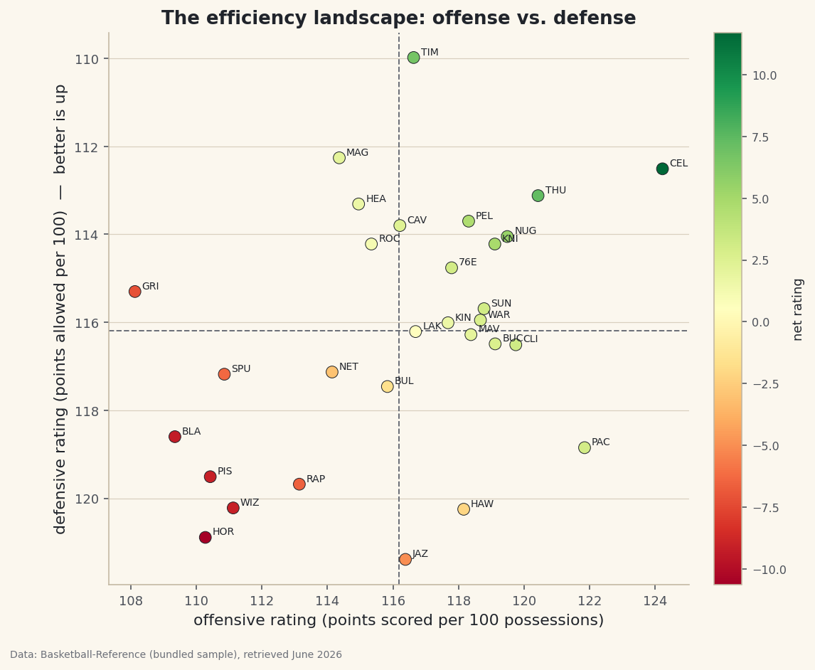
A standings table tells you who is winning. It doesn't tell you how. Two 50-win teams can be built completely differently — one bludgeoning opponents on offense, the other suffocating them on defense. The cleanest way to see that at a glance is to plot every team's offensive rating against its defensive rating on a single chart and split it into four quadrants. Build exactly that from the bundled NBA team ratings, and one picture separates the contenders from the rebuilders.
This pairs naturally with the net-rating dashboard table: that tutorial ranks teams; this one shows the whole landscape. The data is the bundled nba_ratings.csv (per-100-possession ratings, Basketball-Reference, retrieved June 2026), so it runs offline.
-
Load the ratings and find the league average
Offensive rating (
ORtg) is points scored per 100 possessions; defensive rating (DRtg) is points allowed per 100; net rating (NRtg) is the difference. Because both ends are measured on the same per-100 scale, league-average offense and league-average defense are the same number — the crosshairs of our chart.python import pandas as pd df = pd.read_csv("nba_ratings.csv") # Team, W, L, W/L%, ORtg, DRtg, NRtg lg_off = df["ORtg"].mean() lg_def = df["DRtg"].mean() print(df.sort_values("NRtg", ascending=False)[["Team", "ORtg", "DRtg", "NRtg"]].head().to_string())League average and the best net ratingsLeague-average rating: 116.2 offense / 116.2 defense Best net rating: Team ORtg DRtg NRtg 0 Boston Celtics 124.23 112.51 11.71 1 Oklahoma City Thunder 120.43 113.12 7.31 2 Minnesota Timberwolves 116.63 109.98 6.65 3 Denver Nuggets 119.49 114.05 5.44 4 New York Knicks 119.11 114.22 4.89The league averages out to about 116 points per 100 possessions on each end. At the top, the Celtics pair an elite offense (124.2) with a strong defense (112.5) for a net rating near +12 — the signature of a true contender. Minnesota gets there the opposite way, anchored by the league's stingiest defense (about 110).
-
A short label for each point
Thirty full team names would turn the chart into spaghetti. We derive a three-letter tag from each nickname — the last word of the name, trimmed and upper-cased.
python df["Tag"] = df["Team"].str.split().str[-1].str[:3].str.upper() # "Boston Celtics" -> "CEL", "Denver Nuggets" -> "NUG"Chaining string methods with the
.straccessor is the pandas way to transform a whole column at once, with no loop. -
Draw the quadrant scatter
Now the payoff. We scatter
ORtgon the x-axis andDRtgon the y-axis, color each point by net rating, and draw dashed lines at the league averages. The one trick that makes it readable: invert the y-axis, because a lower defensive rating is better, and we want good defenses at the top.python import matplotlib.pyplot as plt fig, ax = plt.subplots(figsize=(8, 7)) sc = ax.scatter(df["ORtg"], df["DRtg"], c=df["NRtg"], cmap="RdYlGn", s=70, edgecolor="#20242B", linewidth=0.5) ax.axvline(lg_off, color="#6C7079", ls="--") ax.axhline(lg_def, color="#6C7079", ls="--") for _, r in df.iterrows(): ax.annotate(r["Tag"], (r["ORtg"], r["DRtg"]), textcoords="offset points", xytext=(5, 2), fontsize=7) ax.invert_yaxis() # better defense (lower DRtg) now sits at the top fig.colorbar(sc, ax=ax).set_label("net rating") fig.savefig("efficiency_quadrant.png", dpi=144, bbox_inches="tight")Data: Bundled sample (NBA team ratings), retrieved June 2026 Read it by quadrant. Top-right is the promised land: above-average offense and defense (the green points). Bottom-left is a rebuild — below average at both ends. The other two corners are the lopsided teams: great offense with a leaky defense (bottom-right), or a defense-first grinder that can't score (top-left). One chart, and every team's identity is obvious.
Troubleshooting
The best teams are in the bottom-right, not the top-right
You skipped ax.invert_yaxis(). Without it, low (good) defensive ratings sit at the bottom, so elite defenses look like they're struggling. Inverting the axis puts "good" up where readers expect it.
The team tags overlap and collide
With 30 labels some crowding is unavoidable on a static chart. Nudge them with the xytext offset, shrink the font, or label only the teams you want to highlight (filter the DataFrame before the annotate loop). For full de-confliction, the adjustText library repositions labels automatically.
The colorbar squishes the plot
Pass fraction=0.046, pad=0.04 to fig.colorbar to keep it slim, or give the figure a little more width in figsize.
Challenge yourself
Scale each point by wins — pass s=df["W"]*4 to scatter — so good records literally loom larger, and check whether the biggest dots really do cluster in the top-right. Then label the four quadrants with ax.text ("Contenders", "Rebuild", and the two lopsided corners) so the chart explains itself to someone who's never seen a rating before.
Get the code
Here's the complete, working script for this tutorial. It runs exactly as shown.
Download the finished script (42_efficiency_landscape_ortg_vs_drtg.py)This script imports a small shared helper (and reads any bundled sample data) that live next to it in /downloads/ — grab these into the same folder so it runs as-is: sdt_common.py, sdt_nba.py.