The Rise of the Three-Pointer: Two Decades of NBA Shot Selection
What you'll build
A chart of the three-point share of NBA shots, season by season.
Some changes in sports happen overnight; the three-point revolution happened in slow motion, one season at a time, until the game looked nothing like it used to. The whole story fits on a single line of a chart. Load real per-season NBA shot totals from 2004 through 2024, compute what fraction of all shots were three-point attempts, and watch that share more than double in front of you. It's a small amount of code for a big idea: how to take twenty years of data and make a trend speak.
This is an advanced follow-on to drawing an NBA shot chart - there you plotted one player's season; here we zoom all the way out to the whole league across two decades. As with the other NBA tutorials, stats.nba.com blocks data-center IPs, so we read a bundled nba_three_point_trend.csv - real per-season league totals - rather than the live nba_api (the live route lives in the shot-chart tutorial). Data retrieved June 2026.
-
Load the per-season totals
The file is small and tidy: one row per season, with the league-wide total field-goal attempts (
FGA), total three-point attempts (FG3A), and a precomputed rate column (FG3A_rate, the fraction of shots that were threes). We read it and sort by season so the timeline runs in order - never assume a CSV arrives sorted.python import os import pandas as pd HERE = os.path.dirname(os.path.abspath(__file__)) trend = pd.read_csv(os.path.join(HERE, "nba_three_point_trend.csv")).sort_values("season")Sorting up front matters more than it looks: a line chart connects points in row order, so if the seasons were shuffled, your "trend" line would zig-zag backward through time into nonsense. One
.sort_values("season")guarantees a left-to-right timeline. -
Turn the rate into a percentage
The
FG3A_ratecolumn is a fraction like 0.187. Humans read percentages more easily than fractions, so we make a friendlyshare_pctcolumn - the rate times 100, rounded to one decimal.python trend["share_pct"] = (trend["FG3A_rate"] * 100).round(1)That's the entire transformation. The hard analytical work - counting every shot in the league for twenty seasons - is already baked into the file; our job is just to present it clearly. Multiplying by 100 and rounding to a single decimal is the difference between "0.395" and a readable "39.5%."
-
Print the endpoints of the story
Before charting, let's confirm the data and state the headline in numbers. We show the first three and last three seasons stitched together, then print the change from the first season to the last.
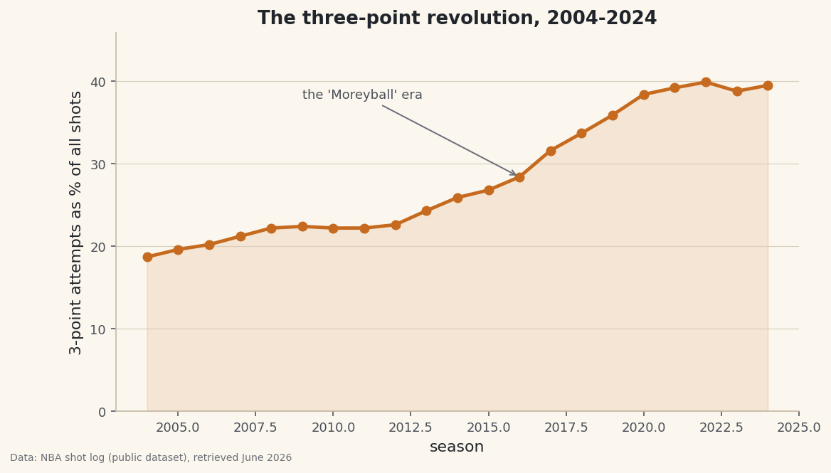
python show = trend[["season", "FGA", "FG3A", "share_pct"]].rename(columns={"share_pct": "3PA_share%"}) print("Three-point attempt share, by season:") print(pd.concat([show.head(3), show.tail(3)]).to_string(index=False)) first, last = trend.iloc[0], trend.iloc[-1] print(f"\nFrom {first['share_pct']}% in {int(first['season'])} to " f"{last['share_pct']}% in {int(last['season'])} - more than doubled.")Three-point share, first and last seasonsThree-point attempt share, by season: season FGA FG3A 3PA_share% 2004 189803 35493 18.7 2005 197626 38748 19.6 2006 194314 39313 20.2 2022 216722 86535 39.9 2023 217220 84164 38.8 2024 218701 86355 39.5 From 18.7% in 2004 to 39.5% in 2024 - more than doubled.
There's the whole revolution in two lines of output. In 2004, just 18.7% of NBA shots were threes - fewer than one in five. By 2024 it was 39.5% - nearly two in five. The raw counts tell the same story: total league field-goal attempts barely moved (about 190,000 to 219,000), but three-point attempts leapt from roughly 35,000 to over 86,000. Teams didn't shoot much more; they radically changed where they shot from. Note how
pd.concat([head, tail])lets us preview both ends of a long table without printing the twenty seasons in between. -
Draw the trend line
Now the payoff. A single line with a marker at each season shows the climb; a light fill underneath gives it weight; and we leave a little headroom at the top of the y-axis so the line doesn't crash into the title.
python import matplotlib.pyplot as plt fig, ax = plt.subplots(figsize=(8.6, 4.8)) ax.plot(trend["season"], trend["share_pct"], marker="o", linewidth=2.4, color="#C56A1E") ax.fill_between(trend["season"], trend["share_pct"], color="#C56A1E", alpha=0.12) ax.set_ylim(0, trend["share_pct"].max() + 6) ax.set_xlabel("season") ax.set_ylabel("3-point attempts as % of all shots") ax.set_title("The three-point revolution, 2004-2024")Starting the y-axis at 0 is a deliberate honesty choice: because the baseline is zero, the visual height of the line is proportional to the real share, so the doubling looks like a doubling instead of being exaggerated by a chopped axis. The faint
fill_betweenunderneath isn't decoration - it reads as "this much of every game's shots," turning an abstract line into a sense of volume. -
Annotate the turning point
A good chart points at its own punchline. The steepest part of the climb is the mid-2010s - the "Moreyball" era, named for the Houston executive Daryl Morey, when analytics-driven offenses leaned all the way into the three. We drop an arrow on the 2016 season to mark it, then save.
python ax.annotate("the 'Moreyball' era", xy=(2016, trend.loc[trend['season'] == 2016, 'share_pct'].iloc[0]), xytext=(2009, trend["share_pct"].max() - 2), fontsize=9, color="#4A4F58", arrowprops=dict(arrowstyle="->", color="#6C7079")) fig.savefig("three_point_era.png", dpi=144, bbox_inches="tight")Data: NBA shot log (public dataset), retrieved June 2026 The two arguments to
annotatedo different jobs:xyis the point the arrow tip lands on (the 2016 data point, looked up by filtering the DataFrame for that season), andxytextis where the label text sits, parked over empty space in the upper-left so it never collides with the line. Annotation is what separates a chart that merely shows a trend from one that explains it - the reader's eye is led straight to the moment the curve bends.
Troubleshooting
The line zig-zags backward instead of climbing smoothly
The seasons aren't in order. A line plot connects points in the DataFrame's row order, so an unsorted file produces a tangled line that jumps back and forth in time. Always .sort_values("season") right after reading the CSV, before you plot.
The annotation arrow points at the wrong spot or raises an IndexError
The lookup trend.loc[trend['season'] == 2016, 'share_pct'].iloc[0] needs a row where season equals exactly 2016. If your data uses a different season label (a string like "2015-16", or a different year range), that filter returns nothing and .iloc[0] fails. Point the annotation at a season that actually exists in your file.
The percentages look like 0.39 instead of 39
You charted the raw FG3A_rate fraction instead of the share_pct column. The rate is on a 0-to-1 scale; multiply by 100 first so the y-axis reads in familiar percentage points, and label it clearly so no one mistakes the units.
Challenge yourself
A share going up doesn't prove the threes are better - maybe teams just shoot more of a worse shot. Test it: if the file includes makes as well as attempts, add a second line for league three-point accuracy (FG3M / FG3A) over the same years and see whether percentage held steady even as volume exploded (it largely did - which is exactly why the volume made sense). For the efficiency case behind the trend, pair this with the points-per-shot math in the shot-zone efficiency table.
Get the code
Here's the complete, working script for this tutorial. It runs exactly as shown.
Download the finished script (28_the_rise_of_the_three_pointer.py)This script imports a small shared helper (and reads any bundled sample data) that live next to it in /downloads/ — grab these into the same folder so it runs as-is: sdt_common.py, sdt_nba.py.