Does Shooting More Threes Actually Win Games? Two Decades of Evidence
What you'll build
A capstone analysis: a three-panel exhibit pairing the 2004-2024 three-point trend with a value calculation and a league-level regression, landing one honest finding.
Here is the question every fan has argued and almost no one has actually checked against twenty years of data: does shooting more threes win games? The honest answer is more interesting than either side of the bar-stool argument. Across 2004–2024 the three-point share of all NBA shots more than doubled — and three-point accuracy barely moved at all. The revolution was never about making a higher percentage of threes. It was about shot value: a 35% three is worth more per attempt than a 50% two, and once teams did that arithmetic they simply took far more of the more-valuable shot. This is a capstone, so we won't stop at a single technique — we'll pair two trends, an expected-value calculation, and a regression to earn that finding, then be honest about exactly how far it does and doesn't reach.
This pulls together two earlier pieces: The Rise of the Three-Pointer (the volume trend) and Correlation and Regression: What Predicts Winning (r, R², and a fitted line). If either is unfamiliar, read it first — here we assume both and put them to work on one question. The data is the bundled nba_three_point_trend.csv: real NBA league-wide totals for every season from 2004 through 2024, so the whole analysis runs offline. Data retrieved June 2026.
-
Set up the question with the right columns
The file is one row per season. We have league-wide field-goal attempts (
FGA), three-point attempts (FG3A), the three-point share (FG3A_rate), and two accuracy columns:FG_pct(overall make rate) andFG3_pct(three-point make rate). To compare shots fairly we also derive effective field-goal percentage (eFG%), which credits a made three as 1.5 made twos — the single honest "efficiency" number because it bakes in that a three is worth more.python import os import numpy as np import pandas as pd HERE = os.path.dirname(os.path.abspath(__file__)) trend = pd.read_csv(os.path.join(HERE, "nba_three_point_trend.csv")).sort_values("season") trend["share_pct"] = (trend["FG3A_rate"] * 100).round(1) # threes as % of all shots trend["fg3_pct"] = (trend["FG3_pct"] * 100).round(1) # how often a three goes in # eFG = (FGM + 0.5*FG3M) / FGA, derived from the totals we already have trend["FGM"] = trend["FGA"] * trend["FG_pct"] trend["FG3M"] = trend["FG3A"] * trend["FG3_pct"] trend["eFG_pct"] = ((trend["FGM"] + 0.5 * trend["FG3M"]) / trend["FGA"] * 100).round(2)Sorting by season up front matters: a line connects points in row order, so a shuffled CSV would zig-zag your "trend" backward through time. One
.sort_values("season")guarantees a clean left-to-right timeline. -
Technique 1 & 2: two trends, side by side
The whole argument starts here. Put the volume trend and the accuracy trend next to each other and the surprise jumps out: one line climbs relentlessly, the other is essentially a flat band.
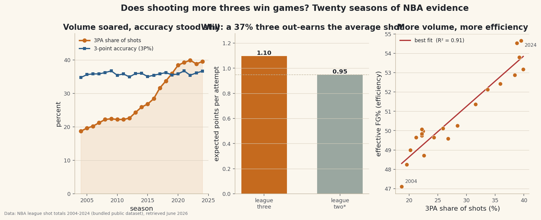
python first, last = trend.iloc[0], trend.iloc[-1] print("3PA share:", first["share_pct"], "->", last["share_pct"], " x", round(last["FG3A_rate"] / first["FG3A_rate"], 2)) print("3P% accuracy:", first["fg3_pct"], "->", last["fg3_pct"], " range", trend["fg3_pct"].min(), "-", trend["fg3_pct"].max())Volume more than doubled; accuracy never left a ~3-point bandTHREE-POINT VOLUME vs ACCURACY, league-wide 3PA share of all shots : 18.7% (2004) -> 39.5% (2024) +20.8 points, x2.11 the share 3-point accuracy (3P%) : 34.7% (2004) -> 36.6% (2024) +1.9 points over 21 seasons 3P% range across era : 34.7% - 36.7% (std 0.55) Volume more than doubled; accuracy never left a ~3-point band.Read those two lines together. The three-point share went from 18.7% to 39.5% of all shots — 2.11× what it was. Over the same 21 seasons three-point accuracy crept from 34.7% to 36.6%, a 1.9-point change, and never once left a roughly three-point band (standard deviation just 0.55). Teams did not get meaningfully better at making threes. They got dramatically more willing to take them. That contradiction is the heart of the question, and it points us straight at the only thing that can explain it: value.
-
Technique 3: expected value — why the share rose
Strip the romance out and a shot is a bet with a known payout. Multiply the make rate by the points to get expected points per attempt. Do that for a league-average three versus a league-average shot and the answer that drove twenty years of strategy appears in two lines.
python three_pct = last["FG3_pct"] # league 3P% two_pct = last["FG_pct"] # overall make rate, a fair league-two proxy pts_per_three = 3 * three_pct pts_per_two = 2 * two_pct breakeven = pts_per_two / 3 # the 3P% at which a three equals that two print(round(pts_per_three, 3), "vs", round(pts_per_two, 3), " break-even 3P%:", round(breakeven, 3))A 36.6% three out-earns the average shotEXPECTED POINTS PER SHOT (using 2024 league rates) league three : 0.366 x 3 = 1.097 pts/attempt league two* : 0.474 x 2 = 0.949 pts/attempt * overall make rate as a league-two proxy break-even 3P%: a three only needs 31.6% to match that two At a 36.6% three the league earned +15.7% more per attempt than its average shot - that gap, not better aim, is the whole case.
A three at the 2024 league rate returns 1.097 points per attempt; the average shot returns 0.949. The three is worth about 15.7% more per attempt — and the break-even is brutal: a three only has to go in 31.6% of the time to match that average two. That gap, not better aim, is the entire case for chucking more. The math was sitting in plain sight for decades; the analytics era just started acting on it.
-
Technique 4: regression — did volume track efficiency?
A value argument predicts something testable: if leaning into threes really is more efficient, seasons with a higher three-point share should also be seasons with higher overall efficiency. We test it directly — correlate the 3PA share against eFG% across the 21 seasons, with a correlation coefficient, an R², and a fitted line, exactly as in the regression tutorial.
python x = trend["share_pct"].to_numpy() y = trend["eFG_pct"].to_numpy() r = float(np.corrcoef(x, y)[0, 1]) slope, intercept = np.polyfit(x, y, 1) print("r =", round(r, 3), " R^2 =", round(r ** 2, 3), " line: eFG% =", round(slope, 3), "* share +", round(intercept, 2))A strong era-level associationLEAGUE-LEVEL REGRESSION (one point per season, 2004-2024) x = 3PA share of shots, y = effective FG% (efficiency) correlation r : 0.952 R-squared : 0.907 (91% of season-to-season eFG% variation) best-fit line : eFG% = 0.261 x (3PA share) + 43.42 reading : each +1 point of 3PA share tracks +0.261 points of eFG% Strong era-level association - but read the limitations before you bet on it.
The association is strong: r = 0.952, R² = 0.907 — the three-point share alone tracks roughly 91% of the season-to-season variation in league efficiency, and each extra point of 3PA share goes with about +0.26 points of eFG%. As a description of the era, the verdict is clear: the league got more efficient as it got threeier, in step, year after year. Now for the part that separates analysis from a hot take.
-
The exhibit: three panels, one argument
One figure carries the whole case. Panel A is the two trends together (the contradiction); Panel B is the value gap that resolves it; Panel C is the league-level regression that confirms volume and efficiency moved as one.
python import matplotlib.pyplot as plt fig, axes = plt.subplots(1, 3, figsize=(13.5, 4.8)) axes[0].plot(trend["season"], trend["share_pct"], marker="o", label="3PA share") axes[0].plot(trend["season"], trend["fg3_pct"], marker="s", label="3P% accuracy") axes[1].bar(["three", "two*"], [pts_per_three, pts_per_two]) axes[2].scatter(x, y); axes[2].plot([x.min(), x.max()], [slope * x.min() + intercept, slope * x.max() + intercept]) fig.suptitle("Does shooting more threes win games? Twenty seasons of evidence") fig.savefig("threes_evidence.png", dpi=144, bbox_inches="tight")Data: Bundled NBA league shot totals 2004-2024 (public dataset), retrieved June 2026 The finding, stated plainly: the three-point era was won on shot value, not better aim. Volume more than doubled, accuracy stood still, the per-shot value of a three sat 16% above the average attempt the whole time, and league efficiency rose lockstep with volume. "Shoot more threes" works because the threes were underpriced, not because anyone learned to make more of them.
-
Now read the limitations — before you believe it
This is league-level evidence, and that buys honesty a seat at the table:
- Ecological inference. Each dot is a whole season, not a team or a game. A relationship that holds across league-years need not hold for any individual team — inferring the team from the aggregate is the ecological fallacy. This analysis cannot tell you that your team wins by jacking up more threes.
- Correlation is not causation. The 0.95 correlation is real, but the same two decades brought better spacing, rule changes that opened the floor, smarter shot selection, and load-management analytics. Threes and efficiency may both be downstream of "teams got more analytical," and our regression cannot separate those.
- eFG% is not winning. We measured offensive efficiency, not wins. Threes are higher-variance and can be rebounded long; a finding about points-per-shot is a step removed from a finding about the standings.
- Volume has a ceiling. A linear fit through 2004–2024 says nothing about what happens past it. Defenses adapt; the value edge shrinks as everyone exploits it. Extrapolating the line off the right edge of the chart is exactly the mistake the limitation warns against.
The intellectual lineage here is worth crediting: this is "Moreyball," after Daryl Morey's Houston Rockets, and the broader analytics-era argument that shot value — expected points per attempt — should drive selection over shot difficulty or aesthetics. The data backs the era-level story cleanly. It just can't, on its own, promise it to any one team on any one night. That gap between a strong association and a causal guarantee is the whole reason we run the regression and write the caveats.
Troubleshooting
My eFG% column comes out as a fraction near 0.5, not a percent
You skipped the * 100. eFG = (FGM + 0.5*FG3M) / FGA is naturally a fraction; multiply by 100 (and round) for a readable percent. Keep your units consistent across columns or the regression slope will look ten times too big or small.
My correlation is suspiciously perfect (r near 1)
That's expected here and it's a warning, not a triumph. With only 21 points and two quantities that both trend smoothly over time, almost anything correlates with anything — this is spurious-correlation territory. The high R² describes the era; it does not prove threes caused the efficiency. Treat the limitations section as part of the result, not an afterthought.
Should I use overall FG% as the two-point rate?
It's a proxy, flagged with an asterisk in the chart. Overall FG% includes the threes themselves, so the true two-point make rate is a touch higher. The conclusion is robust to it: the break-even three (31.6%) sits well below what the league actually shoots, so the value edge survives any reasonable correction. If your dataset carries a real two-point make rate, swap it in.
Challenge yourself
Turn the ecological caveat into a test you can run. Take a single-season team table (the bundled nba_ratings.csv pairs each team with its offensive rating) and, if you can attach each team's 3PA share, regress team efficiency on team three-point volume within one season. Does the strong league-year relationship survive at the team level — or does it weaken, exactly as the ecological-fallacy warning predicts? Then extend the value calculation: compute the break-even 3P% for every season in the file and chart it, showing how the bar a three has to clear has drifted as overall shooting changed.
Get the code
Here's the complete, working script for this tutorial. It runs exactly as shown.
Download the finished script (63_does_shooting_more_threes_win_games.py)This script imports a small shared helper (and reads any bundled sample data) that live next to it in /downloads/ — grab these into the same folder so it runs as-is: sdt_common.py, sdt_nba.py.