Crosstabs: Build a Contingency Table to Test Home Advantage
What you'll build
A home-vs-away win table broken down by margin of victory, charted as home win share.
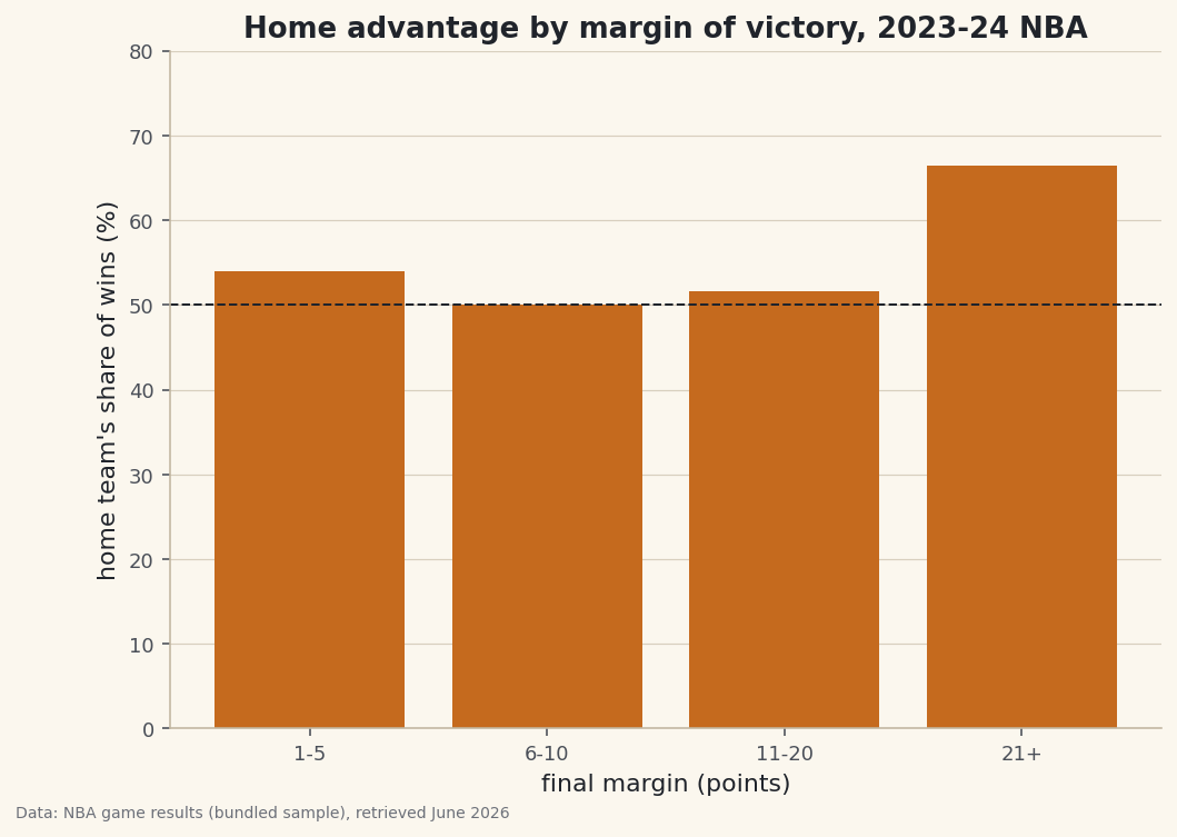
"Teams win more at home" is a hunch. A contingency table turns it into numbers. pd.crosstab() counts how often two categorical variables occur together — here, who won (home or away) against how decisive the game was — and one keyword flips those counts into the rates that tell the story. We'll find that home advantage isn't flat: it barely exists in tight games and balloons in blowouts.
This builds on Group, Pivot, and Reshape. The data is the bundled nba_home_results.csv (real 2023-24 NBA game results), so it runs offline.
-
Make two categorical columns
A crosstab needs two category columns. We derive both from the score: who won, and which margin band the game fell into.
pd.cutbins the absolute margin into labeled tiers.python import pandas as pd games = pd.read_csv("nba_home_results.csv") games["winner"] = (games["home_pts"] > games["away_pts"]).map({True: "Home", False: "Away"}) games["abs_margin"] = (games["home_pts"] - games["away_pts"]).abs() games["margin_tier"] = pd.cut(games["abs_margin"], bins=[0, 5, 10, 20, 100], labels=["1-5", "6-10", "11-20", "21+"])That gives every game a
winner(Home/Away) and amargin_tier— exactly the two axes of the table we want. -
crosstab counts the pairs
Pass the two columns and
crosstabreturns a grid: rows are margin tiers, columns are winners, cells are how many games fall in each combination. Addnormalize="index"and each row becomes proportions that sum to 1.python counts = pd.crosstab(games["margin_tier"], games["winner"]) rates = pd.crosstab(games["margin_tier"], games["winner"], normalize="index").round(3) print(counts.to_string()) print(rates.to_string()) print("Overall home win rate:", round((games["winner"] == "Home").mean(), 3))Counts, then home/away share within each tierCounts: winner Away Home margin_tier 1-5 132 155 6-10 173 173 11-20 184 196 21+ 73 145 Row-normalized (home/away share within each margin tier): winner Away Home margin_tier 1-5 0.460 0.540 6-10 0.500 0.500 11-20 0.484 0.516 21+ 0.335 0.665 Overall home win rate: 0.543
Read the bottom row: in games decided by 21+ points, the home team won about two-thirds of the time, versus a near-even split in 6-10 point games. The overall home win rate (~0.54) hides that structure — the crosstab is what exposes it.
-
Chart the row you care about
The normalized table already holds the answer; a bar of the home-win share per tier makes the trend impossible to miss. A reference line at 50% marks "no advantage".
python import matplotlib.pyplot as plt home_share = rates["Home"] * 100 fig, ax = plt.subplots(figsize=(8, 5.5)) ax.bar(home_share.index.astype(str), home_share.values, color="#C56A1E") ax.axhline(50, color="#20242B", lw=1, ls="--") # 50% = no home advantage ax.set_xlabel("final margin (points)"); ax.set_ylabel("home share of wins (%)") fig.savefig("home_advantage_crosstab.png", dpi=144, bbox_inches="tight")Data: Bundled sample (NBA game results), retrieved June 2026 A natural reading is that home advantage shows up most when games get away from a team — close games are coin-flips, but lopsided ones tilt home. The crosstab doesn't explain why; it just gives you the clean, countable pattern to reason about.
Troubleshooting
How is crosstab different from pivot_table?
They're cousins. crosstab defaults to counting occurrences of category pairs and takes the columns directly. pivot_table defaults to averaging a values column and works on a DataFrame. For "how many fall in each combination?", crosstab is the shorter path.
My percentages don't sum the way I expect
Pick the normalize axis on purpose. normalize="index" makes each row sum to 1, "columns" makes each column sum to 1, and True makes the whole table sum to 1. We wanted "within each margin tier", which is per-row, so "index".
A tier is empty or missing
Your cut bins didn't cover the data's range, so values fell outside every bin and became NaN. Make sure the outer edges span the real min and max — here the top bin reaches 100 to catch every blowout.
Challenge yourself
Add a third category — bucket games by total points scored (low/medium/high) — and pass a list of two columns to crosstab's index to build a multi-level contingency table. Then recompute the home-win share and check: does home advantage depend on whether the game is high- or low-scoring, or only on the margin?
Get the code
Here's the complete, working script for this tutorial. It runs exactly as shown.
Download the finished script (56_crosstab_contingency_tables.py)This script imports a small shared helper (and reads any bundled sample data) that live next to it in /downloads/ — grab these into the same folder so it runs as-is: sdt_common.py, sdt_nba.py.