Is the Difference Real? A Permutation Test
What you'll build
A permutation test on the NBA home-scoring edge: shuffle home/away thousands of times, build the null distribution, and read a p-value off it.
You measured a difference — home teams scored 2.16 more points per game than visitors. The next question is the one that separates analysis from anecdote: is that real, or could chance alone produce a gap that big? The permutation test answers it without a single formula from a stats textbook. You just simulate a world where the effect doesn't exist, thousands of times, and check whether your real result could plausibly have come from it. If it couldn't, the effect is real.
Go deeper with the free textbook: Nonparametric Methods at DataField.dev.
This pairs with Bootstrap a Confidence Interval — bootstrapping asks “how precise is my estimate?”, a permutation test asks “is the effect there at all?”. Both are resampling, both are pure numpy. The data is the bundled nba_home_results.csv (1,231 real 2023-24 games), so it runs offline.
-
Measure the real effect
For each game, take the home margin in points (home minus away), then average it. That average is the observed home-scoring edge.
python import numpy as np import pandas as pd df = pd.read_csv("nba_home_results.csv") diff = (df["home_pts"] - df["away_pts"]).to_numpy(float) # per-game home - away observed = diff.mean()The observed edgeGames: 1231 Home avg: 115.29, Away avg: 113.13 Observed mean (home - away): 2.16 points
Home teams averaged 2.16 points more. It looks like a home-court effect — but “looks like” isn't evidence. We need to know what chance alone could do.
-
Build the null world
Here's the key idea. If home/away truly didn't matter, then within each game the two scores would be interchangeable — it would be pure coincidence which one we labeled “home.” So we simulate that null world by randomly flipping the sign of each game's difference, then recomputing the average. Do it thousands of times and you get the full range of average edges chance can manufacture when there's no real effect.
python rng = np.random.default_rng(2026) N = 20000 signs = rng.choice([-1.0, 1.0], size=(N, len(diff))) # random flip per game null_means = (signs * diff).mean(axis=1) # one fake "edge" per shuffleEach of the 20,000
null_meansis the home edge you’d have measured in a world where home advantage is a myth and the labels are arbitrary. The whole distribution is centered on zero, as it must be. -
Read the p-value
The p-value is simply: how often did the null world produce an edge as extreme as the real 2.16 (in either direction)?
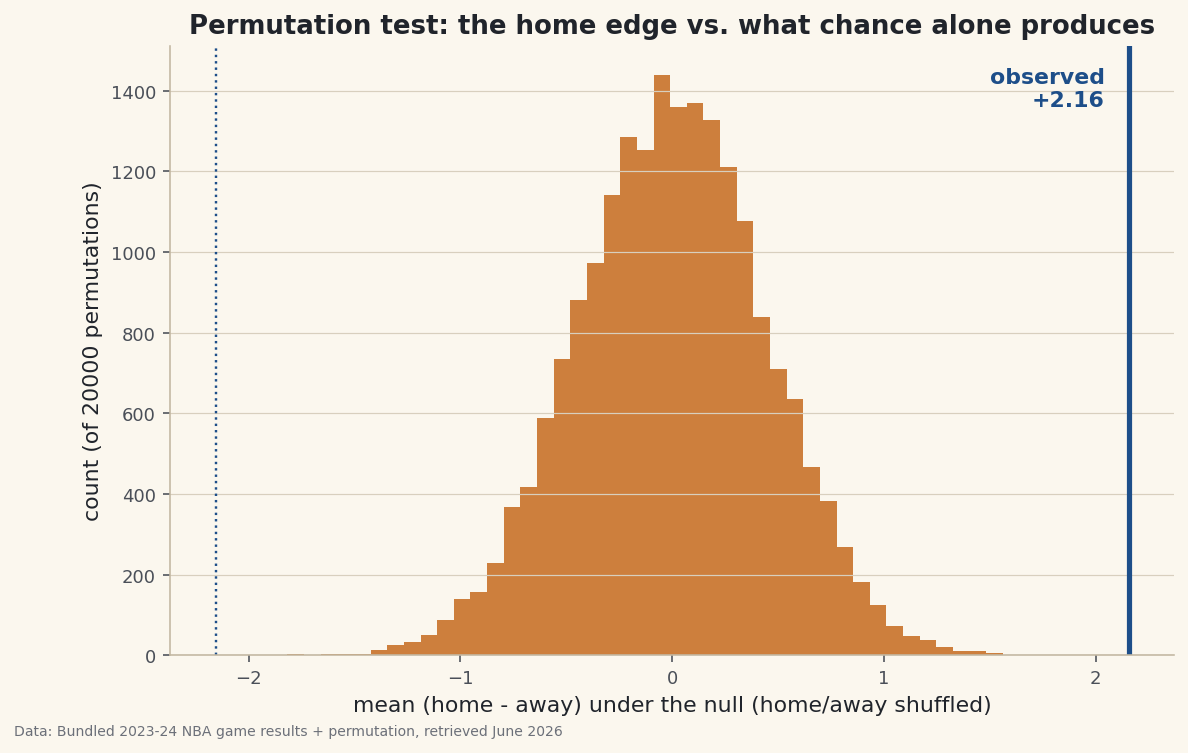
python p = np.mean(np.abs(null_means) >= abs(observed)) print("p-value:", p)What chance alone can doPermutations: 20000 Null distribution: mean -0.002, std 0.447 Biggest gap chance alone produced: 2.11 points p-value (two-sided): 0.0000 Observed 2.16 is far outside what chance produces -> the home edge is real.
The answer: essentially never. Across 20,000 shuffles, the biggest edge chance produced was about 2.11 points — and the real one is 2.16, sitting outside the entire null distribution (p < 0.0001). A gap this size simply doesn’t happen when home and away are interchangeable, so the home-scoring edge is real, not luck.
-
See it
The picture is the proof. Histogram the 20,000 null edges and drop a line at the observed value — it lands off in the empty tail, far from anything chance generated.
python import matplotlib.pyplot as plt fig, ax = plt.subplots(figsize=(9, 5.5)) ax.hist(null_means, bins=50) ax.axvline(observed, color="#1D4E89", lw=2.6) # the real edge ax.set_xlabel("mean (home - away) under the null") fig.savefig("permutation_null.png", dpi=144, bbox_inches="tight")Data: Bundled sample (real 2023-24 NBA game results) + permutation, retrieved June 2026 That gap between the line and the histogram is the effect. The wider it is, the more confident you can be that what you measured isn’t noise.
Troubleshooting
My p-value is exactly 0
That means no permutation matched or beat your observed value — report it as “p < 1/N” (here, p < 0.00005), not literally zero. A permutation test can only resolve a p-value as small as one over the number of shuffles; run more permutations if you need a finer bound.
When do I flip signs vs. shuffle labels?
Flipping signs is the paired version, right when each row pairs two conditions (home vs away in the same game). For two independent groups (say, scores in domes vs outdoors), you instead pool all values and randomly reassign group labels. Same logic, different resampling.
Permutation test or bootstrap?
Different questions. A permutation test asks “is there an effect?” by simulating no-effect and computing a p-value. A bootstrap asks “how big is the effect, with what uncertainty?” by resampling your data for a confidence interval. Often you report both.
Challenge yourself
Run the independent-groups version: does scoring differ between two specific teams' games, or between weekend and weekday games? Pool the values, shuffle the group labels thousands of times, and compute the p-value. Then compare your permutation p-value to a classic t-test on the same data — they should land in the same ballpark, but the permutation test made no assumption about the data's shape.
Get the code
Here's the complete, working script for this tutorial. It runs exactly as shown.
Download the finished script (68_permutation_test_significance.py)This script imports a small shared helper (and reads any bundled sample data) that live next to it in /downloads/ — grab these into the same folder so it runs as-is: sdt_common.py, sdt_nba.py.