Bootstrap a Confidence Interval: Is Home-Court Advantage Real or Luck?
What you'll build
A bootstrap 95% confidence interval on the NBA home win rate, with a histogram of resampled estimates showing the whole interval sitting above 50%.
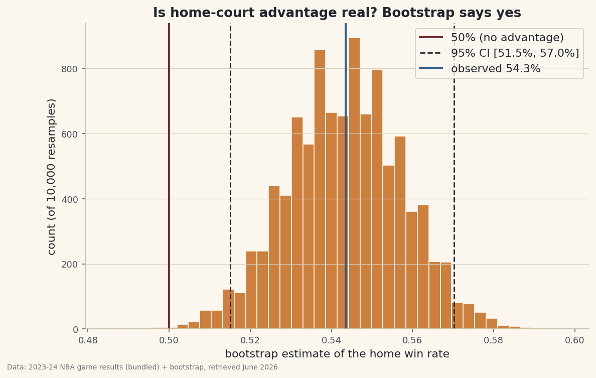
Across the 2023–24 NBA regular season, home teams won 54.3% of their games — 669 of 1,231. Bigger than a coin flip, sure. But a single season is itself a sample, and samples wobble. So here is the question worth answering honestly: is home-court advantage a real edge, or could a 54% rate just be one season's luck? The tool that answers it without a stats-textbook formula is the bootstrap — resample your own data with replacement thousands of times, recompute the number each time, and watch how much it moves. The spread of those re-estimates is your uncertainty. We'll find that the entire 95% interval sits above 50%: the home edge is real, and we can say exactly how precisely we've pinned it.
This builds on two earlier pieces: Summary Statistics and Distributions (a rate is just the mean of 0/1 outcomes) and Monte Carlo: How Much Does Luck Move a Season's Record? (resampling to map a range of outcomes). The bootstrap is the same resampling instinct, but pointed at the data you already have rather than a model you invented. The data is the bundled nba_home_results.csv — real 2023–24 NBA game-by-game results — so the whole analysis runs offline. Data retrieved June 2026.
-
Reduce every game to one number
Home-court advantage is a question about a single rate, so collapse each game to a single outcome from the home team's point of view:
1if the home team won,0if it lost. The observed home win rate is then just the mean of that 0/1 array — a rate is a mean in disguise.python import os import numpy as np import pandas as pd HERE = os.path.dirname(os.path.abspath(__file__)) df = pd.read_csv(os.path.join(HERE, "nba_home_results.csv")) home_win = (df["home_pts"] > df["away_pts"]).to_numpy().astype(int) # 1 = home win n = home_win.size observed = home_win.mean() print(n, "games,", home_win.sum(), "home wins, rate", round(observed, 4))That single line of arithmetic gives us 54.3%. The point estimate is the easy part. Everything interesting is in the question of how much we should trust it — and that is what the next step actually measures.
-
Bootstrap: resample the season, thousands of times
Here is the whole idea. Our 1,231 games are one sample drawn from the (unobservable) population of "all games this league could play." We can't go get more seasons — but we can simulate drawing fresh samples by resampling our own games with replacement: build a new 1,231-game season by picking games at random, allowing repeats, and recompute the home win rate. Do that thousands of times and you get a whole distribution of plausible rates. A fixed seed makes it reproducible.
python rng = np.random.default_rng(2026) # fixed seed -> same CI every run B = 10000 # number of bootstrap resamples idx = rng.integers(0, n, size=(B, n)) # B new "seasons", each n games, with repeats boot_rates = home_win[idx].mean(axis=1) # one home win rate per resample lo, hi = np.percentile(boot_rates, [2.5, 97.5]) # 95% percentile interval print("95% CI:", round(lo, 4), "-", round(hi, 4))No formula for the standard error of a proportion, no normal-approximation assumptions — just resampling and counting. The
rng.integers(0, n, (B, n))call is the engine:Brows ofnrandom row-indices, each row a fresh resampled season, all vectorized so numpy plays ten thousand seasons in a blink. -
Read the interval off the percentiles
The 95% percentile interval is just the 2.5th and 97.5th percentiles of those ten thousand re-estimates — the middle 95% of where the rate landed when we shook the data. The decisive check is simple: does the interval clear 50%?
python se = boot_rates.std(ddof=1) above = (boot_rates > 0.5).mean() print("observed", round(observed, 4), " SE", round(se, 4)) print("95% CI [", round(lo, 4), ",", round(hi, 4), "]") print("share of resamples above 50%:", round(above * 100, 2), "%")The whole interval clears 50%Games in sample: 1231 Home wins: 669 (669/1231) Observed home win rate: 0.5435 (54.3%) Bootstrap resamples: 10,000 (seed 2026) Bootstrap std error: 0.0141 95% confidence interval: [0.5150, 0.5703] = [51.5%, 57.0%] Share of resamples above 50%: 99.90% The entire 95% interval is above 50% -> home advantage is real, not luck.
The numbers, stated plainly: the observed rate is 54.3%, the bootstrap standard error is 0.0141 (about 1.4 percentage points), and the 95% confidence interval is [51.5%, 57.0%]. Every one of those bounds is above 50% — in fact 99.9% of all ten thousand resampled seasons came out above 50%. We can read that two ways, both honest: the home edge is real (not a coin-flip fluke of one season), and our best estimate of its size is "somewhere between 1.5 and 7 points above even," not a single confident 54.3%.
-
The exhibit: a distribution, not a point
Histogram the ten thousand bootstrap estimates and the finding becomes something you can see. The bell of resampled rates is the uncertainty; the dashed lines fence off the 95% interval; the solid red line at 50% is the "no advantage" mark the whole distribution clears.
python import matplotlib.pyplot as plt fig, ax = plt.subplots(figsize=(9, 5.5)) ax.hist(boot_rates, bins=40, color="#C56A1E", alpha=0.85, edgecolor="#FBF7EE") ax.axvline(0.5, color="#7A2E2E", lw=2, label="50% (no advantage)") ax.axvline(lo, color="#20242B", lw=1.4, ls="--", label="95% CI") ax.axvline(hi, color="#20242B", lw=1.4, ls="--") ax.axvline(observed, color="#2C5E8A", lw=2, label="observed 54.3%") ax.set_xlabel("bootstrap estimate of the home win rate"); ax.legend() fig.savefig("bootstrap_ci.png", dpi=144, bbox_inches="tight")Data: Bundled sample (real 2023-24 NBA game results) + bootstrap, retrieved June 2026 The gap between the red 50% line and the body of the histogram is the answer in one picture: home-court advantage in the 2023–24 NBA is real. The width of the bell is the part most "is it real?" arguments skip — it's the difference between knowing the edge exists and pretending we've measured it to the decimal.
-
Now read the limitations — before you believe it
A confidence interval is a precise statement about one specific kind of uncertainty, and being clear about what it does and doesn't cover is the whole point:
- The bootstrap assumes the sample represents the population. Resampling can only reshuffle the games we actually have; if this season's schedule, rules, or quirks aren't representative of "NBA basketball" in general, the interval is honest about sampling noise but blind to that mismatch.
- It's one season. 2023–24 is a single draw. Home advantage drifts across eras (it has shrunk over decades) and varies by league. This interval describes this season; it is not a permanent constant.
- It quantifies sampling variability, not bias. The bootstrap measures how much the rate would wobble across resamples. It cannot detect a systematic bias — scheduling effects, rest-day imbalances, scorekeeping conventions — that would shift the true rate. A tight CI around a biased estimate is still precisely wrong.
- Games aren't perfectly independent. The bootstrap-the-rows recipe treats each game as an exchangeable draw, but games share teams, back-to-backs, and streaks. The clustering is mild for a season-long win rate, so the interval is a good approximation here — but for finer questions (one team, one month) a block bootstrap that resamples groups of games is the more honest tool.
The intellectual lineage is worth crediting: the bootstrap is Bradley Efron's, introduced in his 1979 Annals of Statistics paper "Bootstrap Methods: Another Look at the Jackknife," and developed in Efron & Tibshirani's An Introduction to the Bootstrap (1993). The idea that you can substitute brute-force resampling for a hand-derived sampling distribution is one of the quiet revolutions of modern statistics — and it's why a beginner with numpy can put an honest error bar on a number that used to require a formula. The dataset is the real 2023–24 NBA game results bundled with this tutorial; every figure above was executed on it with seed 2026, so you can reproduce it exactly.
Troubleshooting
My interval changes every run
You didn't seed the generator. Create it once with rng = np.random.default_rng(SEED) and reuse that rng. A fixed seed makes the bootstrap reproducible — essential for a published interval. The interval should also be stable to roughly the second decimal across different seeds; if it jumps around more than that, raise B.
How many resamples (B) do I need?
Enough that the interval stops moving. A few thousand pins down a CI like this; push to 10,000+ when you want the bounds stable to a tenth of a percent or you're estimating extreme tails. Re-run with two seeds and compare — the difference is your Monte Carlo error, and it should be far smaller than the interval's width.
Should I sample with or without replacement?
With replacement, always — that's what makes it a bootstrap. Resampling without replacement at full size just hands back the original data in a new order, so every "resample" has the identical rate and the interval collapses to zero width. The repeats are the whole mechanism: they're what simulate drawing a fresh sample from the population.
Challenge yourself
Turn the interval into a margin estimate. Instead of the win/loss flag, bootstrap the mean home point margin (home_pts - away_pts) and report its 95% CI — does it clear zero, and by how many points? Then test the independence caveat: split the season in half by date, bootstrap each half separately, and check whether the two intervals overlap. Finally, compare the bootstrap CI against the textbook normal-approximation interval for a proportion (observed ± 1.96 * sqrt(p(1-p)/n)) and see how closely brute-force resampling reproduces the formula you didn't have to memorize.
Get the code
Here's the complete, working script for this tutorial. It runs exactly as shown.
Download the finished script (64_bootstrap_confidence_intervals.py)This script imports a small shared helper (and reads any bundled sample data) that live next to it in /downloads/ — grab these into the same folder so it runs as-is: sdt_common.py, sdt_nba.py.