K-Means Clustering From Scratch: Find Team Archetypes
What you'll build
A pure-numpy k-means that clusters 30 NBA teams into four playing-style archetypes from offensive and defensive rating, with a colored scatter of the groups.
Every tutorial so far has had a right answer to check against. Clustering doesn't — it's unsupervised learning: you hand the algorithm unlabeled data and ask it to find the groups hiding inside. K-means is the simplest version, and it's just two steps repeated until they settle: assign each point to the nearest center, then move each center to the middle of its group. We'll build it from scratch in pure numpy and watch it sort 30 NBA teams into playing-style archetypes from nothing but offensive and defensive rating.
This builds on Correlation and Regression and Z-Scores (we standardize first, and you'll see why). The data is the bundled nba_ratings.csv (real 2023-24 team ratings), so it runs offline.
Go deeper with the free textbook: What Is a Model? at DataField.dev.
-
Load the data and standardize it
We cluster on two features: offensive rating and defensive rating. First standardize them to z-scores — subtract the mean, divide by the standard deviation — so a point of offense and a point of defense carry equal weight. Skip this and whichever feature has the bigger numeric spread silently dominates the distances.
python import numpy as np import pandas as pd df = pd.read_csv("nba_ratings.csv") X = df[["ORtg", "DRtg"]].to_numpy(float) Xz = (X - X.mean(axis=0)) / X.std(axis=0) # z-scores: equal footingSetupTeams: 30 | features: ['ORtg', 'DRtg'] | k = 4 Standardized so a point of offense and a point of defense count equally.
-
The whole algorithm: assign, update, repeat
Pick
kstarting centers, then loop two steps until the assignments stop changing. Assign: every team joins its nearest center. Update: every center jumps to the average position of its members. That's it — convergence is guaranteed.python def kmeans(Xz, k, rng, iters=100): centers = Xz[rng.choice(len(Xz), k, replace=False)].copy() # random start for _ in range(iters): d = ((Xz[:, None, :] - centers[None, :, :]) ** 2).sum(axis=2) # dist to each center labels = d.argmin(axis=1) # assign: nearest center new = np.array([Xz[labels == j].mean(axis=0) for j in range(k)]) # update: group mean if np.allclose(new, centers): break # converged centers = new return labels, centers rng = np.random.default_rng(2026) labels, centers = kmeans(Xz, 4, rng) df["cluster"] = labelsThe broadcasting in the distance line does all 30×4 distances at once;
argminpicks the closest center for each team. The fixed seed makes the run reproducible. -
Read the groups it found
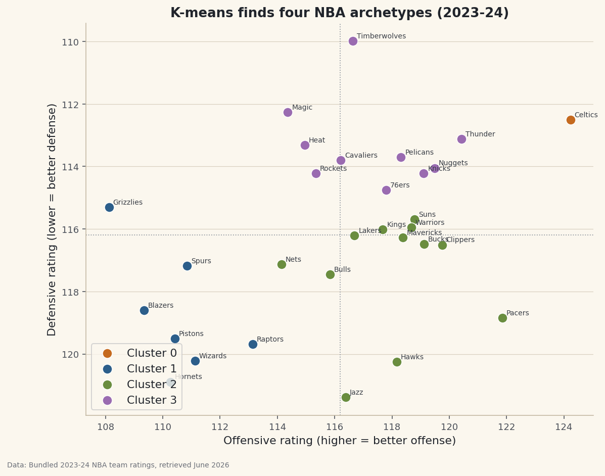
K-means returns numbered clusters, not names — you interpret them by looking at each group's average. Here, four clean archetypes fall out:
python for j in range(4): g = df[df.cluster == j] print(j, round(g.ORtg.mean(),1), round(g.DRtg.mean(),1), list(g.Team))The archetypes, unlabeled then namedCluster 0 (elite both) ORtg 124.2, DRtg 112.5): Celtics Cluster 1 (rebuilding) ORtg 110.5, DRtg 118.8): Spurs, Raptors, Grizzlies, Pistons, Wizards, Blazers, Hornets Cluster 2 (offense-first) ORtg 118.0, DRtg 117.4): Clippers, Suns, Pacers, Warriors, Bucks, Mavericks, Kings, Lakers, Bulls, Hawks, Nets, Jazz Cluster 3 (elite both) ORtg 117.3, DRtg 113.3): Thunder, Timberwolves, Nuggets, Knicks, Pelicans, 76ers, Cavaliers, Magic, Heat, Rockets
One cluster is the Celtics alone — an outlier so far ahead (elite offense and defense) that the algorithm gave them their own group. The rest split into a balanced-contender tier, an offense-first tier (score a lot, defend less), and a rebuilding tier (below average at both). Nobody told the algorithm what an "archetype" is; it found them from distance alone.
-
See it
Plot offense against defense, color by cluster, and the groups become regions of the map. We invert the defense axis so "good defense" is up — then the top-right is elite-both and the bottom-left is rebuilding.
python import matplotlib.pyplot as plt fig, ax = plt.subplots(figsize=(9, 7)) for j in range(4): g = df[df.cluster == j] ax.scatter(g.ORtg, g.DRtg, label=f"Cluster {j}") ax.invert_yaxis() # lower DRtg = better defense -> up ax.legend() fig.savefig("kmeans_clusters.png", dpi=144, bbox_inches="tight")Data: Bundled sample (real 2023-24 NBA team ratings), retrieved June 2026 The clusters are contiguous patches of the plane — exactly what k-means produces, because it groups by straight-line distance.
Troubleshooting
I get different clusters every run
K-means depends on its random start and can land in different local solutions. Seed the generator (default_rng(SEED)) for reproducibility, and in practice run it several times and keep the best (lowest total within-cluster distance). Libraries like scikit-learn do this for you with n_init.
Do I really need to standardize first?
Almost always, yes. K-means uses distance, so a feature measured in bigger units dominates. Z-scoring puts every feature on equal footing. If you skip it here the clusters bend toward whichever rating happens to vary more.
How do I choose k?
There's no labeled answer, so use judgment plus the "elbow method": plot total within-cluster distance against k and look for where the improvement flattens. Here k=4 gives interpretable archetypes; k=2 just splits good from bad, k=8 slices too finely for 30 teams.
Challenge yourself
Add a third feature — pace, or net rating — and re-cluster; do the groups change? Then implement the elbow method: run k-means for k = 1..8, record the total squared distance from each point to its center, and plot it to justify your choice of k. Finally, try k-means on nba_player_shots.csv shot locations to discover shooting "zones" without defining them by hand.
Get the code
Here's the complete, working script for this tutorial. It runs exactly as shown.
Download the finished script (69_kmeans_clustering_from_scratch.py)This script imports a small shared helper (and reads any bundled sample data) that live next to it in /downloads/ — grab these into the same folder so it runs as-is: sdt_common.py, sdt_nba.py.