Bayesian Updating: Learn a Win Probability Game by Game
Part 8 of 10 in Randomness, Inference & Simulation · course bundle (code + data)
What you'll build
A Beta-Binomial belief about the NBA home-win probability updated one real game at a time, with the posterior sharpening from a flat prior into a tight estimate and a 95% credible interval.
The bootstrap and the permutation test both ask a frequentist question: how much would this number wobble if we reran the season? Bayesian updating asks something different — given what we believed before the data, what should we believe after it? For a yes/no outcome like "did the home team win?", the Beta distribution is the natural container for that belief. We'll start from a flat prior, feed in 1,231 real games one at a time, and watch a vague guess sharpen into a tight estimate of the true home-win probability — with a credible interval read straight off the curve.
This pairs with the bootstrap (the frequentist take on the same home-edge question) and builds on Summary Statistics and Distributions. The data is the bundled nba_home_results.csv (real 2023-24 games), so it runs offline.
Related chapter: Probability: The Foundation of Inference (DataField.dev).
-
The prior: what we believe before any data
A Beta distribution lives on 0 to 1, which is exactly the range of a probability. Its two parameters,
alphaandbeta, act like a running tally of wins and losses.Beta(1, 1)is perfectly flat — it says every home-win rate from 0 to 1 is equally plausible, the honest starting point when we claim to know nothing.python import numpy as np, pandas as pd, math df = pd.read_csv("nba_home_results.csv") home_win = (df.home_pts > df.away_pts).to_numpy(int) # 1 = home won def beta_pdf(x, a, b): # density, in log-space logB = math.lgamma(a) + math.lgamma(b) - math.lgamma(a + b) return np.exp((a - 1)*np.log(x) + (b - 1)*np.log(1 - x) - logB)We compute the density in log-space with
math.lgammaso that large counts — alpha and beta in the hundreds by season's end — don't overflow. -
The update rule: one game, one increment
The Beta is the conjugate prior for a yes/no outcome, which is a technical way of saying the update is trivially simple: after
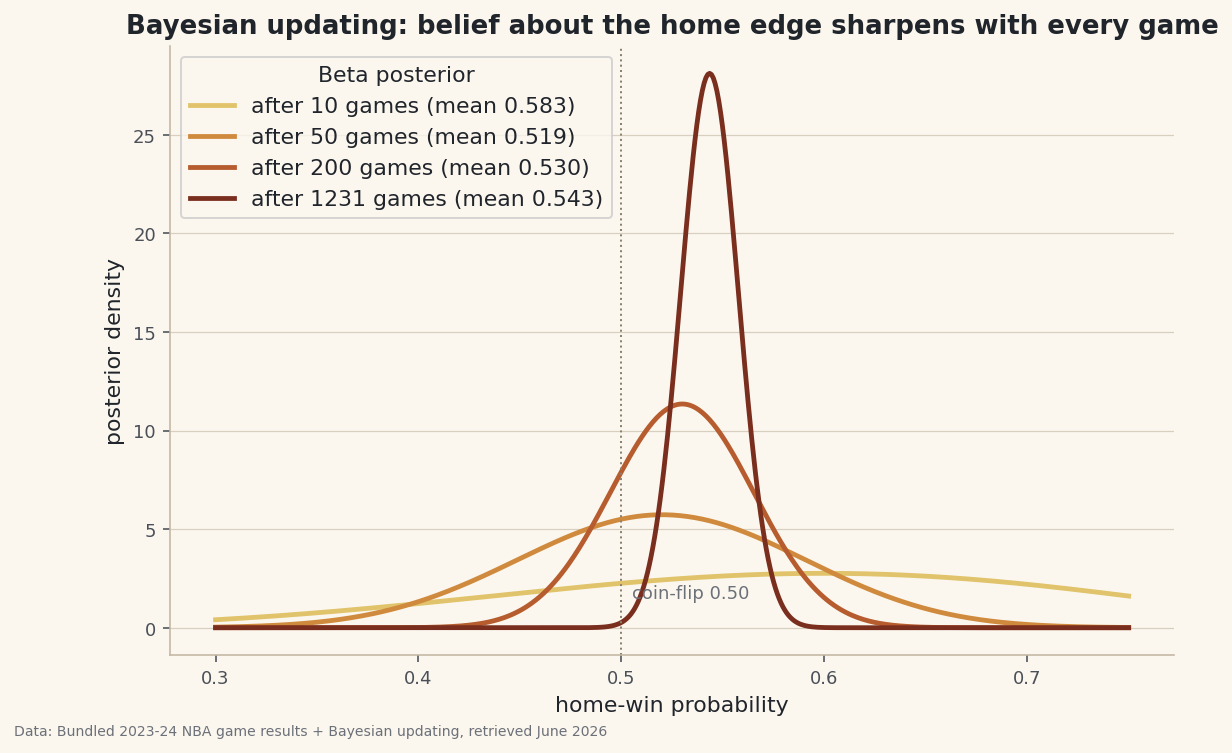
ngames withkhome wins, the posterior isBeta(1 + k, 1 + (n - k)). Every home win adds one to alpha, every loss adds one to beta. No integrals, no simulation — just counting.python def posterior_after(n): wins = int(home_win[:n].sum()) a, b = 1 + wins, 1 + (n - wins) return a, b, a / (a + b) # params and the posterior mean for n in (10, 50, 200, 1231): print(n, posterior_after(n))The belief sharpening game by gamePrior: Beta(1, 1) - a flat line, every home-win rate equally plausible. after 10 games: Beta( 7, 5) mean 0.583 95% CI [0.308, 0.833] after 50 games: Beta( 27, 25) mean 0.519 95% CI [0.385, 0.652] after 200 games: Beta( 107, 95) mean 0.530 95% CI [0.461, 0.598] after 1231 games: Beta( 670, 563) mean 0.543 95% CI [0.516, 0.571] Each game nudges the belief; the interval tightens as evidence piles up.
After just 10 games the mean is a jumpy 0.583 with a 95% interval spanning 0.31 to 0.83 — almost useless. By the full 1,231 games the estimate has settled to 0.543 with an interval of just 0.516 to 0.571. The belief didn't jump to the answer; it was dragged there, one game at a time.
-
Plot the posteriors on top of each other
The whole story is visible at a glance if you draw the posterior density at a few checkpoints on one axis. Early curves are wide and low; later curves are tall and narrow, concentrating on the true rate.
python import matplotlib.pyplot as plt grid = np.linspace(0.30, 0.75, 500) fig, ax = plt.subplots() for n in (10, 50, 200, 1231): a, b, mean = posterior_after(n) ax.plot(grid, beta_pdf(grid, a, b), label=f"after {n} games") ax.axvline(0.5, ls=":"); ax.legend() fig.savefig("posterior_evolution.png", dpi=144, bbox_inches="tight")Data: Bundled sample (real 2023-24 NBA game results) + Bayesian updating, retrieved June 2026 The credible interval — the 2.5th to 97.5th percentile of the posterior — is the Bayesian cousin of a confidence interval, and here you can say the plain-English thing a confidence interval technically can't: given a flat prior and this data, there's a 95% probability the true home-win rate is between 0.516 and 0.571. Every part of that interval sits above 0.50, so the home edge is real — the same conclusion the bootstrap reached, arrived at from the other direction.
Troubleshooting
My beta_pdf returns inf or nan
Two causes. Passing x of exactly 0 or 1 makes log(x) or log(1-x) blow up — evaluate on a grid strictly inside (0, 1). And if you used math.gamma instead of math.lgamma, gamma of a few hundred overflows a float; the log-space version dodges that entirely.
Does the prior bias the answer?
With a lot of data, barely. Beta(1,1) contributes one imaginary win and one imaginary loss; against 669 real wins that's noise. Try a strong, wrong prior like Beta(50, 5) (a stubborn belief the home team almost always wins) and watch the data still drag it back within a season — the evidence overwhelms the prior. Priors matter most when data is scarce.
Why is a credible interval not the same as a confidence interval?
They often land in nearly the same place but mean different things. A confidence interval is a statement about the procedure ("95% of intervals built this way cover the truth"); a credible interval is a statement about the parameter given your prior and data ("95% probability the rate is in here"). The Bayesian version is the one people usually think a confidence interval means.
Challenge yourself
Update team by team instead of league-wide: give each home team its own Beta and rank them by posterior-mean home-win rate, but sort by the lower end of the credible interval so small-sample teams don't top the list on luck. Then plot one team's posterior mean as a running line across its season with the credible band shaded around it — a live picture of a belief being refined. Finally, swap the flat prior for a league-average prior and see how much faster a thin-data team's estimate stabilizes.
The finished script
Everything this tutorial built, assembled in one runnable file.
Download the finished script (78_bayesian_updating_beta_binomial.py)This script imports a small shared helper (and reads any bundled sample data) that live next to it in /downloads/ — grab these into the same folder so it runs as-is: sdt_common.py, sdt_nba.py. Or skip the collecting: the Randomness, Inference & Simulation bundle has this whole course’s scripts and data in one ZIP.