ROC Curves and AUC From Scratch
What you'll build
Build a ROC curve and its area (AUC) from scratch in pure numpy for the tutorial-71 home-win classifier: sweep the threshold to trace true-positive vs false-positive rate, then compute AUC two independent ways (trapezoid area and the rank identity) and watch them agree at 0.755.
In the train/test tutorial we scored the home-win classifier with one number: accuracy at a 0.50 threshold. But that number hides a decision. “Call it a home win when the predicted probability clears 0.50” is a choice — slide that cutoff and you trade missed wins for false alarms. The ROC curve shows the whole trade-off at once, and the area under it (AUC) collapses the curve into a single, threshold-free score: the probability the model rates a random actual home win above a random home loss.
We build both from scratch in pure numpy, on the same tutorial-71 dataset (net-rating gap → home win), and cross-check AUC two independent ways. Offline, on bundled CSVs.
Go deeper with the free textbook: Chapter 29: Evaluating Models — Accuracy, Precision, Recall, and ROC at DataField.dev.
-
Train the classifier and get predicted probabilities
Reuse the tutorial-71 logistic regression and the tutorial-72 train/test split. The model outputs a probability for each held-out game; that probability — not a hard 0/1 label — is what the ROC curve sweeps over.
python import numpy as np # ... build x_all (standardized net-rating gap) and y_all (home win) as in tutorial 71 ... rng = np.random.default_rng(74) idx = rng.permutation(len(x_all)) cut = int(0.75 * len(x_all)) tr, te = idx[:cut], idx[cut:] def sigmoid(z): return 1.0 / (1.0 + np.exp(-z)) w, b, lr = 0.0, 0.0, 0.3 for _ in range(600): # train on the training games only p = sigmoid(w*x_all[tr] + b) err = p - y_all[tr] w -= lr*np.mean(err*x_all[tr]); b -= lr*np.mean(err) scores = sigmoid(w*x_all[te] + b) # predicted P(home win) on held-out games y_te = y_all[te]Keep the raw
scores— the ROC curve needs the probabilities, not thresholded labels. -
Sweep the threshold to trace the ROC curve
A clever trick avoids looping over every possible cutoff: sort the games from highest predicted score to lowest, then walk down the list. Each step “accepts” one more game as a predicted win. The running count of real wins accepted is the true-positive tally; the running count of real losses accepted is the false-positive tally. Divide each by its total and you have the curve.
python def roc_points(y_true, y_score): P = y_true.sum() # total real positives (home wins) N = len(y_true) - P # total real negatives (losses) order = np.argsort(-y_score) # highest score first y_sorted = y_true[order] tp = np.cumsum(y_sorted) # true positives caught so far fp = np.cumsum(1 - y_sorted) # false positives so far tpr = np.concatenate([[0], tp / P]) # start the curve at (0, 0) fpr = np.concatenate([[0], fp / N]) return fpr, tpr fpr, tpr = roc_points(y_te, scores)As the threshold drops from 1 toward 0, both rates climb from 0 to 1. A model that ranks wins above losses shoots the true-positive rate up first, bowing the curve toward the top-left corner.
-
Compute AUC two ways — and check they agree
The area under the curve is just the sum of trapezoid strips between successive points (the “from scratch” version of an integral). Then we verify it with a completely different identity: AUC equals the share of all win/loss pairs in which the model gave the win the higher score — the Mann-Whitney interpretation.
python # trapezoid area under the ROC curve auc_trap = float(np.sum(np.diff(fpr) * (tpr[1:] + tpr[:-1]) / 2.0)) # cross-check: P(score(win) > score(loss)) over every win/loss pair pos = scores[y_te == 1] neg = scores[y_te == 0] wins = (pos[:, None] > neg[None, :]).sum() ties = (pos[:, None] == neg[None, :]).sum() auc_rank = float((wins + 0.5*ties) / (len(pos) * len(neg)))Two unrelated routes to the same number is the kind of cross-check that catches bugs the moment they appear.
-
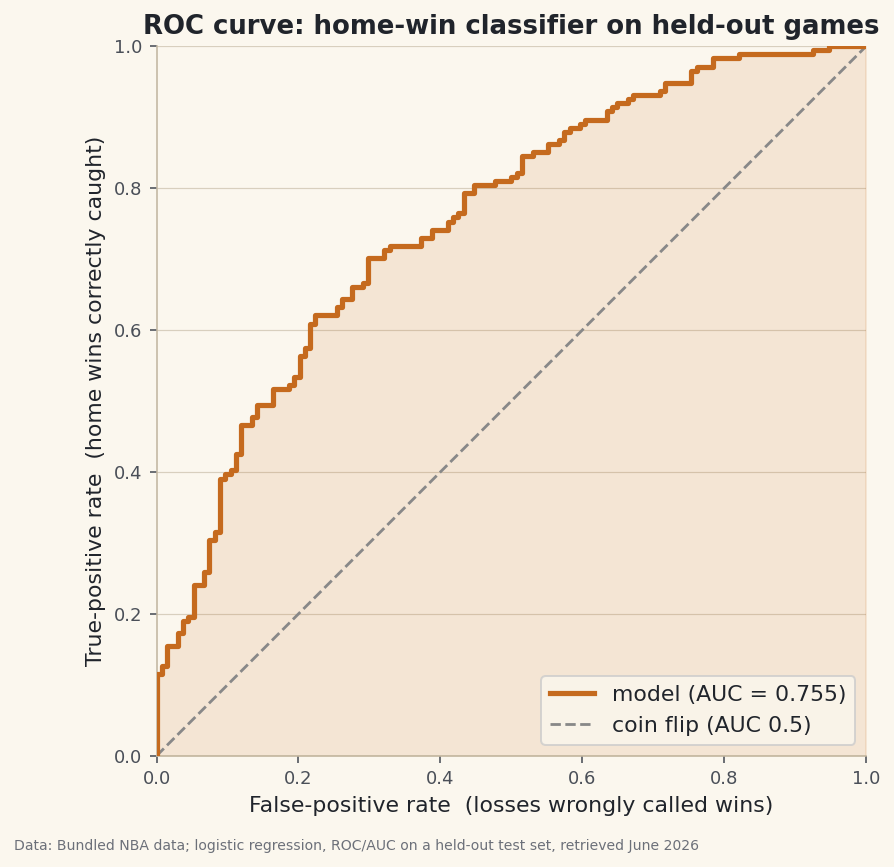
Read the score
ROC / AUC on held-out gamesHeld-out test games: 308 (174 home wins, 134 losses) Accuracy at threshold 0.50: 68.2% AUC (area under ROC, trapezoid): 0.755 AUC (rank identity, cross-check): 0.755 Reading it: 0.50 = coin flip, 1.00 = perfect ranking. AUC 0.755 means a random actual home win outranks a random loss 76% of the time.
Data: Bundled Basketball-Reference net ratings + 1,231 game results; logistic regression, ROC/AUC on a held-out test set, retrieved June 2026 On 308 held-out games the curve bows well above the diagonal, and both methods return AUC = 0.755 — identical to three decimals, exactly as the theory promises. Read it plainly: a random actual home win outranks a random loss about 76% of the time. Accuracy at the 0.50 cutoff was 68.2%, but AUC says something the single number can't — the model orders games well across every threshold, not just at one.
-
Why AUC beats a single accuracy
Accuracy depends on the threshold and on how balanced the classes are; AUC depends on neither. It asks only whether the model ranks wins above losses, which is what you actually want when you'll later tune the cutoff for your own purpose — a confident favorites filter (high threshold) or a wide net (low threshold). 0.50 is a coin flip, 1.00 is perfect ranking, and 0.755 is a genuinely useful classifier built from a single feature. It's the standard headline score for a binary classifier for exactly this reason.
Troubleshooting
My AUC is below 0.5
That means your scores rank losses above wins — the labels or the sign of the score are flipped. An AUC of 0.2 is just a 0.8 model with its predictions inverted. Check that y_true is 1 for home wins and that you sorted by -y_score (descending).
The two AUC numbers don't match
Small gaps come from tied scores. The rank formula credits ties as half (the 0.5*ties term); the trapezoid handles them as vertical/horizontal steps. With continuous probabilities ties are rare, so the two should agree to several decimals — here they match exactly at 0.755.
My curve looks jagged, not smooth
That's correct — an empirical ROC on a few hundred games is a staircase, one step per game. It only looks smooth with huge samples. The area under the staircase is still the exact AUC.
Challenge yourself
Find the threshold that maximizes Youden's J (true-positive rate minus false-positive rate) — the point on the curve farthest from the diagonal — and compare it to the default 0.50. Then add a second feature (say, rest-day difference) to the logistic regression and see whether AUC climbs above 0.755; AUC is the fair way to judge whether a feature actually helps. Finally, average the AUC across the five folds from the cross-validation tutorial for a more stable estimate of how well this model really ranks.
Get the code
Here's the complete, working script for this tutorial. It runs exactly as shown.
Download the finished script (74_roc_curve_and_auc.py)This script imports a small shared helper (and reads any bundled sample data) that live next to it in /downloads/ — grab these into the same folder so it runs as-is: sdt_common.py, sdt_nba.py.