Draw a Pass Map with mplsoccer
What you'll build
A team's completed passes drawn as arrows on a proper pitch with mplsoccer.
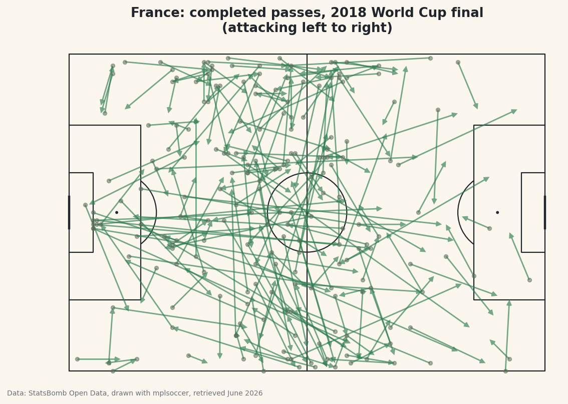
A pass map is one of the most recognizable images in football analytics: a pitch covered in arrows, each one a pass, the whole picture revealing how a team moved the ball. We're building one from scratch — the completed passes of France in the 2018 World Cup final, real StatsBomb event data, drawn as arrows on a correctly-proportioned pitch with the mplsoccer library. The result looks professional. The code is shorter than you'd guess.
This follows directly from your first StatsBomb pull. We're loading the exact same match the same way - so if you worked through that one, the first few lines will be old friends. The new ideas here are filtering for completed passes, pulling coordinates out of list-shaped columns, and letting mplsoccer handle the geometry of the pitch.
Attribution, same as always: this chart is built from StatsBomb Open Data, whose free license requires credit on anything you publish. We'll add it to the figure automatically, and I'll point it out at the finish.
-
Install mplsoccer and load the match
mplsocceris a small library built on top of matplotlib that knows how to draw football pitches - the right dimensions, the penalty boxes, the centre circle - so you never have to plot a single line yourself. Install it alongsidestatsbombpy:python pip install mplsoccer statsbombpyNow load the 2018 World Cup final exactly as before: find the Final among the tournament's matches, note which team was home (France), and pull every event from the game.
python import matplotlib.pyplot as plt from mplsoccer import Pitch from statsbombpy import sb matches = sb.matches(competition_id=43, season_id=3) final = matches[matches["competition_stage"] == "Final"].iloc[0] TEAM = final["home_team"] events = sb.events(int(final["match_id"]))Storing the team name in a
TEAMvariable instead of hard-coding"France"is a small habit that pays off: change that one line later and the whole map redraws for a different side. -
Filter for one team's completed passes
The events DataFrame holds everything - passes, shots, tackles, the lot - for both teams. We want only France's passes, and only the ones that found a team-mate. Here's the key insight that trips people up: in StatsBomb data, a successful pass has no
pass_outcome- the column is blank (NaN). An outcome is only recorded when something goes wrong:Incomplete,Out, intercepted. So "completed" means "outcome is missing."python passes = events[(events["type"] == "Pass") & (events["team"] == TEAM)].copy() passes = passes[passes["pass_outcome"].isna()].dropna(subset=["location", "pass_end_location"])Read that second line carefully.
.isna()keeps the rows wherepass_outcomeis blank - the completed ones. The.dropna()at the end discards any pass missing its start or end coordinates, which we're about to need. It feels backwards that absence of data marks a successful pass, but that's the convention, and forgetting it is the single most common mistake in pass maps. -
Pull the coordinates out of the list columns
StatsBomb stores positions as little two-element lists:
locationis[x, y]where the pass began, andpass_end_locationis[x, y]where it arrived. To draw an arrow we need those four numbers as their own columns. The.str[0]and.str[1]accessors reach into each list and pull out the first and second element - it works on lists, not just strings.python passes["x"] = passes["location"].str[0] passes["y"] = passes["location"].str[1] passes["ex"] = passes["pass_end_location"].str[0] passes["ey"] = passes["pass_end_location"].str[1]Now every pass has a clean start point
(x, y)and end point(ex, ey). Let's confirm the filter worked and see who did the passing.python print(f"{TEAM} completed {len(passes)} passes in the final.") top = passes["player"].value_counts().head(5) print("\nMost passes:") print(top.to_string())France's completed passersFrance completed 202 passes in the final. Most passes: player Paul Pogba 29 Lucas Hernández Pi 22 Antoine Griezmann 18 Raphaël Varane 18 Blaise Matuidi 18
France completed 202 passes, with Paul Pogba pulling the strings at 29 - the most of anyone, fitting for the midfielder who ran the final. Seeing a believable list like this, topped by exactly the player you'd expect, is your signal that the filtering is correct before you spend effort on the chart.
-
Draw the pitch
This is where
mplsoccerearns its keep. We create aPitchand tell itpitch_type="statsbomb"- that one argument lines the pitch coordinates up perfectly with StatsBomb's data, so a pass at x=60 lands at the halfway line where it should. Thenpitch.draw()hands back a matplotlib figure and axes, already painted with all the markings.python pitch = Pitch(pitch_type="statsbomb", line_color="#20242B", pitch_color="#FBF7EE", linewidth=1.1) fig, ax = pitch.draw(figsize=(8.4, 5.6)) fig.set_facecolor("#FBF7EE")The
pitch_typeargument is doing all the heavy lifting. Without it you'd be calculating where the penalty box edges fall and whether your y-axis runs the right direction - mplsoccer knows the answer for every major data provider, StatsBomb included. You now have an empty, correctly-scaled pitch waiting for arrows. -
Add the passes as arrows
The pitch object has an
arrows()method made for exactly this. We feed it our four coordinate columns - start x and y, end x and y - and it draws an arrow for every pass in one vectorized call. We add small dots at each pass origin too, so you can read where moves began, and a title up top.python pitch.arrows(passes["x"], passes["y"], passes["ex"], passes["ey"], ax=ax, color="#3A7D44", width=1.4, headwidth=4, headlength=4, alpha=0.65) pitch.scatter(passes["x"], passes["y"], ax=ax, s=14, color="#C2B280", alpha=0.5, zorder=1) ax.set_title(f"{TEAM}: completed passes, 2018 World Cup final\n(attacking left to right)", fontsize=13, color="#20242B") fig.savefig("pass_map.png", dpi=144, bbox_inches="tight")Data: StatsBomb Open Data, drawn with mplsoccer, retrieved June 2026 The
alpha=0.65makes the arrows semi-transparent, so where France passed most often the overlapping arrows pool into darker, denser regions - an instant read on where their play was concentrated. And there's the attribution: because this is a published chart, the caption credits StatsBomb Open Data (drawn with mplsoccer). That credit is required by the license every time you share the image - make it a reflex.
Troubleshooting
My pass map is nearly empty or has far too few arrows
You probably filtered the wrong way on pass_outcome. Completed passes have a blank outcome, so you want .isna() - keep the rows where it's missing. If you accidentally kept rows where it's present, you've plotted only the failed passes, which are a small minority.
The arrows land in strange places or off the pitch
Almost always a pitch_type mismatch. The Pitch must be created with pitch_type="statsbomb" so its coordinate system matches the data. A default pitch uses different dimensions and your points will scatter wrongly.
TypeError when assigning the x/y columns
The .str[0] trick needs the column to actually hold lists. If a stray row has a missing location, the accessor returns NaN rather than erroring - but make sure you ran the .dropna(subset=["location", "pass_end_location"]) from step 2 first so every remaining row has real coordinates.
Challenge yourself
Change TEAM to final["away_team"] and redraw the map for Croatia - then put the two side by side and compare how the finalists moved the ball. For a harder version, colour each arrow by pass length: compute the distance from start to end, and use a longer or brighter arrow for the bigger switches of play. You'll start to see which players sprayed the ball across the pitch and which kept it short and safe - the same coordinates you pulled in step 3 are all you need.
Get the code
Here's the complete, working script for this tutorial. It runs exactly as shown.
Download the finished script (14_draw_a_pass_map_with_mplsoccer.py)This script imports a small shared helper (and reads any bundled sample data) that live next to it in /downloads/ — grab these into the same folder so it runs as-is: sdt_common.py.