Build a Match Shot Map with Expected Goals
What you'll build
Both teams' shots on a pitch, sized by xG and marked for goals.
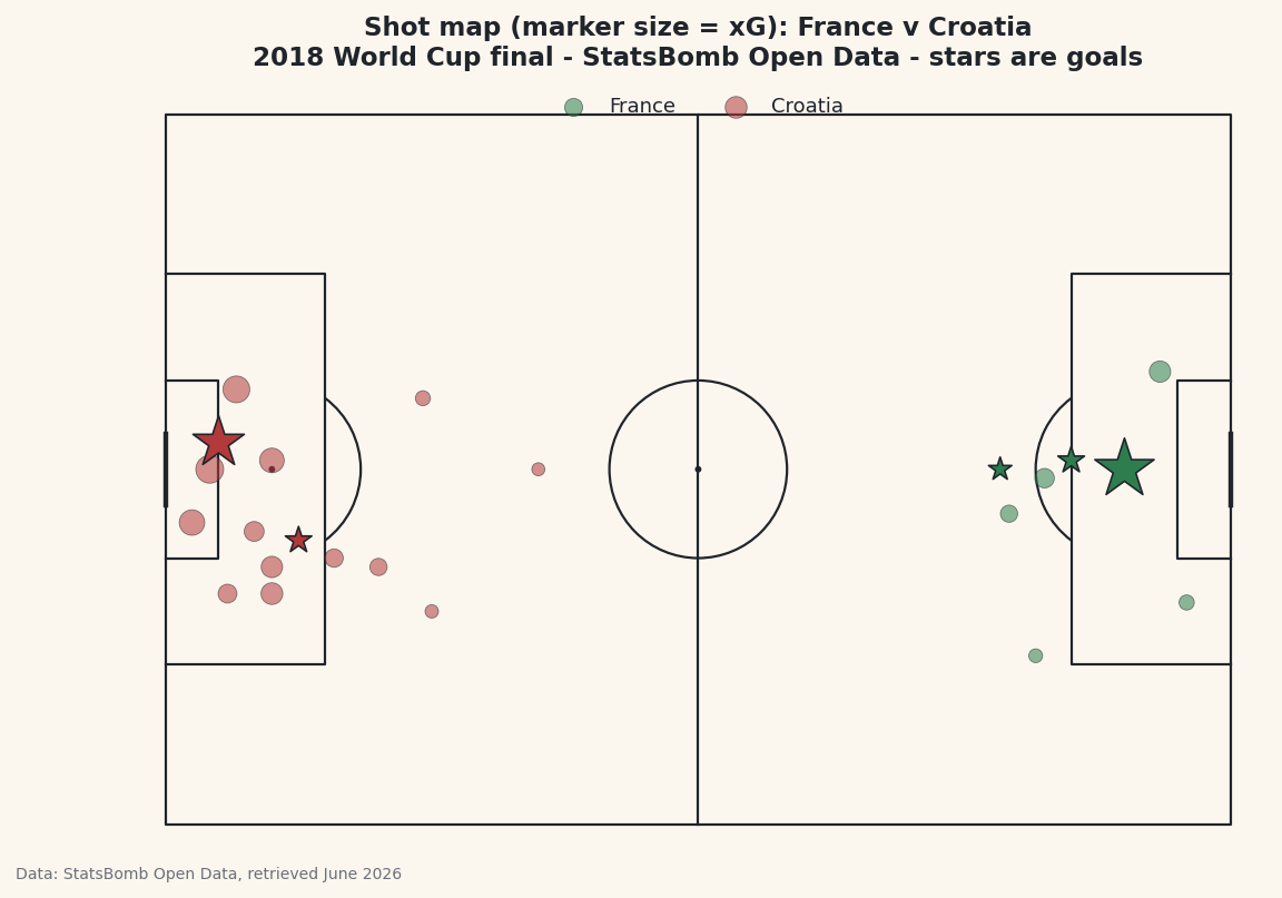
Ask a soccer analyst for the one chart worth learning first and most of them say the shot map. It puts every shot of a match onto a pitch, sizes each one by how good a chance it was - its expected goals, or xG - and stars the ones that went in. In a single picture you can see who shot from where, who created the better chances, and whether the scoreline matched the run of play. The match I'll use is the 2018 World Cup final, France against Croatia, built from real StatsBomb event data and the mplsoccer library.
This follows on from the pass map tutorial - we load the same match the same way, so the opening lines will feel familiar. The new ideas are filtering events down to shots, sizing markers by a data column, and a coordinate trick that puts the two teams at opposite ends of the pitch for a proper two-ended map.
Attribution, as always with this source: StatsBomb Open Data is free, but its license requires credit on anything you publish. We bake that into the figure and I'll point it out at the end. The data was retrieved June 2026.
-
Load the final and pull out the shots
We find the Final among the tournament's matches, note who was home (France) and away (Croatia), and load every event. Then we keep only the rows where
typeis"Shot", dropping any with no location. Each shot'slocationis a two-element list[x, y], so we split it into its ownxandycolumns with the.str[0]/.str[1]accessors - they reach into a list, not just a string.python import matplotlib.pyplot as plt from mplsoccer import Pitch from statsbombpy import sb matches = sb.matches(competition_id=43, season_id=3) final = matches[matches["competition_stage"] == "Final"].iloc[0] home, away = final["home_team"], final["away_team"] events = sb.events(int(final["match_id"])) shots = events[events["type"] == "Shot"].dropna(subset=["location"]).copy() shots["x"] = shots["location"].str[0] shots["y"] = shots["location"].str[1] shots["goal"] = shots["shot_outcome"] == "Goal"The
goalcolumn is a simple True/False flag we'll use to draw goals differently. The column carrying each shot's expected-goals value isshot_statsbomb_xg- a number between 0 and 1 estimating the chance that shot was scored. That one column is what makes this a shot map rather than a scatter plot. -
Flip the away team to the other end
Here's the quirk that surprises everyone the first time. StatsBomb records every team as if it were attacking toward
x=120- the right-hand goal. That's perfect for analysing one team in isolation, but if you plot both teams' shots raw, they pile up on the same half of the pitch and the map makes no sense. To get a normal two-ended shot map, we flip the away team's coordinates to the opposite end: mirrorxaround the pitch length (120) andyaround its width (80).python away_mask = shots["team"] == away shots.loc[away_mask, "x"] = 120 - shots.loc[away_mask, "x"] shots.loc[away_mask, "y"] = 80 - shots.loc[away_mask, "y"]Now France shoots toward one goal and Croatia toward the other, exactly like watching the match. The
away_maskis a boolean Series - True for Croatia's rows - andshots.loc[away_mask, "x"]edits only those rows in place. Subtracting from 120 and 80 reflects each point across the centre of the pitch, which is the same as turning the team around to attack the other way. -
Confirm the shot counts and xG
Before drawing anything, let's check the data tells the story we expect. We group by team and, on the
shot_statsbomb_xgcolumn, count the shots and sum the xG - the total quality of chances each side created.python print(f"{home} {final['home_score']}-{final['away_score']} {away}") print("\nShots and total xG by team:") print(shots.groupby("team")["shot_statsbomb_xg"] .agg(shots="count", xG="sum").round(2).to_string())Shots and expected goals by teamFrance 4-2 Croatia Shots and total xG by team: shots xG team Croatia 15 1.48 France 8 1.10This is one of the most famous results in the whole xG canon. Croatia took 15 shots worth 1.48 xG; France took just 8 worth 1.10 - and yet France won 4-2. By the numbers Croatia created more and better chances and still lost the final. That gap between expected goals and the actual scoreline is exactly the kind of story a shot map exists to reveal, and seeing these believable totals first is your signal the filtering and the flip both worked.
-
Draw the pitch and set up colors
This is where
mplsoccerearns its place. We create aPitchwithpitch_type="statsbomb"so its coordinate system matches the data perfectly - a shot at x=108 lands near the goal, where it belongs - andpitch.draw()hands back a figure and axes already painted with all the markings. We also pick a color per team: soccer green for the home side, the site's baseball red for the away side, so the two are easy to tell apart.python colors = {home: "#2E7D4F", away: "#B23A3A"} pitch = Pitch(pitch_type="statsbomb", line_color="#20242B", pitch_color="#FBF7EE", linewidth=1.1) fig, ax = pitch.draw(figsize=(8.6, 5.6)) fig.set_facecolor("#FBF7EE")The
pitch_typeargument does all the geometry for you - box edges, the centre circle, the right aspect ratio - so you never plot a single line by hand. You now have an empty, correctly-scaled pitch waiting for shots. -
Plot the shots, sized by xG
Now the payoff. For each team we split its shots into the ones that missed and the ones that scored, then draw them with
pitch.scatter. The trick that makes this a shot map is thesargument - the marker size. We set it toshot_statsbomb_xg * 900 + 30, so a big chance draws a big dot and a long-range hopeful draws a small one. Goals get the same size treatment but a star marker and a heavier edge, so they leap off the page.python for team in (home, away): sub = shots[shots["team"] == team] no_goal, goal = sub[~sub["goal"]], sub[sub["goal"]] pitch.scatter(no_goal["x"], no_goal["y"], s=no_goal["shot_statsbomb_xg"] * 900 + 30, ax=ax, color=colors[team], alpha=0.55, edgecolor="#20242B", linewidth=0.4, label=team) pitch.scatter(goal["x"], goal["y"], s=goal["shot_statsbomb_xg"] * 900 + 80, ax=ax, marker="*", color=colors[team], edgecolor="#20242B", linewidth=0.8, zorder=5) ax.legend(loc="upper center", ncol=2, fontsize=9, frameon=False) ax.set_title(f"Shot map (marker size = xG): {home} v {away}\n" f"2018 World Cup final - StatsBomb Open Data - stars are goals", fontsize=11.5, color="#20242B") fig.savefig("shot_map.png", dpi=144, bbox_inches="tight")Data: StatsBomb Open Data, retrieved June 2026 The
+ 30(and+ 80for goals) is a baseline so even a near-zero-xG shot is still visible - multiplying by 900 alone would make the smallest dots vanish. Read the map the way a coach would: the big dots close to goal are the gilt-edged chances, and the big dots far from goal are the low-percentage long shots that flatter a team's shot count without troubling the keeper. Thezorder=5on the goals keeps the stars drawn on top of everything else.And there's the attribution: because this is a published chart built from StatsBomb data, the title credits StatsBomb Open Data. That credit is required by the license every time you share the image - make it a reflex.
Troubleshooting
Both teams' shots are on the same half of the pitch
You skipped the flip in step 2, or applied it to the wrong team. StatsBomb stores every side attacking toward x=120, so without mirroring the away team's x and y, both teams' shots crowd the same end. Double-check away_mask selects the away team and that you subtract from 120 for x and 80 for y.
Every dot is the same size
You're passing a single number to s instead of the shot_statsbomb_xg column. The size argument has to be the per-shot xG Series so each marker scales individually. Confirm the column exists with shots["shot_statsbomb_xg"].head() - if it's all NaN, you filtered out the shots or mistyped the column name.
The shots scatter off the pitch or bunch in a corner
Almost always a pitch_type mismatch. The Pitch must be created with pitch_type="statsbomb" so its 120×80 coordinate system matches the data. A default pitch uses different dimensions and your points will land in the wrong places.
Challenge yourself
Add a running xG total to the title for each team by summing shot_statsbomb_xg - you already computed it in step 3, so it's a copy-paste. For a harder version, annotate the biggest chance of the match: find the row with the maximum xG and draw its value next to the dot with ax.text, so the single best opportunity is labelled. Then change which match you load - any final, any tournament from the competitions list - and watch the same code redraw a brand-new shot map without another edit.
Get the code
Here's the complete, working script for this tutorial. It runs exactly as shown.
Download the finished script (30_build_a_match_shot_map_with_xg.py)This script imports a small shared helper (and reads any bundled sample data) that live next to it in /downloads/ — grab these into the same folder so it runs as-is: sdt_common.py.