Draw a Player Heatmap from Event Data
What you'll build
A heatmap of where one player was involved across a match.
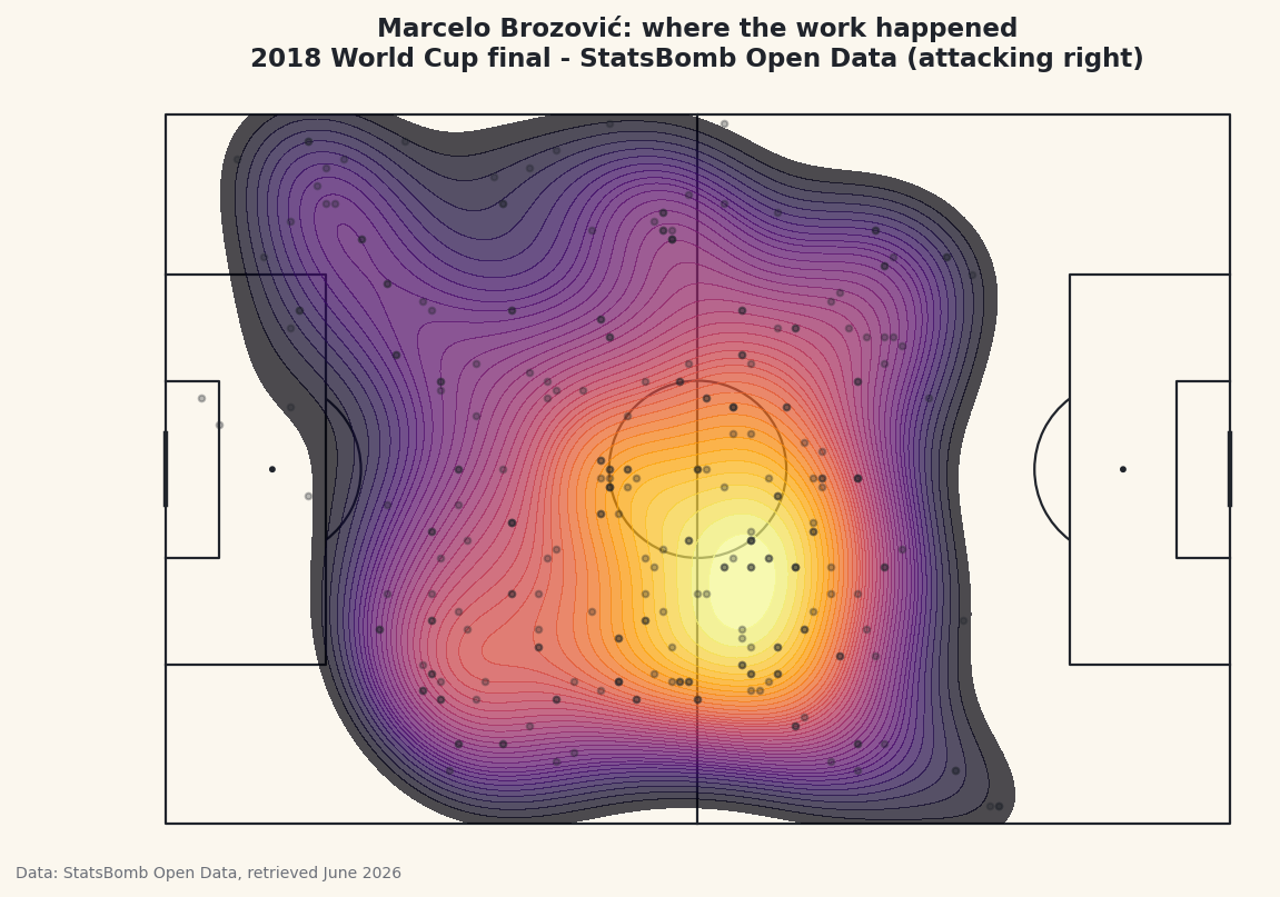
Every single thing a player does on the pitch - every pass, touch, tackle, and carry - is recorded with a location. Collect all of those points for one player and you can draw a heatmap: a smooth, glowing map of where on the pitch that player did their work. It's one of the most striking images in the sport, and it answers a question the box score never can. We'll build one from the 2018 World Cup final using real StatsBomb event data and mplsoccer, and we'll let the code pick the busiest player on the pitch automatically.
This builds on the pass map tutorial - we load the same match the same way, so the first lines are familiar. The new idea is turning a cloud of scattered points into a continuous density surface with a kernel density estimate, which mplsoccer draws for us in a single call.
Attribution, as always: StatsBomb Open Data is free but its license requires credit on anything you publish. We stamp it onto the figure and I'll flag it at the end. Data retrieved June 2026.
-
Load the match and find the busiest player
We load the final's events, then keep only rows that have both a
locationand aplayer- administrative events like the half kicking off have neither. To choose whose heatmap to draw, we ask which player appears in the most located rows.value_counts()tallies the rows per player and sorts them descending, so.index[0]is the single most-involved player in the match.python import matplotlib.pyplot as plt from mplsoccer import Pitch from statsbombpy import sb matches = sb.matches(competition_id=43, season_id=3) final = matches[matches["competition_stage"] == "Final"].iloc[0] events = sb.events(int(final["match_id"])) located = events.dropna(subset=["location", "player"]) player = located["player"].value_counts().index[0] acts = located[located["player"] == player].copy() acts["x"] = acts["location"].str[0] acts["y"] = acts["location"].str[1]Once we have the player's name we filter down to just their rows in
acts, then split eachlocationlist intoxandycolumns with the.str[0]/.str[1]accessors - the same trick the pass map used. Picking the player by activity rather than hard-coding a name means this script works for any match you point it at. -
See who got picked and what they did
Let's confirm who the busiest player was and break down their actions by type, so we know the heatmap will be built on real, plentiful data.
python print(f"Most-involved player: {player} ({len(acts)} actions)") print("\nAction breakdown:") print(acts["type"].value_counts().head(5).to_string())The most-involved player and their actionsMost-involved player: Marcelo Brozović (271 actions) Action breakdown: type Pass 99 Ball Receipt* 73 Carry 67 Pressure 12 Ball Recovery 5
The busiest player in the final was Croatia's Marcelo Brozović with 271 located actions - a huge number that tells you how much of the game ran through him. The breakdown is the profile of a deep midfield metronome: 99 passes, 73 ball receipts, 67 carries, then 12 pressures and 5 ball recoveries. Those 239 passes-receipts-carries are touches of the ball all over the middle of the park, which is exactly the kind of activity that paints a broad, bright heatmap. A believable name and a sensible breakdown are your sign the data is right before you spend effort on the chart.
-
Draw the pitch
As in every mplsoccer chart, we create a
Pitchwithpitch_type="statsbomb"so its coordinates line up with the data, thenpitch.draw()returns a figure and axes already marked out. We keep our warm "paper" background so the heatmap's colors sit on a calm surface.python pitch = Pitch(pitch_type="statsbomb", line_color="#20242B", pitch_color="#FBF7EE", linewidth=1.1) fig, ax = pitch.draw(figsize=(8.6, 5.6)) fig.set_facecolor("#FBF7EE")One thing to keep in mind as you read the finished map: StatsBomb stores this player attacking toward the right, so the heatmap is oriented with their attacking direction to the right of the pitch. We note that in the title so nobody misreads which way the player was going.
-
Lay down the heatmap with a kdeplot
This is the heart of the tutorial. A pile of points is hard to read; a density surface is instantly legible.
pitch.kdeplottakes the scatteredxandypoints and estimates a smooth density - brighter where actions cluster, fading to nothing where the player rarely went. We fill the contours, use many levels for a smooth gradient, and pick the warminfernocolormap so dense areas glow.python pitch.kdeplot(acts["x"], acts["y"], ax=ax, fill=True, levels=40, thresh=0.05, cmap="inferno", alpha=0.7) pitch.scatter(acts["x"], acts["y"], ax=ax, s=8, color="#20242B", alpha=0.3, zorder=2)A few arguments are doing real work here.
fill=Trueshades the area between contour lines instead of drawing bare outlines;levels=40sets how many shading bands to use, and more bands means a smoother fade;thresh=0.05tells it not to bother shading the very sparsest 5% so the pitch isn't tinted edge to edge. The faint dark dots are the raw actions themselves, laid on top at low opacity so you can see the actual points the smooth surface is built from - it keeps the chart honest about where the data really is. -
Title it, credit the source, and save
Last, a title that names the player and states the attacking direction, then save through the figure. Because this is a published chart from StatsBomb data, the caption credits the source - required by the license every single time you share an image made from it.
python ax.set_title(f"{player}: where the work happened\n" f"2018 World Cup final - StatsBomb Open Data (attacking right)", fontsize=11.5, color="#20242B") fig.savefig("player_heatmap.png", dpi=144, bbox_inches="tight")Data: StatsBomb Open Data, retrieved June 2026 Read the finished heatmap and you can see Brozović's job in one glance: the glow concentrates through the centre of the pitch, a little deeper than the halfway line, exactly where a holding midfielder lives. The heatmap turns 271 cold coordinates into an intuitive story about a player's territory - and it's the same handful of lines for any player in any match. Make the attribution a reflex: it rides along with every chart you publish from this data.
Troubleshooting
The heatmap is blank or a single flat color
Usually too few points reached kdeplot. A density estimate needs a decent cloud of locations; one or two points can't form a surface. Check len(acts) is comfortably into the dozens, and that you filtered to a player who actually played - print the value_counts() from step 1 to confirm.
ModuleNotFoundError or an error on kdeplot
mplsoccer's kdeplot relies on seaborn and scipy under the hood. If it errors, install them with pip install seaborn scipy in the same environment, then re-run. The pitch can draw without them, but the density surface cannot.
The hot zone looks on the wrong side of the pitch
It probably isn't wrong - StatsBomb stores every player attacking toward x=120 (the right), so the heatmap is oriented attacking-right by default. That's why the title says so. If you want it flipped, mirror the coordinates with acts["x"] = 120 - acts["x"] and acts["y"] = 80 - acts["y"] before plotting.
Challenge yourself
Pick a specific player instead of the busiest one - set player = "Antoine Griezmann" (StatsBomb stores full names, so print located["player"].unique() to find the exact spelling) and redraw. Then go a step further and build a heatmap of just one action type: filter acts to acts["type"] == "Pressure" before the kdeplot to see where a player did their defensive pressing, versus where they touched the ball overall. The contrast between a player's pressing map and their possession map is one of the most revealing things in event data, and the related pass network tutorial takes these same locations in a different direction.
Get the code
Here's the complete, working script for this tutorial. It runs exactly as shown.
Download the finished script (31_draw_a_player_heatmap_from_event_data.py)This script imports a small shared helper (and reads any bundled sample data) that live next to it in /downloads/ — grab these into the same folder so it runs as-is: sdt_common.py.