Build a QB Efficiency Comparison Chart
What you'll build
A labeled scatter of quarterbacks by EPA per play and completion rate.
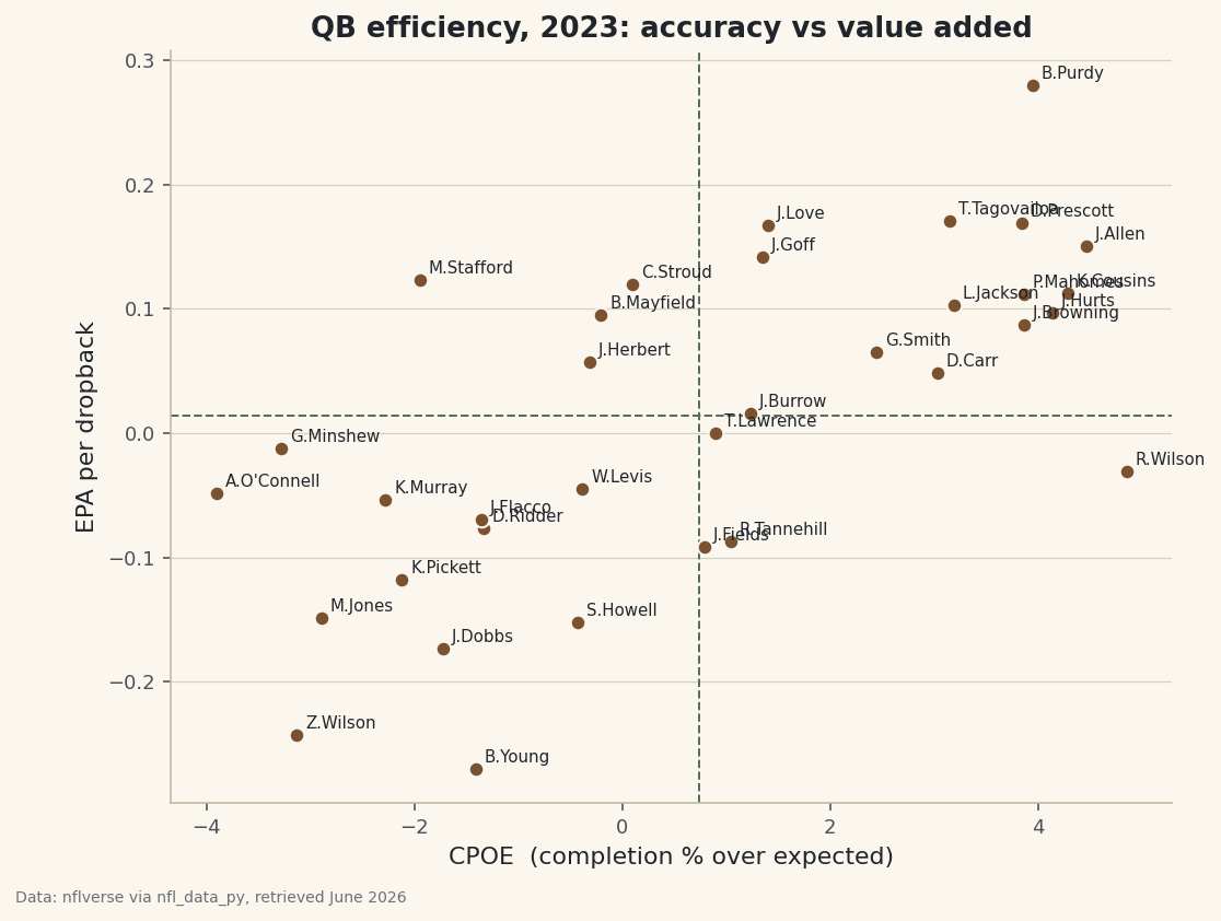
Comparing quarterbacks by passing yards or touchdowns is a trap - those stats reward volume and lucky bounces as much as skill. The analytics community settled on something better: a two-number portrait of every starting quarterback that separates how much value he adds from how accurate he is. Building it means aggregating a full season of play-by-play down to the quarterback level, requiring a fair sample of attempts, and finishing with a labeled scatter where the best passers land in the upper-right corner.
This is an intermediate step up: we're moving from analyzing plays to analyzing people, which means grouping many rows into one row per player. It builds on EPA explained by building it - we'll use a quarterback-specific flavor of EPA here - so make sure that idea is comfortable before you start. As always we read nflverse's data through the sdt_nflverse helper rather than the broken nfl_data_py library.
-
The two metrics, and why they're the right two
We'll plot every qualifying passer on two axes. The vertical axis is EPA per dropback: the average Expected Points Added each time the quarterback drops back to pass. It answers "how much is this player worth on a typical passing play?" and it captures everything - completions, the costly sacks and interceptions, the explosive gains. It's the closest thing we have to a single value metric for a passer.
The horizontal axis is CPOE, Completion Percentage Over Expected. nflverse models how likely each individual throw is to be completed given its difficulty - depth, location, pressure - and CPOE is how much better (or worse) the quarterback did than that expectation, in percentage points. A CPOE of +4 means he completed passes at a rate four points above what an average passer would on those exact throws. It isolates accuracy from the difficulty of what he was asked to do. Value and accuracy are related but not identical, and plotting one against the other reveals quarterbacks who are efficient through different means.
-
Load the dropback-level columns
We only need five columns for the whole 2023 season: who threw the ball, his team, his per-dropback EPA, his CPOE, and a flag marking pass attempts. Pulling just these keeps the read fast.
python import matplotlib.pyplot as plt import sdt_common as sdt import sdt_nflverse as nfl sdt.init("build-a-qb-efficiency-comparison-chart") pbp = nfl.import_pbp_data([2023], columns=[ "passer_player_name", "posteam", "qb_epa", "cpoe", "pass_attempt"])Notice we ask for
qb_epa, not the plainepafrom the last tutorial. They're closely related, butqb_epais credited to the quarterback's account on dropbacks - the right column when the unit of analysis is the passer rather than the offense. -
Aggregate to one row per quarterback
This is the central move. We keep only pass attempts, group by passer and team, and compute three summaries at once: the count of attempts, the mean EPA per dropback, and the mean CPOE. Then we require a minimum sample so backups and emergency fill-ins don't pollute the chart.
python # One row per dropback; group to the quarterback and require a real sample. MIN_ATT = 250 qbs = (pbp[pbp["pass_attempt"] == 1] .groupby(["passer_player_name", "posteam"]) .agg(att=("pass_attempt", "sum"), epa=("qb_epa", "mean"), cpoe=("cpoe", "mean")) .query("att >= @MIN_ATT") .reset_index())The named-aggregation syntax -
epa=("qb_epa", "mean")- reads as "make a column calledepaby taking the mean ofqb_epa," and it lets us build all three columns in a single pass. The@MIN_ATTinsidequerypulls in our Python variable, so the threshold lives in exactly one place. Grouping by both name and team is deliberate: it keeps a midseason-traded quarterback's stints separate, which is more honest than blending two different supporting casts. -
Why a minimum attempts threshold matters
Without
MIN_ATT, the leaderboard would be topped by someone who threw twelve passes in garbage time and happened to complete most of them. Efficiency metrics are rate stats, and rates are wildly noisy in small samples - a single explosive play can swing a 20-attempt EPA average more than a great game swings a 600-attempt one. Setting the bar at 250 attempts (a little under half a season of starts) keeps us to genuine starters whose numbers have stabilized. It's the same discipline as the minimum batted-balls rule in the Statcast exit-velocity leaderboard: never let a tiny sample crash the party. -
Read the leaderboard
Let's sort by EPA per dropback and look at the most valuable passers of 2023. We label the rows 1 through 8 and round for readability.
python with sdt.snippet("leaders"): top = qbs.sort_values("epa", ascending=False).head(8).round(3) top.index = range(1, len(top) + 1) print(f"Most efficient passers (min {MIN_ATT} attempts, 2023):") print(top[["passer_player_name", "posteam", "att", "epa", "cpoe"]].to_string())The most efficient passers of 2023Most efficient passers (min 250 attempts, 2023): passer_player_name posteam att epa cpoe 1 B.Purdy SF 584.0 0.280 3.947 2 T.Tagovailoa MIA 632.0 0.170 3.150 3 D.Prescott DAL 695.0 0.169 3.845 4 J.Love GB 667.0 0.168 1.402 5 J.Allen BUF 678.0 0.151 4.466 6 J.Goff DET 758.0 0.142 1.349 7 M.Stafford LA 592.0 0.123 -1.946 8 C.Stroud HOU 595.0 0.120 0.102
This passes the smell test, which is how you know the pipeline is sound. Brock Purdy tops the list at +0.280 EPA per dropback with an excellent +3.947 CPOE - both accurate and enormously valuable. Tua Tagovailoa and Dak Prescott follow, then Jordan Love, Josh Allen, and Jared Goff. The numbers are real season aggregates, retrieved June 2026.
The most instructive row is Matthew Stafford at #7: a strong +0.123 EPA per dropback despite a negative CPOE of -1.946. That combination tells a story the single number would hide - he added value while completing passes below expectation, which usually means aggressive, high-value downfield throws rather than easy checkdowns. Two quarterbacks can reach similar efficiency by opposite routes, and the two-axis view is what lets you see it.
-
Build the labeled scatter
Now the payoff chart. Each quarterback becomes a dot at his (CPOE, EPA) coordinates. We add dashed reference lines at the mean of each axis so the plot splits into four quadrants, and we label every dot with the passer's name.
python fig, ax = plt.subplots(figsize=(8.2, 6.2)) ax.scatter(qbs["cpoe"], qbs["epa"], s=46, color=sdt.sport_color("football"), edgecolor="#FBF7EE", zorder=3) ax.axhline(qbs["epa"].mean(), color=sdt.SPORT_COLORS["foundations"], linestyle="--", linewidth=1) ax.axvline(qbs["cpoe"].mean(), color=sdt.SPORT_COLORS["foundations"], linestyle="--", linewidth=1) for _, r in qbs.iterrows(): ax.annotate(r["passer_player_name"], (r["cpoe"], r["epa"]), fontsize=7.5, xytext=(4, 3), textcoords="offset points", color="#20242B") ax.set_xlabel("CPOE (completion % over expected)") ax.set_ylabel("EPA per dropback") ax.set_title("QB efficiency, 2023: accuracy vs value added") sdt.save_fig(fig, "qb_efficiency", source="nflverse via nfl_data_py")Data: nflverse via nfl_data_py, retrieved June 2026 The two design choices that make this readable: the
annotatecall with anxytextoffset nudges each name a few points up and to the right of its dot so the labels don't sit on top of the markers, and the dashed mean lines turn raw coordinates into meaning. The upper-right quadrant - above-average value and above-average accuracy - is where the best quarterbacks live; the lower-left is where struggling starters cluster. The off-diagonal quadrants are the interesting ones, holding passers who are accurate but low-value (lots of safe completions) or inaccurate but high-value (aggressive playmakers like Stafford). -
How to actually read the four quadrants
Train your eye to read position, not just rank. A dot far to the right is a precision passer hitting throws others would miss. A dot high up is moving the ball and avoiding the catastrophic sacks and picks that tank EPA. The dream is up and right - Purdy's corner. A quarterback who is high but left is winning with explosiveness over accuracy; one who is right but low is accurate on a diet of low-value throws. None of that is visible in a passer-rating column, and that's the whole point of trading a single ranking for a two-dimensional map.
Troubleshooting
AttributeError: 'DataFrame' object has no attribute 'append'
The real nfl_data_py on a modern pandas - it calls the removed DataFrame.append(). Use the sdt_nflverse helper (it reads the same parquet via pandas.read_parquet), or install the library in an isolated venv pinned to pandas<2.0 / numpy<2.0.
Too many or too few quarterbacks on the chart
That's the MIN_ATT threshold at work. Lower it (say to 100) and you'll pull in committee and injured starters - and watch the scatter spread out as noisier rate stats produce more extreme dots. Raise it and you keep only full-season starters. There's no single correct number; just be explicit about the bar you chose and report it on the chart, as we do in the title.
KeyError: 'qb_epa' or 'cpoe'
These columns must be named in your import_pbp_data call. If you copied a column list from another tutorial you may have requested plain epa instead of qb_epa, or forgotten cpoe entirely. Add them to the columns=[...] list and re-read.
A traded quarterback appears twice
That's intended - we grouped by name and posteam, so a midseason move splits into two rows, each with its own team and supporting cast. If you'd rather combine them, drop posteam from the groupby, but know you're then averaging across two different situations.
Challenge yourself
Add a third dimension without adding an axis: scale each dot's size by the quarterback's attempt count by passing s=qbs["att"] / 5 to scatter. Now volume is visible too - a small, high dot is an efficient part-time starter, while a large dot in the upper-right is a workhorse ace carrying a full season at elite efficiency. Then color the dots by EPA with a diverging colormap and see whether the visual story sharpens or just gets busy. Restraint in a chart is a skill worth practicing.
Get the code
Here's the complete, working script for this tutorial. It runs exactly as shown.
Download the finished script (17_build_a_qb_efficiency_comparison_chart.py)This script imports a small shared helper (and reads any bundled sample data) that live next to it in /downloads/ — grab these into the same folder so it runs as-is: sdt_common.py, sdt_nflverse.py.