Team Tendencies: Run/Pass Rate by Down and Distance
What you'll build
A heatmap of how pass-happy a team is by down and distance.
Every defensive coordinator in the NFL carries a version of the same cheat sheet: a grid that says how likely the offense across the field is to throw on each combination of down and yards-to-go. Tip your hand on third-and-long and the pass rush tees off; stay balanced on first down and you keep the defense honest. Let's build that scouting grid ourselves for the Kansas City Chiefs from a full 2023 season of play-by-play. The workhorse is pivot_table, one of the most useful tools in pandas, and the payoff is a heatmap a coordinator could actually read.
This is an intermediate step that leans on aggregation rather than new data plumbing. It builds on pulling your first NFL data, so I'll assume you've got the sdt_nflverse helper working and understand why we read nflverse's parquet files directly instead of fighting the broken nfl_data_py library. The data is nflverse play-by-play, retrieved June 2026.
-
Load just four columns
A scouting grid only needs four facts about each play: who had the ball, what down it was, how many yards to go, and whether it was a pass or a run. Pulling only those columns keeps the read quick, because parquet pulls just the columns you name off the wire.
python import matplotlib.pyplot as plt import numpy as np import sdt_common as sdt import sdt_nflverse as nfl sdt.init("team-tendencies-run-pass-by-down-distance") pbp = nfl.import_pbp_data([2023], columns=["posteam", "down", "ydstogo", "play_type"])posteamis the team with possession - the offense on that play - andydstogois the distance needed for a first down. We pass the year as a list even for one season, which is the same signaturenfl_data_pyuses and lets you ask for several years at once later. -
Filter to one team's real plays
We want Kansas City, and we only want ordinary pass and run plays on a genuine down - that drops kickoffs, punts, extra points, and the timeouts and penalties that carry no
down. After filtering we castdownto an integer so it reads as 1 through 4 rather than1.0through4.0.python TEAM = "KC" plays = pbp[(pbp["posteam"] == TEAM) & (pbp["play_type"].isin(["pass", "run"])) & (pbp["down"].notna())].copy() plays["down"] = plays["down"].astype(int)The
.copy()after slicing is the habit that keeps theSettingWithCopyWarningaway when we add columns on the next steps - it tells pandas we want a fresh DataFrame, not a view ontopbp. Casting after thenotna()filter matters too: trying to convert a column that still holdsNaNtointwould raise an error. -
Bucket the distance
Raw yards-to-go ranges from 1 to 20-plus, which is far too granular for a readable grid - you'd have a column for "third-and-7" and another for "third-and-8" that mean essentially the same thing to a defense. So we collapse distance into four football-meaningful buckets: short (1-2), medium (3-6), normal (7-10), and long (11+). A small function makes the rule explicit.
python def distance_bucket(yards): if yards <= 2: return "1-2" if yards <= 6: return "3-6" if yards <= 10: return "7-10" return "11+" order = ["1-2", "3-6", "7-10", "11+"] plays["dist"] = plays["ydstogo"].apply(distance_bucket) plays["is_pass"] = (plays["play_type"] == "pass").astype(int)Two new columns come out of this.
distis the bucket label, built by running every value ofydstogothrough our function with.apply.is_passis the clever one: by turning "was this a pass?" into a 1 or a 0, we set ourselves up so that the average of that column over any group is exactly the pass rate for that group. Theorderlist just remembers how we want the buckets sorted left to right, since alphabetical order would put "11+" before "1-2". -
Pivot into the grid
Here's the heart of it.
pivot_tableturns a long list of plays into a two-dimensional table: one row per down, one column per distance bucket, and in each cell the mean ofis_pass- which, because of that 1/0 trick, is the pass rate. We then force the rows into 1-2-3-4 order and the columns into our bucket order withreindex.python grid = (plays.pivot_table(index="down", columns="dist", values="is_pass", aggfunc="mean") .reindex([1, 2, 3, 4]).reindex(columns=order))Read the three arguments like a sentence:
index="down"puts downs down the side,columns="dist"spreads distance across the top, andaggfunc="mean"says how to combine the many plays that fall into each cell. This single call replaces what would otherwise be a nested loop over every down-and-distance combination. If you've done the EPA tutorial, you sawunstackreshape a grouped Series the same way;pivot_tablejust does the grouping and the reshaping in one move. -
Print the scouting grid
Let's look at the numbers before we draw anything. We multiply by 100 and round to whole percentages so the table reads like a coordinator's notes.
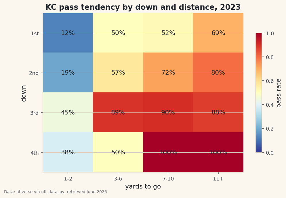
python with sdt.snippet("grid"): print(f"{TEAM} pass rate by down and distance, 2023 (%):") print((grid * 100).round(0).to_string())Kansas City's pass tendencies, 2023KC pass rate by down and distance, 2023 (%): dist 1-2 3-6 7-10 11+ down 1 12.0 50.0 52.0 69.0 2 19.0 57.0 72.0 80.0 3 45.0 89.0 90.0 88.0 4 38.0 50.0 100.0 100.0
This grid tells the whole story of how a modern offense thinks. Look across the top row: on first down with 1-2 yards to go, Kansas City passed just 12% of the time - that's short-yardage, run-to-move-the-chains territory. But first-and-11-plus (usually after a penalty) jumps to 69%, because they're behind schedule and need a chunk. Now scan down to third down, where the offense's hand is forced: 89% passing on third-and-3-to-6, 90% on third-and-7-to-10, 88% on third-and-long. That's the predictability every defense feasts on - on third-and-medium-or-worse, you can all but pencil in a pass. The 100% pass rates on fourth-and-7-plus are the same logic taken to its extreme: when they choose to go for it from far out, they always throw. The interesting wrinkle is fourth-and-short at 38% pass - even going for it, Kansas City trusts the run when only a yard or two is needed.
-
Draw it as a heatmap
A table of percentages is precise but slow to read; color is instant. We render the grid with
imshow, which paints each cell according to its value, and a red-to-blue colormap where hot red means pass-heavy and cool blue means run-leaning. Then we write the actual percentage into every cell so you get the number and the color together.python fig, ax = plt.subplots(figsize=(7.8, 5)) im = ax.imshow(grid.values, cmap="RdYlBu_r", vmin=0, vmax=1, aspect="auto") ax.set_xticks(range(len(order)), order) ax.set_yticks(range(4), ["1st", "2nd", "3rd", "4th"]) for i in range(grid.shape[0]): for j in range(grid.shape[1]): v = grid.values[i, j] if not np.isnan(v): ax.text(j, i, f"{v:.0%}", ha="center", va="center", fontsize=11, color="#20242B") ax.set_xlabel("yards to go") ax.set_ylabel("down") ax.set_title(f"{TEAM} pass tendency by down and distance, 2023") fig.colorbar(im, ax=ax, shrink=0.75, label="pass rate") sdt.save_fig(fig, "tendencies", source="nflverse via nfl_data_py")Data: nflverse via nfl_data_py, retrieved June 2026 Three details make this chart honest and clear. Pinning
vmin=0, vmax=1locks the color scale to the full 0-100% range, so a "red" cell always means the same thing and two teams' grids would be directly comparable. Thenp.isnanguard skips writing a label into any empty cell - a combination KC never faced, like a specific fourth-and-distance with no plays. Andsave_figstamps the data source and retrieval date onto the corner, so the chart's provenance travels with the image. Read the finished heatmap by looking for the band of deep red across the third-down row: that's where the offense becomes one-dimensional, and it's exactly what an opposing coordinator circles first.
Troubleshooting
AttributeError: 'DataFrame' object has no attribute 'append'
You're importing the real nfl_data_py on a modern pandas - it still calls the removed DataFrame.append() and crashes. Use the sdt_nflverse helper as the script does (it reads the same nflverse parquet with pandas.read_parquet), or set up a separate virtual environment pinned to pandas<2.0 / numpy<2.0 as described in the NFL data tutorial.
Some cells are empty or show NaN
That's a down-and-distance combination the team simply never ran - fourth-and-medium, for instance, is rare. pivot_table leaves those cells as NaN, and our np.isnan check skips labeling them on purpose. It's not a bug; it's an honest blank where there's no data. If you'd rather show a number, pick a team with more plays or widen the buckets.
The columns are in the wrong order (11+ appears first)
Without the reindex(columns=order) step, pandas sorts the bucket labels alphabetically, which puts "11+" before "1-2". The explicit order list fixes the left-to-right sequence. Make sure the strings in order exactly match what distance_bucket returns, spaces and all.
ValueError: invalid literal for int() on the down cast
You tried to convert down to an integer before dropping the null downs. Kickoffs and timeouts have a NaN down, which can't become an int. Keep the (pbp["down"].notna()) filter ahead of the .astype(int) call, as the script does.
Challenge yourself
Tendencies are only useful as a comparison. Wrap the whole pipeline in a function that takes a team abbreviation and returns its grid, then build the grid for a run-heavy team and a pass-happy team and place the two heatmaps side by side. Where does the run-first team stay balanced on second-and-medium while the pass-first team has already abandoned the run? Then go one level deeper: split each cell by whether the offense was leading or trailing (add the score_differential column and bucket it) and watch third-down passing climb even higher when a team is playing from behind.
Get the code
Here's the complete, working script for this tutorial. It runs exactly as shown.
Download the finished script (33_team_tendencies_run_pass_by_down_distance.py)This script imports a small shared helper (and reads any bundled sample data) that live next to it in /downloads/ — grab these into the same folder so it runs as-is: sdt_common.py, sdt_nflverse.py.