Build a Hitter's Spray Chart
What you'll build
A hitter's batted balls plotted on a baseball field, by outcome.
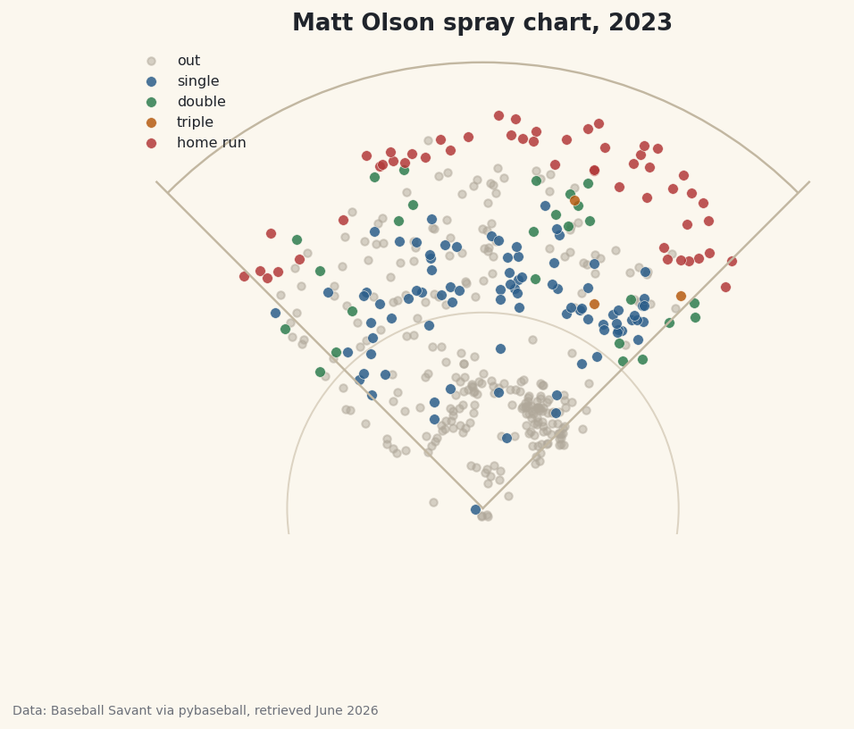
A batting line tells you how often a hitter succeeds; a spray chart tells you where. Plot every batted ball a hitter put in play and a personality appears on the page - the dead-pull slugger who lives down the left-field line, the spray-it-everywhere line-drive hitter, the guy who only does damage to one gap. I'll draw that picture for Matt Olson's monster 2023 season (he led the majors in home runs), using the same Statcast hit-location data the broadcast graphics are built on. The catch — and the one skill that makes this work — is that Statcast's coordinate system is genuinely weird, and you have to convert it into real field coordinates before any of it plots right.
This builds on your first pybaseball pull, so the library is installed and your cache is warm. We'll lean on matplotlib too; if you worked through your first matplotlib visualization, the plotting here will feel familiar. The data is Baseball Savant via pybaseball, retrieved June 2026.
-
Pull one hitter's batted balls
Just as
statcast_pitchergrabs a single pitcher,statcast_batter(start, end, player_id)grabs every pitch a single hitter saw across a date range - fast, because it's one player. We pull Olson's whole 2023 and look him up so we have a real name for the title.python import matplotlib.patches as mp import matplotlib.pyplot as plt import pybaseball as pyb pyb.cache.enable() BATTER_ID = 621566 # Matt Olson (led MLB in HR, 2023) data = pyb.statcast_batter("2023-04-01", "2023-09-30", BATTER_ID) name_row = pyb.playerid_reverse_lookup([BATTER_ID], key_type="mlbam").iloc[0] hitter = f"{name_row['name_first'].title()} {name_row['name_last'].title()}"That
621566is Olson's MLBAM ID. The reverse lookup turns it into "Matt Olson" by titling and joining his first and last names, exactly as we did when profiling a pitcher. The troubleshooting section shows how to find any other hitter's ID. -
Keep only batted balls with coordinates
Most rows in a Statcast pull are pitches that were never put in play - balls, called strikes, swinging strikes. A spray chart only wants contact, so we filter to rows where the pitch result type is
"X"(a ball in play) and then drop any that are missing hit coordinates.python bb = data[(data["type"] == "X")].dropna(subset=["hc_x", "hc_y"]).copy()The
typecolumn codes every pitch asS(strike),B(ball), orX(in play), sodata["type"] == "X"keeps just the batted balls. We add.copy()immediately because we're about to create new columns on this slice, and copying up front avoids pandas'SettingWithCopyWarning. -
Convert Statcast coordinates to field coordinates
Here's the one genuinely tricky idea. Statcast records where each ball was fielded as
hc_xandhc_y, but in a pixel-like system left over from the old hit-chart tool: the origin is a corner, not home plate, andyincreases downward. To draw a real field we shift the origin to home plate and flip the vertical axis so the outfield goes up.python bb["x"] = bb["hc_x"] - 125.42 bb["y"] = 198.27 - bb["hc_y"]Subtracting
125.42fromhc_xslides home plate tox = 0, so pulled balls land at negative x and opposite-field balls at positive x. The198.27 - hc_ydoes two jobs at once: it moves the origin and, becausehc_yis subtracted rather than added, it flips the axis so a deep fly ball gets a large positiveyinstead of a large downward value. Those two magic numbers are the standard constants the community uses to map Statcast's coordinate grid onto a 90-foot diamond. -
See what we're working with
Before drawing anything, let's sanity-check the data. We print how many batted balls survived the filter and a quick tally of outcomes from the
eventscolumn.python print(f"{hitter}, 2023: {len(bb)} batted balls with coordinates") print(bb["events"].value_counts().head(6).to_string())Olson's batted-ball outcomesMatt Olson, 2023: 439 batted balls with coordinates events field_out 244 single 86 home_run 52 double 26 grounded_into_double_play 13 force_out 8
This passes the smell test for a slugger's season: 439 batted balls with coordinates, of which 244 were routine outs (
field_out), 86 singles, and a remarkable 52 home runs - the real total that led baseball that year. Thevalue_countson theeventscolumn is doing the work here, tallying each distinct outcome. Notice the outcomes split into two families: hits we'll want to color individually (single, double, home run) and various kinds of outs (field_out,grounded_into_double_play,force_out) that we'll lump together as gray dots. -
Draw a simple field
We don't need a stadium-accurate diagram - just enough geometry to orient the eye. Two foul lines running out from home plate, an outfield arc, and a small infield circle do the job. We build the axes, then add each piece with matplotlib's line and patch tools.
python fig, ax = plt.subplots(figsize=(7.2, 6.8)) ax.plot([0, -150], [0, 150], color="#C2B7A1", lw=1.2) # left-field foul line ax.plot([0, 150], [0, 150], color="#C2B7A1", lw=1.2) # right-field foul line ax.add_patch(mp.Arc((0, 0), 2 * 205, 2 * 205, theta1=45, theta2=135, edgecolor="#C2B7A1", lw=1.2)) # outfield fence ax.add_patch(mp.Circle((0, 0), 90, fill=False, edgecolor="#DCD3C2", lw=1)) # infieldThe two
ax.plotcalls draw the foul lines as straight segments from home plate at(0, 0)out to the corners. TheArcis centered on home plate with a radius of 205 feet (the width and height arguments are full diameters, hence2 * 205); limiting it totheta1=45throughtheta2=135sweeps only the outfield arc between the foul poles. TheCircleof radius 90 hints at the infield. We use the site's warm parchment palette so the field recedes and the batted balls pop. -
Plot the batted balls by outcome
Now the payoff. We give each hit type its own color, draw the outs first as faint gray dots so they sit in the background, then loop over the hit outcomes and scatter each in its color on top.
python OUTCOME = {"single": ("#2C5E8A", "single"), "double": ("#2E7D4F", "double"), "triple": ("#B65C12", "triple"), "home_run": ("#B23A3A", "home run")} outs = bb[~bb["events"].isin(OUTCOME)] ax.scatter(outs["x"], outs["y"], s=18, color="#B0A89A", alpha=0.5, label="out") for ev, (color, lbl) in OUTCOME.items(): sub = bb[bb["events"] == ev] ax.scatter(sub["x"], sub["y"], s=34, color=color, alpha=0.85, edgecolor="#FBF7EE", linewidth=0.3, label=lbl) ax.set_xlim(-165, 165) ax.set_ylim(-12, 215) ax.set_aspect("equal") ax.axis("off") ax.legend(loc="upper left", fontsize=8, frameon=False) ax.set_title(f"{hitter} spray chart, 2023") fig.savefig("spray_chart.png", dpi=144, bbox_inches="tight")Data: Baseball Savant via pybaseball, retrieved June 2026 The line
bb[~bb["events"].isin(OUTCOME)]is the clever filter:.isin(OUTCOME)tests whether each event is one of our four hit types, and the leading~flips it to mean "everything that isn't a hit" - all the various outs in one gray pile, no matter how they were recorded. Two settings make the field look right rather than stretched:ax.set_aspect("equal")forces one unit of x to equal one unit of y so the diamond isn't squashed, andax.axis("off")hides the numeric axes we don't want a fan to see.
Troubleshooting
How do I find a different hitter's ID?
Use the forward lookup: pyb.playerid_lookup("olson", "matt") returns a table with a key_mlbam column - that number goes into BATTER_ID. Last name first, then first name. For a common name you'll get several rows; mlb_played_last tells you which one is the current player.
The field looks stretched or squashed
You're missing ax.set_aspect("equal"). Without it, matplotlib scales the x and y axes independently to fill the figure, which turns the diamond into a lopsided blob. Add that one line and the proportions snap back. Make sure your x and y limits are roughly symmetric too, as ours are.
The dots are clustered in a corner or upside down
This almost always means the coordinate conversion was skipped or copied wrong. Double-check you computed x = hc_x - 125.42 and y = 198.27 - hc_y - note that hc_y is subtracted from 198.27, not the other way around. Plotting raw hc_x/hc_y puts home plate in the wrong place and flips the field vertically.
A few dots land in foul territory or beyond the fence
That's expected and honest - the conversion is a good approximation, not survey-grade, and Statcast's fielded-location data has its own scatter (a ball can be cut off well in front of where it would have landed). A handful of points just outside the lines or arc is normal; don't try to "fix" them by clipping the data.
Challenge yourself
Quantify the eye test. Olson is a textbook pull hitter, and you can prove it: count the share of his batted balls with a negative x (pulled to the right side of the field for a left-handed hitter) versus positive x, and print the pull percentage. Then size each dot by exit velocity - pass s=sub["launch_speed"] to scatter - so the hardest-hit balls draw the eye, and watch his home runs swell into the biggest markers on the chart. For a real project, build the same chart for a known opposite-field hitter and put the two side by side; the contrast in where the color lives is the whole story of how differently two sluggers attack the ball.
Get the code
Here's the complete, working script for this tutorial. It runs exactly as shown.
Download the finished script (25_build_a_hitter_spray_chart.py)This script imports a small shared helper (and reads any bundled sample data) that live next to it in /downloads/ — grab these into the same folder so it runs as-is: sdt_common.py.