Regression to the Mean: Why Hot Starts Cool Off, on Schedule
Part 9 of 10 in Randomness, Inference & Simulation · course bundle (code + data)
What you'll build
The 2023-24 NBA season split into 41-game halves and regressed on itself: a 0.77 slope with both extremes fading toward the mean, that slope rebuilt from variance accounting as a 0.82 shrinkage factor that out-forecasts naive persistence, and the curve showing 10-game records regress far harder.
Every November, some team starts 8-2 and the takes arrive: they've figured it out, this year is different. By April the record has usually drifted back toward ordinary, the coach gets credit for "steadying the ship" or blame for "losing the room" — and most of what happened was neither. It was regression to the mean, the most reliably misread phenomenon in sports. This tutorial makes it a number you compute rather than a phrase you deploy: split the 2023-24 NBA season into halves, regress each team's second-half win% on its first-half win%, and stare at the result — a slope of 0.77, not 1. Then we rebuild that slope from scratch by splitting variance into talent and luck, use it to beat the naive forecast, and draw the curve showing why ten-game records regress hardest of all.
You've met the machinery: tutorial 38 taught the regression line, and the Monte Carlo season simulation showed that identical teams produce a wide standings spread by luck alone. This is where those two facts meet. Everything runs offline on the bundled nba_home_results.csv — every 2023-24 final score — and there's no randomness anywhere: each number recomputes identically, every run.
-
Split every team's season into its two halves
The file has one row per game; a team's schedule is the rows where it appears on either side. Stack home and away appearances into one long win/loss log per team, sort by date, and take games 1–41 versus games 42–82. First-half win% is our predictor; second-half win% is what we're trying to forecast.
python import numpy as np import pandas as pd games = pd.read_csv("nba_home_results.csv") long = pd.concat([ pd.DataFrame({"date": games["date"], "team": games["home_team"], "win": (games["home_pts"] > games["away_pts"]).astype(int)}), pd.DataFrame({"date": games["date"], "team": games["away_team"], "win": (games["away_pts"] > games["home_pts"]).astype(int)}), ]) rows = [] for team, sub in long.groupby("team"): sub = sub.sort_values("date") rows.append((team, sub["win"].iloc[:41].mean(), sub["win"].iloc[-41:].mean())) halves = pd.DataFrame(rows, columns=["team", "first", "second"]).set_index("team")Half-season splits, best and worst first halves1,231 games -> 2,462 team-games -> 30 teams best first halves: first second change team Boston Celtics 0.780 0.780 0.000 Minnesota Timberwolves 0.732 0.634 -0.098 Philadelphia 76ers 0.683 0.463 -0.220 Oklahoma City Thunder 0.683 0.707 0.024 Milwaukee Bucks 0.683 0.512 -0.171 worst first halves: first second change team Detroit Pistons 0.098 0.244 0.146 Washington Wizards 0.171 0.195 0.024 San Antonio Spurs 0.171 0.366 0.195 Charlotte Hornets 0.244 0.268 0.024 Portland Trail Blazers 0.293 0.220 -0.073 league mean win%: first half 0.503, second half 0.496Read the
changecolumn before any theory. Of the five best first-half teams, four got worse; of the five worst, none got meaningfully worse and three got better — the 8-win-pace Pistons nearly tripled their rate, the 14-win-pace Spurs doubled theirs. Nobody planned this. It's what the arithmetic below guarantees will happen on average. -
Fit the line: the slope is the whole story
Now the one regression this tutorial is named after. If half-season records were perfectly persistent, second-half win% would equal first-half win% and the fitted slope would be 1. If records were pure coin flips, the first half would tell you nothing and the slope would be 0. Reality has to pick a point in between.
python x = halves["first"].to_numpy() y = halves["second"].to_numpy() slope, intercept = np.polyfit(x, y, 1) r = np.corrcoef(x, y)[0, 1] print(round(slope, 3), round(intercept, 3), round(r, 3))Second-half win% regressed on first-half win%regress second-half win% on first-half win% (30 teams): slope 0.775 intercept 0.106 r 0.790 slope < 1 is regression to the mean, stated as arithmetic: a team 1 win above average before the break projects 0.77 wins above average after it. the other 0.23 wins were luck, and luck doesn't carry over.
0.775. That number is regression to the mean, fully stated: a team one win above average at the break projects to be 0.77 wins above average after it. Not zero wins — first halves obviously carry information (r = 0.79) — but not one win either. The missing 0.23 is the share of every extreme record that was luck, and luck doesn't renew. This is also where the phrase comes from: Galton fit exactly this picture to parents' and children's heights in 1886, found a slope below 1, and called it "regression towards mediocrity." The name attached itself to the technique forever.
-
Watch both tails fade — in opposite directions
A slope below 1 makes two predictions at once: the top should come down and the bottom should come up, purely as a matter of where luck had piled up. Check both.
python top5 = halves.nlargest(5, "first") bot5 = halves.nsmallest(5, "first") print(top5["first"].mean(), "->", top5["second"].mean()) print(bot5["first"].mean(), "->", bot5["second"].mean())The five best and five worst first halves, after the breakthe five best first-half teams: first half 0.712 -> second half 0.668 (29.2 -> 27.4 wins per 41) the five worst first-half teams: first half 0.195 -> second half 0.259 (8.0 -> 10.6 wins per 41) both extremes moved toward the middle - no coaching change required. extreme records are where luck piled up in one direction, and the luck resets to zero while the talent stays.
The elite five gave back about two wins per 41 games; the bottom five picked up about two and a half. Note what regression to the mean is not saying: it is not a force pulling teams to .500, and it is not the gambler's fallacy ("they're due"). The Celtics' second half doesn't remember their first. The mechanism is selection: sorting by first-half record partly sorts teams by talent and partly by who got lucky, so the top of the table over-represents good luck — and in the second half, luck is redrawn from scratch while talent persists. The lucky component evaporates on average, which is all the slope claims.
-
Rebuild the slope from variance accounting — then forecast with it
Here's the beautiful part: 0.77 isn't just an empirical accident, it's derivable. The spread of first-half records has exactly two sources — teams genuinely differ (talent variance), and 41 games of binomial coin-flipping adds noise on top (luck variance,
p(1-p)/41per team). The theoretical slope of second half on first is the talent share of total variance — because that's the fraction of an extreme record you should expect to survive. Sports analysts call it a shrinkage factor.python var_obs = x.var(ddof=1) # total spread of 41-game win% var_luck = (x * (1 - x)).mean() / 41 # binomial noise in 41 games shrink = (var_obs - var_luck) / var_obs # talent's share pred_shrunk = x.mean() + shrink * (x - x.mean()) # shrink toward the mean rmse = lambda p: np.sqrt(np.mean((y - p) ** 2)) print(round(shrink, 3), round(rmse(x), 4), round(rmse(pred_shrunk), 4))Talent vs luck, and the forecast head-to-headwhere does 0.77 come from? split the variance of first-half win%: observed variance 0.03042 binomial luck in 41 games 0.00538 (mean of p(1-p)/41) what's left: talent variance 0.02504 talent share = shrinkage factor 0.823 two routes, same answer: fitted slope 0.775, variance route 0.823. a 41-game record is ~4/5 talent, ~1/5 luck - so shrink it ~1/5 of the way back to the mean before you forecast with it: RMSE, naive 'repeat the first half': 0.1103 RMSE, shrunk toward the league mean: 0.1036 ...on the 10 most extreme teams only: 0.1029 -> 0.0832 the gain lives exactly where the takes live: at the extremes.
Two completely different routes — fitting a line through 30 points, versus pure variance bookkeeping that never looks at the second half at all — land at 0.78 and 0.82. That agreement is the tutorial's strongest evidence that the model of "record = talent + binomial noise" is basically right. And it cashes out: shrinking every team ~1/5 of the way to the mean beats the naive "they'll repeat it" forecast overall, with the entire gain concentrated in the ten most extreme teams — RMSE 0.103 → 0.083 — exactly the teams hot-take arguments are about. If this move feels familiar, it should: it's the same pull-toward-the-prior you built in the Beta-Binomial tutorial, arrived at from the frequentist side.
-
Shrink the split point and watch October takes die
Half a season is a lot of evidence. The fun begins when there's less. Re-run the same regression using only the first n games as the predictor and the whole rest of the season as the target, sweeping n from 5 to 60. Less evidence means luck makes up a bigger share of the record's variance, so the slope must fall — the only question is how fast.
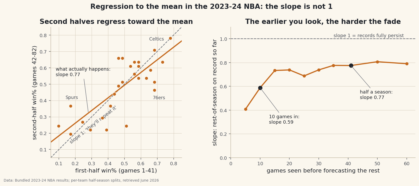
python splits = [5, 10, 15, 20, 25, 30, 35, 41, 50, 60] early_slopes = [] for n in splits: rows = [] for team, sub in long.groupby("team"): sub = sub.sort_values("date") rows.append((sub["win"].iloc[:n].mean(), sub["win"].iloc[n:].mean())) a = np.array(rows) early_slopes.append(np.polyfit(a[:, 0], a[:, 1], 1)[0]) print(n, round(early_slopes[-1], 2))How hard records regress, by how early you lookslope of (rest of season) on (first n games), by n: games seen slope 5 0.41 10 0.59 15 0.73 20 0.74 25 0.69 30 0.74 35 0.78 41 0.78 50 0.81 60 0.79 after 10 games the slope is ~0.6: nearly half of what a 10-game record says is noise. the 2023-24 receipts: teams that started 8-2 (win% .800): first second team Boston Celtics 0.8 0.778 Dallas Mavericks 0.8 0.583 Denver Nuggets 0.8 0.681 Minnesota Timberwolves 0.8 0.667 Philadelphia 76ers 0.8 0.542 collectively .800 through ten games, 0.650 the rest of the way. still good - regression pulls toward the mean, not past it - but every single one cooled off.After five games the slope is 0.41 — a 5-0 record is mostly noise. After ten it's 0.59, and the 2023-24 receipts are lined up in the table: all five teams that started 8-2 cooled off, collectively from .800 ball to .650. Still genuinely good — regression pulls toward the mean, never past it — but every single one of those November stories aged the same way. One chart holds both halves of the argument:
python import matplotlib.pyplot as plt fig, (ax1, ax2) = plt.subplots(1, 2, figsize=(11.2, 4.9)) ax1.scatter(x, y, color="#C56A1E") # left: the halves scatter lims = np.array([0.05, 0.85]) ax1.plot(lims, lims, ls="--", color="#6C7079") # slope 1: "they'll repeat it" ax1.plot(lims, intercept + slope * lims, color="#C56A1E") ax2.plot(splits, early_slopes, marker="o", color="#C56A1E") # right: slope vs n ax2.axhline(1.0, ls="--", color="#6C7079") fig.savefig("halves_slope.png", dpi=144, bbox_inches="tight")Data: Bundled sample (real 2023-24 NBA game results), retrieved June 2026 The left panel's geometry is worth a slow look: the fitted line crosses the identity line near the league mean, sits below it on the right (good teams undershoot their first halves) and above it on the left (bad teams overshoot theirs). The right panel is the same idea as a dial: the fewer games behind a record, the further the honest forecast sits from "they'll keep doing this" — and it never, at any n, reaches the dashed line pundits implicitly draw.
What the slope does and doesn't license
Three fine points keep this tool honest. First, regression to the mean is a statement about averages, not about teams: the Thunder and Nuggets both improved on .683 first halves — individual residuals are large, and the slope only claims the tendency. Second, it never acts alone. The 76ers fell from .683 to .463, far beyond what a 0.77 slope predicts, because Joel Embiid's knee is not a statistical phenomenon — injuries, trades and schedule strength are real forces stacked on top of the luck arithmetic, which is why shrinkage is a baseline forecast, not a complete one. Third, mind the sample: 30 teams is a small regression (a different season will give a slope a few hundredths away), our two halves share a schedule rather than being independent draws, and win% discards margin information — rerun the analysis on per-game point margin and you'll get a slightly higher slope (0.82) because margins carry more signal per game. None of these caveats rescue an 8-2 take, but they're the difference between using regression to the mean and merely invoking it.
Troubleshooting
Two teams show 83 games, not 82 — is the file corrupt?
No. The bundled file contains 1,231 games because the 2023-24 in-season-tournament final (Lakers–Pacers) is included alongside the 1,230 regular-season games, giving those two teams one extra row. Taking games [:41] and [-41:] keeps every team's halves the same size and simply skips one mid-season game for those two teams — the slope moves by less than 0.01 if you drop that game instead.
My slope and my correlation are suspiciously close (0.775 vs 0.790)
Not a bug — a relationship. A regression slope is always r × (sd_y / sd_x). Here the two halves have nearly equal spread, so the ratio is close to 1 and the slope nearly equals r. That's also a deeper point: whenever you predict a quantity from a noisy earlier measurement of itself on the same scale, the slope is essentially the correlation — which is why "the correlation between halves is 0.79" and "records regress 21% toward the mean" are the same sentence.
The fitted slope (0.775) and the variance route (0.823) don't match — which is right?
Neither, exactly — both are estimates of the same underlying quantity, from 30 data points. The fitted slope carries sampling error of roughly ±0.11 (one standard error), and the variance route leans on the talent-plus-coin-flips model being true. Landing within 0.05 of each other is the two methods agreeing, not disagreeing. If you want a tiebreaker, the Challenge's even/odd split gives the variance route a cleaner test by removing mid-season drift.
Doesn't the second half also predict the first half with a slope below 1? That seems paradoxical.
It does — run np.polyfit(y, x, 1) and you'll get another slope below 1. It feels impossible ("both halves regress toward each other?") but it's the signature fact of the phenomenon: regression to the mean is symmetric in time because it's about noise, not causation. Whichever measurement you condition on, the extreme values of that measurement contain the extreme luck, and the other measurement won't repeat it. Galton found the same thing: tall parents have less-tall children, and tall children have less-tall parents.
Challenge yourself
Three extensions, in rising order of ambition. First, swap win% for average point margin per game in half_split and confirm the slope rises to about 0.82 — then explain in one sentence why margins regress less than records. Second, replace first-half/second-half with an even/odd game split (games 1, 3, 5… predict games 2, 4, 6…): that removes injuries, trades and schedule drift from the gap between the two samples, so the slope should land even closer to the variance-route prediction — check it. Third, take the shrinkage idea to the bundled sample_standings.csv (2023 MLB): compute each team's win% and shrink it using p(1-p)/162 as the luck variance, then compare your shrunk estimates to the Pythagorean expectations from tutorial 41 — two different luck-removal machines, and you now own both.
The finished script
Everything this tutorial built, assembled in one runnable file.
Download the finished script (86_regression_to_the_mean.py)This script imports a small shared helper (and reads any bundled sample data) that live next to it in /downloads/ — grab these into the same folder so it runs as-is: sdt_common.py, sdt_nba.py. Or skip the collecting: the Randomness, Inference & Simulation bundle has this whole course’s scripts and data in one ZIP.